The Patek Philippe 5327G Perpetual Calendar – A traditional QP desire
Hello everyone,
The Patek Philippe 5327 Perpetual Calendar is the latest interpretation of the classical and more traditional QP-only family. Not only it is the recent generation but it conveys Patek Philippe’s dedication and history regarding this grande complication they endeavoured since 1925 for wristwatches and even earlier for pocket watches. It is available in rose, yellow or white gold and it is this latter version I wish to talk about here.
The previous generation reference 5140 had been in the catalogue for 10 years and is one of the very fine examples of what Patek classics means: a thin and smooth case, an elegant dial in spite of the large amount of information to display (inherent to such complications) and housing the renowned minirotor 240 caliber.
The last 5140 to be produced was the Platinum version with a grey dial (here below).
The Patek Philippe 5327G is the illustration of their designing talent in the field of romantic, enchanting and marvelous timepieces, next to an increasing sport-chic proposition. Thus, I’ll try to express what this kind of models mean to me as a watch enthusiast.
The 5327, the brand, today
Tastes are evolving with generations, cultures, etc… Nevertheless, aesthetical ideals evolution can be slower on the long run, meaning that they don’t change at the same speed people change. They can even remain beacons and not just mirrors of people’s shuffling perceptions. Hence, standards of elegance, beauty, evolve as well. I feel (because nobody except Patek has the figures) that the ending period of the 5140 and the early period of the 5327 weren’t showing an utmost selling success, at least from what I have seen through forums, auctions, etc…
Was it boredom, apetite for more modern stuff, the fact the casual trend has thrived in our societies, the Nautilus frenzy beginning? Certainly a little bit of everything. New clients (last decade) also needed time to study this field. While, the Nautilus’ immense appeal has definitely “hurt” the classical references, its promotion has also rejuvenated Patek’s image and talked to a new below-40 panel of clients. The latter being from all over the world now, and not only from Western countries (hence tastes diversity). When recently introduced, the 5320G Perpetual Calendar brought something new, not as traditional, while remaining classical. These traditional established brands needed this dusting off. Yes, new regions have their local culture (hence taste characteristics) but the European fashion, through incredible brands like Chanel, Dior, Hermes, Gucci and so on, is still something people admire and want to access to.
More widely, new customers (including potential future collectors) needed time to discover that what has passed isn’t necessarily old.
Myself, although I loved the balance of its case (from the 5227) and such dressy very elegant slimmer pieces, I felt it was beautiful, I liked it but I just didn’t feel I wanted it early on.
However, time flies and I was browsing my pictures lately. And, of course, I reviewed the 5327’s. When I see this reference today, I feel quite different after the recent breath of fresh air carried in by the Nautilus/Aquanaut, different new dial texture/coloring effects, color associations, sportier spirit in even classical models etc… And envy is there.
I think that Patek has explored and found its new way. There were trials and (not many) errors in my opinion. I feel today they nailed it as, beside the more casual line-ups, the classical ones are a modern version of traditional design, without going too far, without creating things that might go out of fashion. They indeed saved the timeless strength of their brand. We should give justice to Thierry Stern (Patek’s President) as I think he was sometimes too hastily misjudged. People don’t like change but they are happy the 5070 was introduced in 1998. Or the Aquanaut in 1997. Or the Nautilus in 1976. Etc, etc…
Have a look at the last 10 years novelties (in real otherwise you’ll miss it) and ask yourself how they evolved: the “40th” Nautilus/5170P’s diamond markers, the 5960/1A white dial, the 5320G, the 5524G and R, the 5235s, the 5650G Advanced Research, the 5270 3rd generation, the 5172G, the 5205G blue, the 5905A, the 5168G blue, the 5212A, the 5960G, the 5200G white dial, the 5230s, the 5930G… Think also about how they have changed your perception of watches in general and Pateks in particular. Did their quite slightly “old-fashioned” image change, did their uniqueness in terms of identity change, are their traditional pieces still appealing and beautifully styled, are they leader in their field, even more than ever? Meanwhile, think about how its established competitors’ models have evolved. And dress your own personal picture.
The few recent years showed a very strong impetus for watches (available liquidities, strong interest in famous brands, development of status symbol, discovering the appeal for watch making and what it offers crafting-wise…). If some brands could start surfing the wave and manage their scarcity on a few models, for Patek Philippe, it was rush hour for most of its collections. We don’t count anymore the number of PP clients not being able to purchase models they could 5 years ago. Maybe such demand won’t last at this level eternally, but it has brought people to Patek Philippe for a first purchase. It has reinforced its brand. This is an important step. It is now about where the brand will aim at, what product balance they will push to.
Back to the 5327G reviewed here, I feel it looks delightful and, beside a world of sporty-chic Nautilus’, Aquanauts, Royal Oaks and Daytonas, I feel I want in parallel to select also more traditional designs, symbol of more classical elegance and refinement. An intrinsic leather strap watches characteristic. Even if I’m a great fan of a few of the aforementioned (not really the Aquanaut except the 5650G :p).
This being said, there is a clear distinction to make. The Nautilus is refined and elegant (the thinner models), in a sportier atmosphere. On the other hand, the more classical references are “dressier”, as a reminder of beautiful suit and ties outfits. It is a different way of life. Or nice shirts with rolled-up sleeves and elegant trousers during summer time. Denim and Kaki fatigue jacket for an Ellipse (as I mentioned in my review) or such 5227/5327 are rocking my world as well. I see more and more people asking “I have a Nautilus, now I would like a more elegant/dressier watch, what should I go for?”.
Yes indeed, people may like to wear “dressier” pieces in a classic/business way (I like) but more and more clients (and not only younger) want to pair such style exclusively and deliberately with the opposite clothings (bermudas, jeans, hoodies, etc…). The more constrasted, the better. Because that’s how we can dress nowadays. We can even prefer a dressier model rather than a sportier one when a watch is meant to be worn with a very sporty outfit. This is how the contrasting style is designed to work today. Wear the “opposites”.
So, only room for the casual models? My crystal ball whispered that once this blooming period, which is putting back such established brand in the game of new generations, will be more mature, the romantic collections will be back on track again. We’ll see but, like in many fields, things behave like a pendulum: they go one way and come back the other way (roughly) after a while. Especially in a current aesthetical world where old/new, classical/modern contrasts are in.
Wearing such 5327 reference is very subjective of course and I would say it depends on the mood of the moment and the owners’ personality. Sometimes you want the all-steel model chic, some other times, the more traditional ravishing chic. Once, you wanted gold, then steel, and it might come back to precious metals again (especially if Patek reduces greyer steel and Nautilus models in the future). They are both timeless but one is contemporary while the other is more inspired by tradition.
Let’s be honest, there is no denying that how much people desire something is part of how it is attractive. Currently, Nautilus’ and Aquanauts are the hottest out there. And to which extent it preserves its value, matters for such high-priced watches as well. This can change more or less quickly depending on what the brands decide of their marketting policy, their volume management, etc… But they correspond to today’s tastes and standards. This Nautilus has a rare power of attraction that has released its full potential and changed the whole market in recent years.
However, in such context, the Patek Philippe 5327 and especially this white gold one, is at the right place. And maybe more than we think.
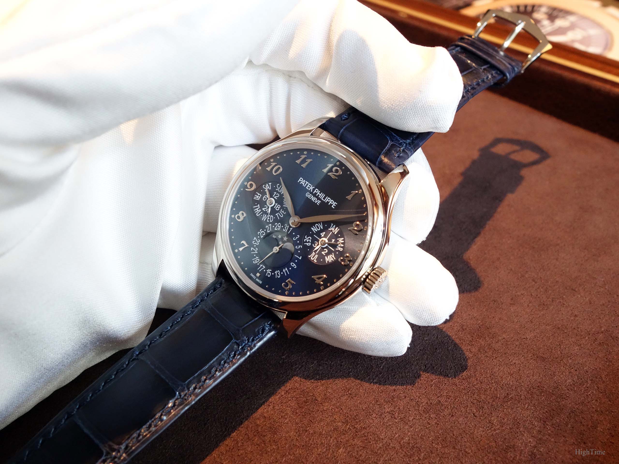
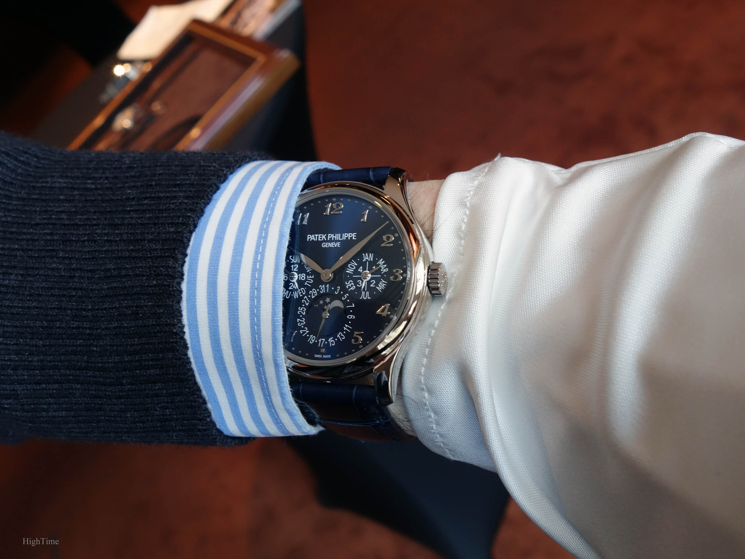
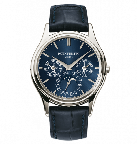
Dial of a traditional QP
To start with, the dial side has lived a smooth evolution. Its balance has been preserved compared to the 5140 reference while gaining in legibility. Indeed, because of the extended case size (from 37.2 to 39mm), the new space available at the edge of the dial has allowed inserting those beautiful Breguet numerals as well as an increased subdial diameter, especially for the date which is a piece of information we tend to look at more often. Thus, people who know the 5140, may feel at home while being more comfortable in its use.
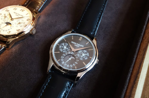
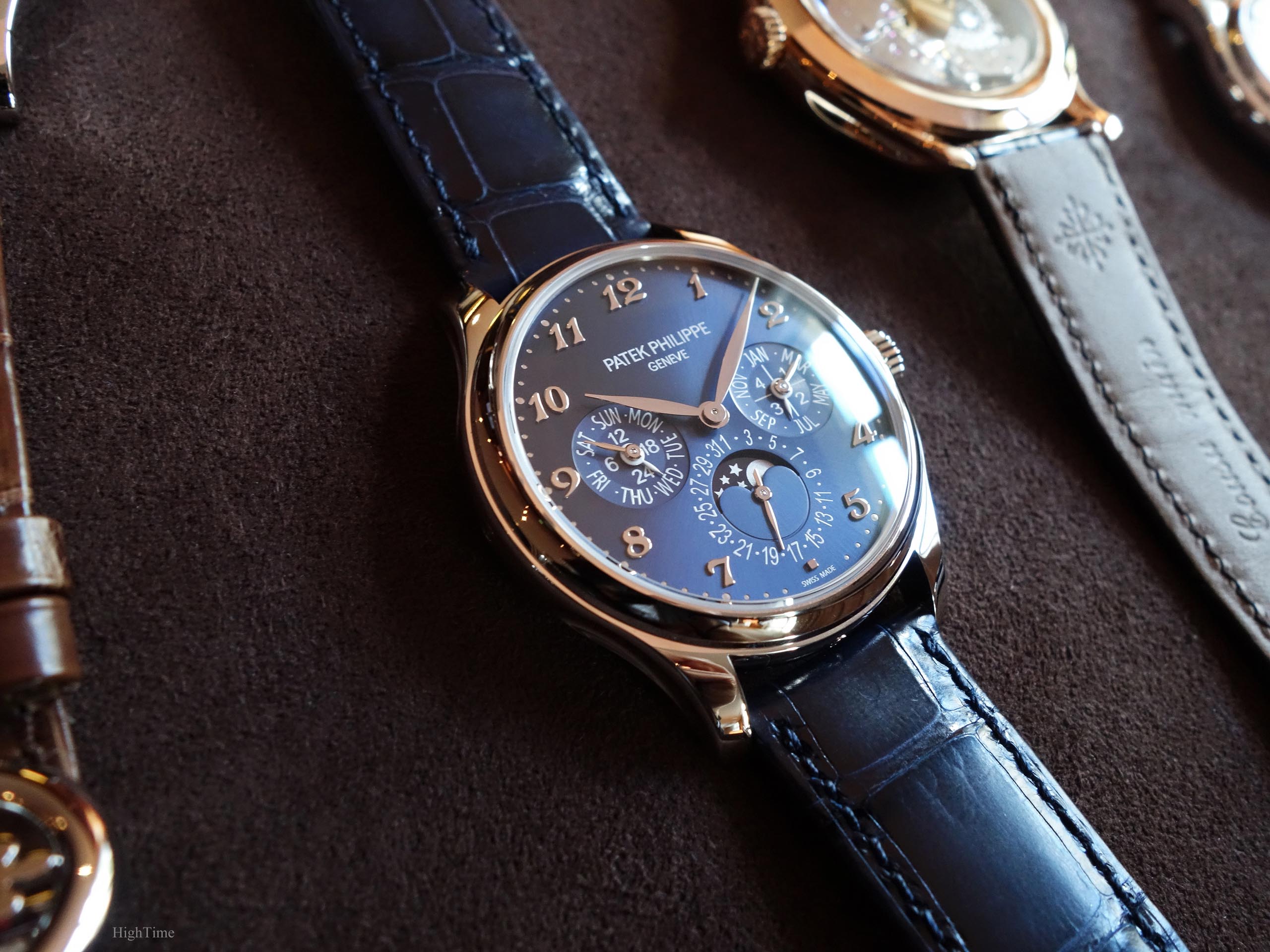
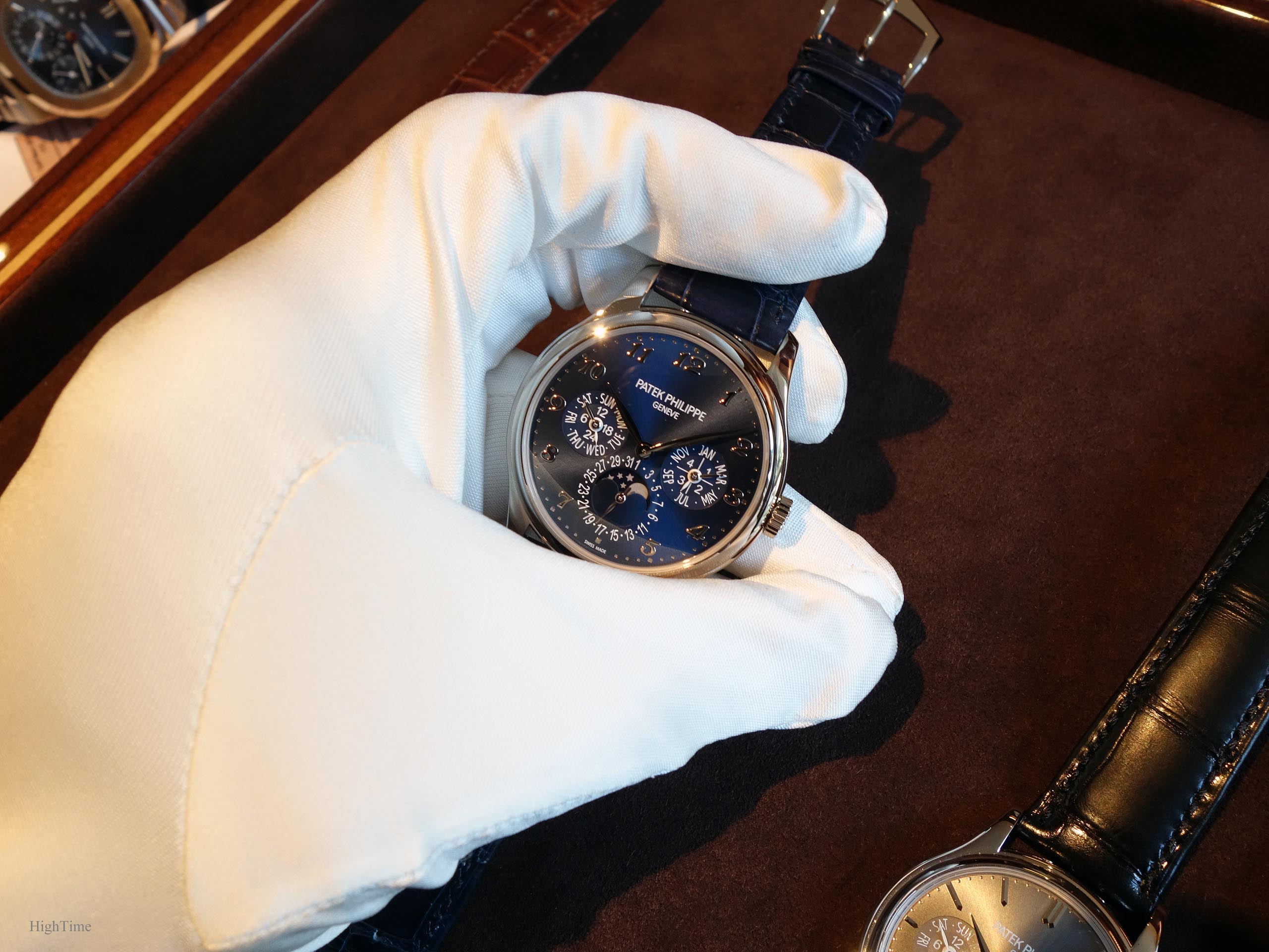
Here below, you may see the 5327G takes after the same color and spirit layout used for the 5140P (though the material has changed): a blue metallic dial with some white painted subdial hands.
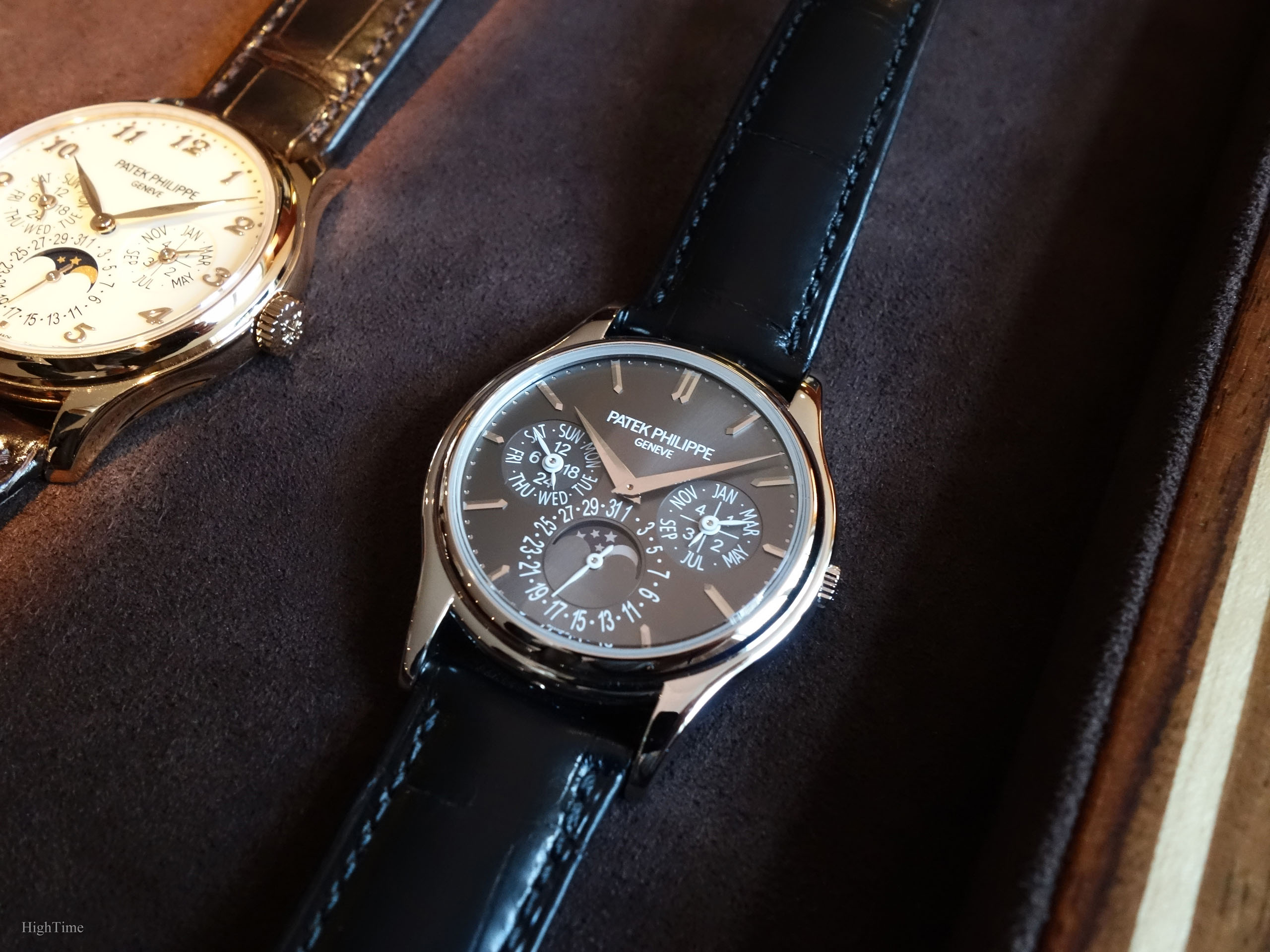
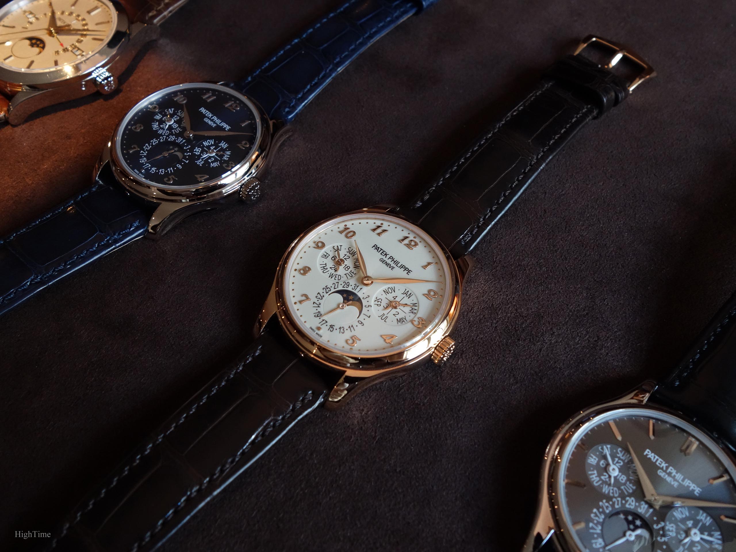
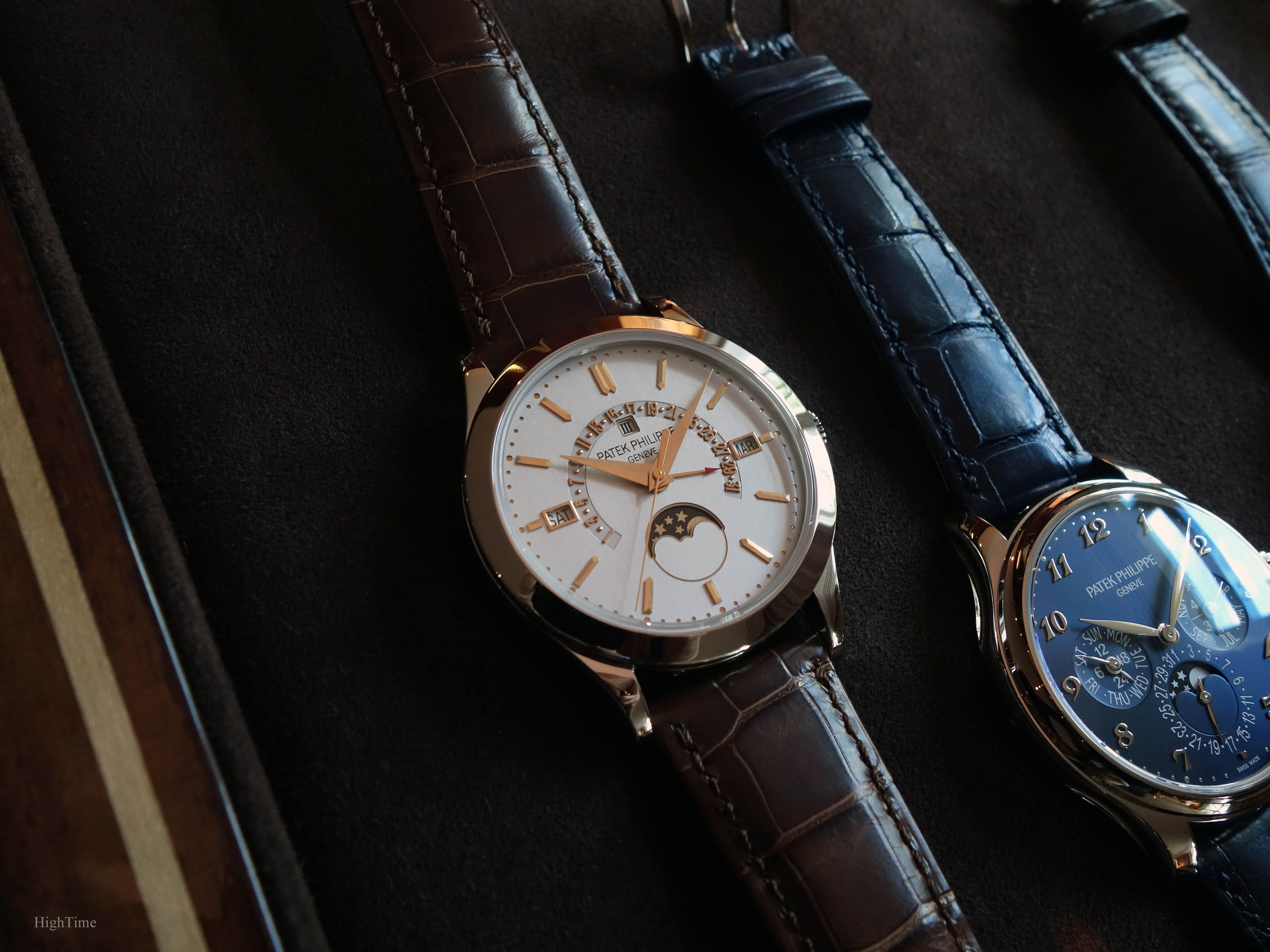
The Ivory lacquered dials used in the 5327R and J versions look warmer and a little more “vintage” than the silvery ones used in previous references. Hence, their spirit is very different from the 5327G.
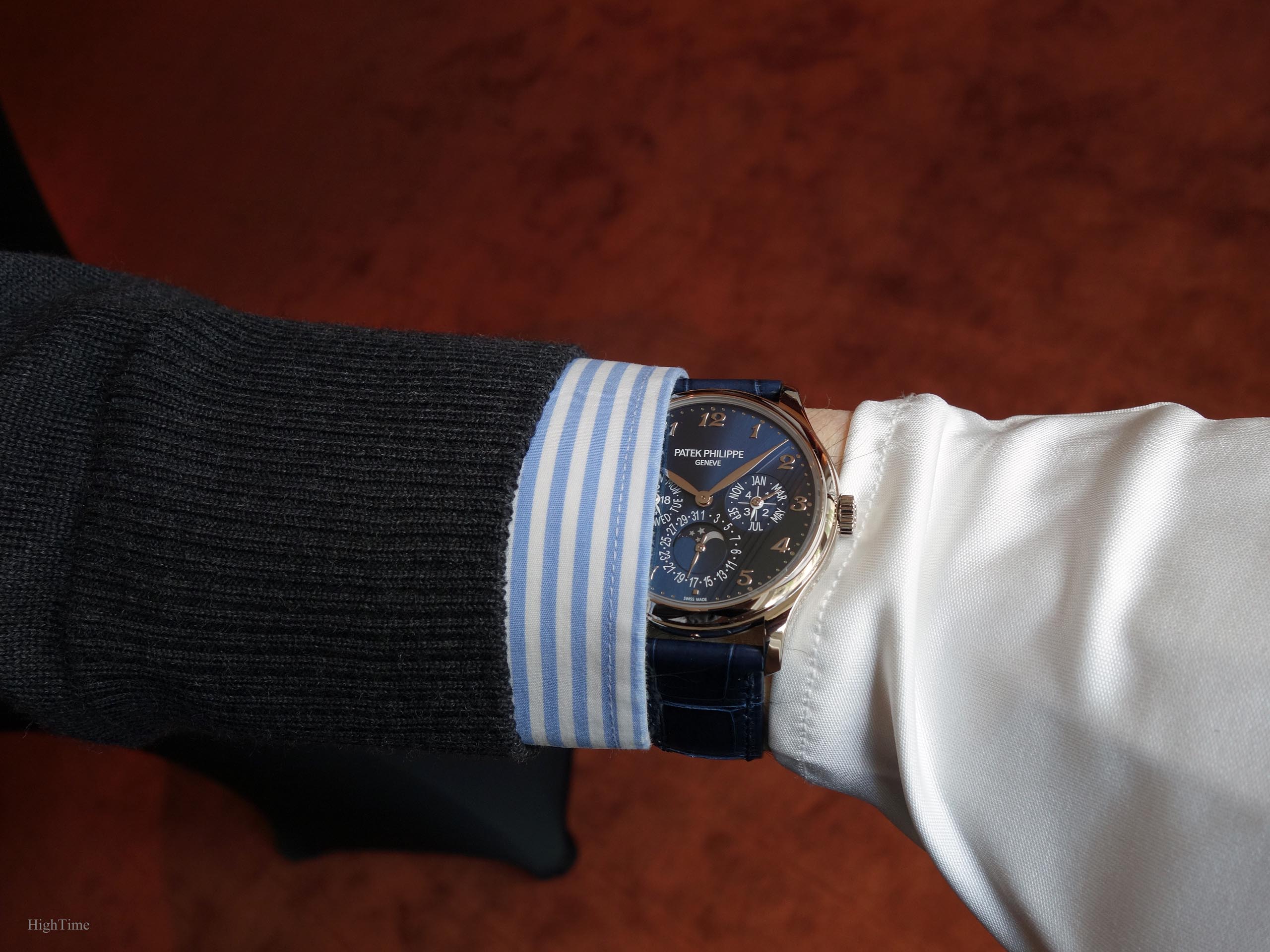
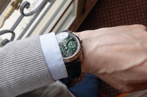
In the white gold version, Patek chose to provide a new offer with a perfectly tuned sunburst Royal blue dial. The latter brings the reference into today’s world in a wonderful way as the modern touch suits the watch perfectly. As usual with Patek’s metallic blue dials, the color changes quite significantly depending on the lighting, whether you are inside or outside. Always a nice surprise to have a look at your watch and see it looks as a different one.
A newcomer to watches could observe the way the former 5140’s dial shows sligthly smaller figures while keeping the same classical/casual spirit.
I think these evolutions bring an answer to today’s questions (yet regarding traditional designs), whether we talk about will and need of new or older clients whose tastes have evolved. On a more practical level, the dial is very legible (considering how much information a QP has to display) and the font used is modern classics, no serif or rounded shapes that look more traditional.
Besides, I always noticed how well Patek integrated these little minute nails, whether the dial is lacquered or, here, metallic. They look 3-D but sometimes they are carved “inward”. Have a look in-person if you can. A lot of ways to play with dial decorations.
Of course, another important style evolution in the dial layout is the new hour markers evolving from baton markers to Breguet numerals. It obviously transforms the watch significantly and brings a charm that is very attractive. This marker move is following another path from the lighter looking dials seen in the two previous generations, in line with a few of this period’s novelties (5370, 5170, 5396 Anniversary…).
However, recently, watches aren’t unveiled with Breguet numerals anymore (except the blue version of the 5370P in 2020) and they seem to have been chosen for a few years only, which is to say approximately from the 1st 5170G maybe until 3 years ago (?).
Finally, the white gold Leaf hands bring the final romantic touch to the dial and explore a different aspect from the hands we have seen meanwhile: stick hands (5170), Luminova hands (5370P, 5204 or 5905) or the Dauphine hands (used in the two previous generations).
Well, in the end, this is exactly it: we want to get this “I really can’t get tired of staring at my watch, whatever the number of times I look at it” effect.
This splendid case
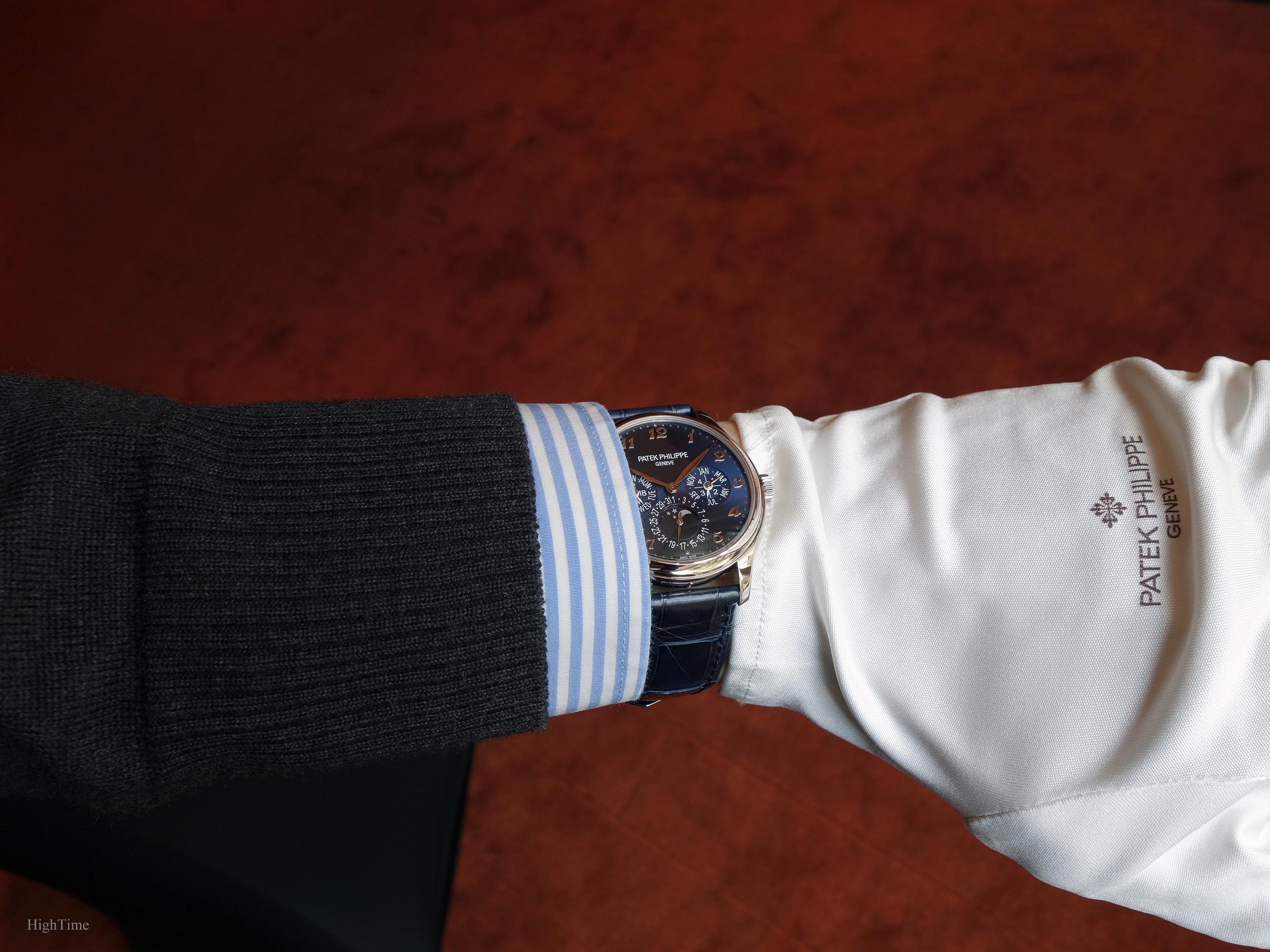
When we talk about Patek’s Perpetual Calendar-only pieces, we still have in mind its predecessors: the Patek Philippe 3940 (which had an even smaller 36mm case) and the 5140 (37.2mm case). Hence, the new 5327 with its 39mm is reaching today’s standards for a thin traditional watch, even more so as the watch is complicated, hence a dial looking more complex than on a 3-hander. In that regards, I feel it is quite a perfect size compared to 42mm cases we might see. This being said, case size depends on the wrist size, local culture, not on an absolute standard. As mentioned above, I find the case is now a perfect contemporary standard 39 x 9.7mm, especially considering it is a perpetual calendar.
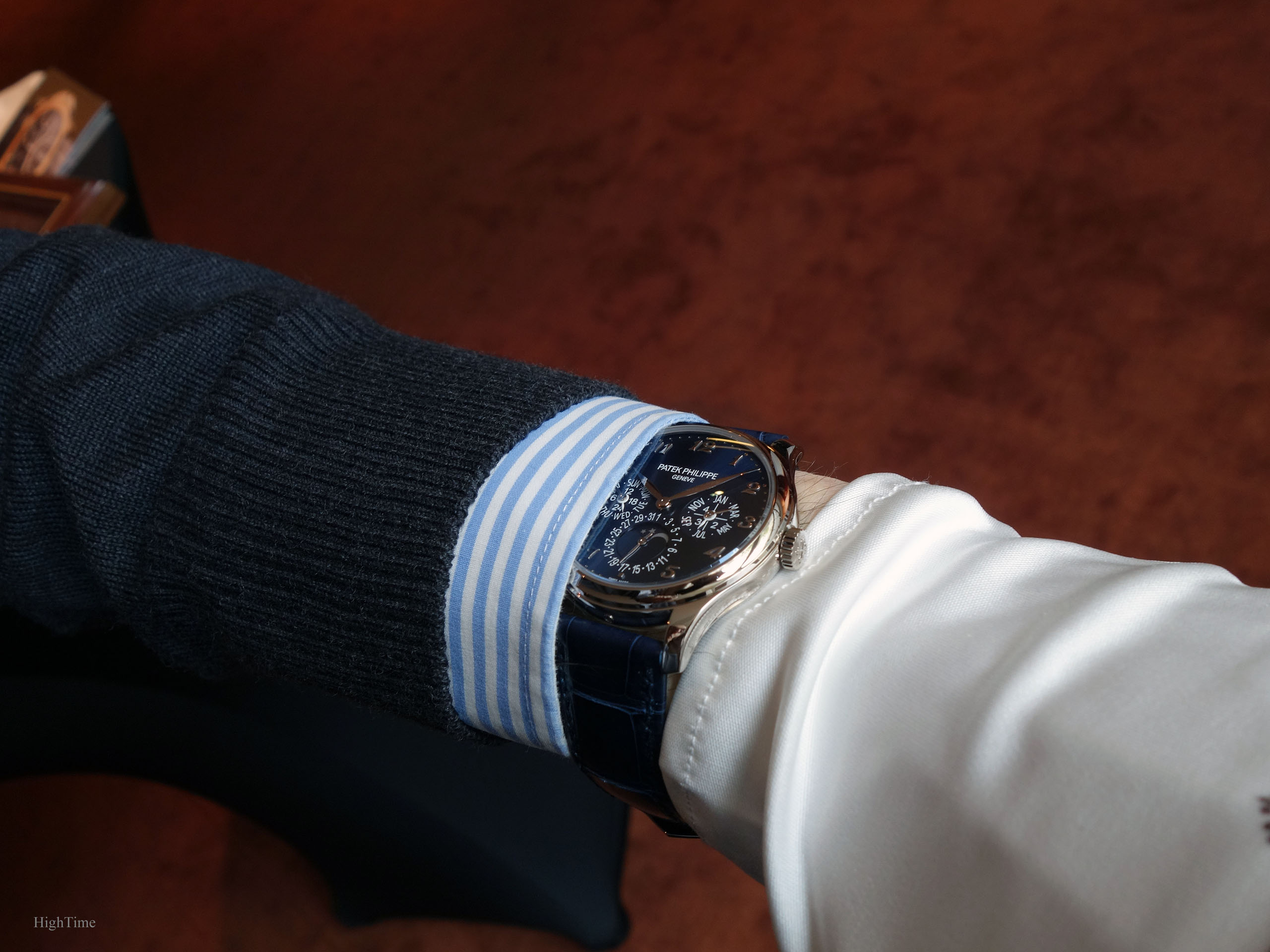
However, as you may have noticed, the most significant evolution from the 5140 stands in the case’s shape, borrowed from the gorgeous 5227 Calatrava. This outstanding design makes it amongst my top-3 favorite cases from the last two decades.
The way the side grooves are made, the lugs’ shape, their slightly inclined, curved end part… very sensual and a lot of appeal, while not being heavy or over decorated. This reminds us (if needed) of the polishing skills of Patek watchmakers making why their cases are among my favorites, especially in diversity.
It is delightfully combined with a concave bezel.
All what Patek Philippe is about for many of us.
Whereas the 5227 has the officer’s cover with the recent stunning nearly invisible hinge, the 5327 receives a classical sapphire caseback (and an additional solid one for your favorite Curling team engraving). It would have been so nice to find such a feature in the 5327 but I see two problems that Patek had to cope with. First, the case would have been at least 2mm thicker, which I think wouldn’t have been a good move when we know that traditional Patek Perpetual Calendars are known and sought after for their thinness. Secondly, the price increase as seen in the 5227 would have also been quite significant.
I was dreaming of getting that 5227 case (and that was quite natural indeed) for the new perpetual calendar reference and I must say it serves it perfectly today.
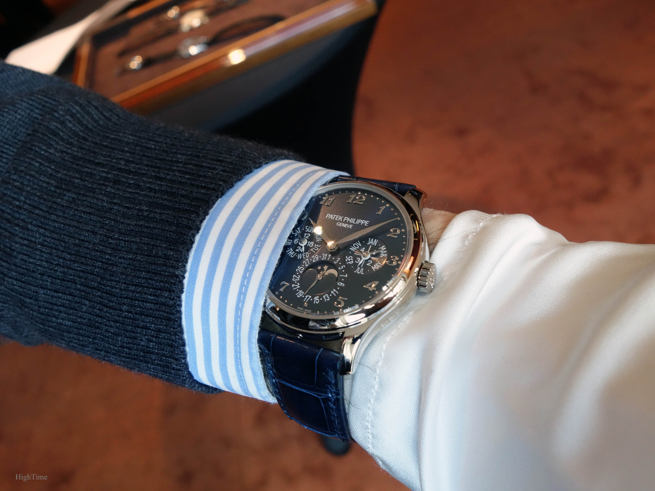
The watch receives a fold-over clasp in white gold with a shiny navy blue Alligator strap.
The thin movement dedicated to QPs
The movement is the famous and revered minirotor 240 caliber that was used in previous generations and that is still as enjoyable to look at through the sapphire caseback.
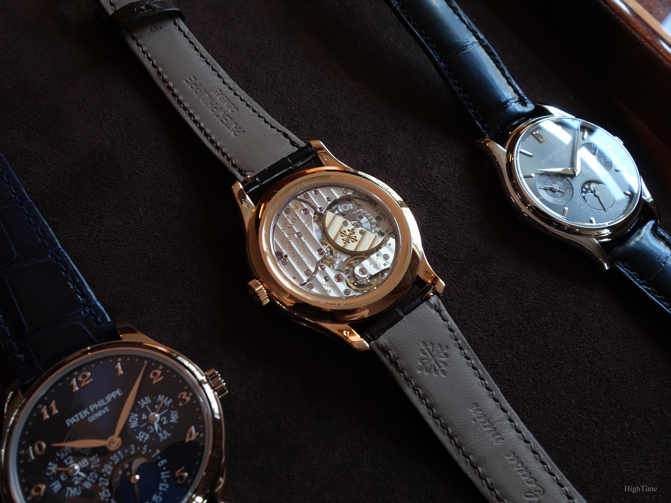
It is only 3.88mm thick for the 275 parts and has proven being incredibly accurate and reliable through the years.
The power reserve stands at min. 38 hours – max. 48 hours, which is standard and enough for an automatic-wind QP.
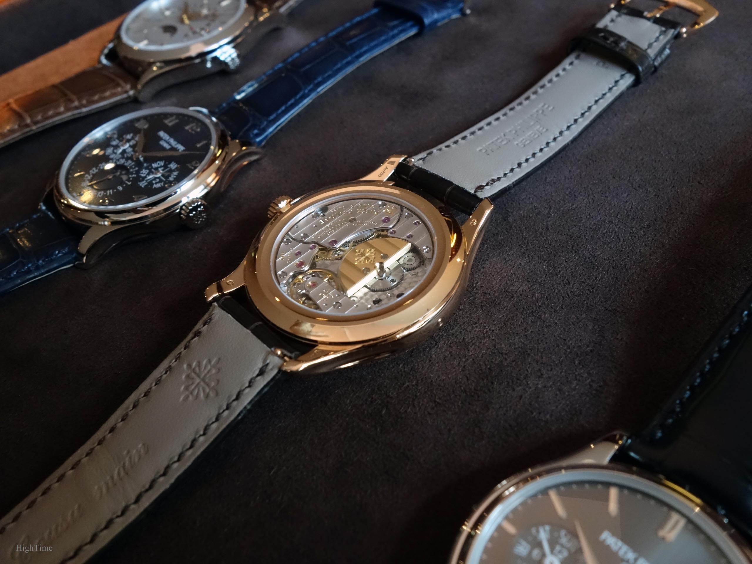
The movement receives their Spiromax balance spring made of Silinvar (Silicon-based material). It doesn’t require lubrication, experiences very limited wear and is amagnetic which is nice considering all the electronic devices we manipulate nowadays.
Conclusion and Thoughts
Patek Philippe really has a kind of “signature” about these exceptional Perpetual Calendar-only Calatravas, whether we’re talking about the 5327G presented here, the 5140, the more original 5940 which is the cushion-shaped version, the “clous de Paris” decorated 5139 and last but not least, the sought after 3940’s different series.
Yes, being an owner of a QP from this very brand isn’t something easy to afford. But these rare moments are definitely worth experiencing, that’s for sure.
As far as I’m concerned, this is my favorite and best looking perpetual calendar from the last “recent” generations, even if I love the 3940 in a different way (call it the old school charm). It brings one of the brand’s emblematic traditional complications to the present and, to me, has no equal in such dressier very complicated references.
It goes with modern, it goes with classics. Brilliantly.
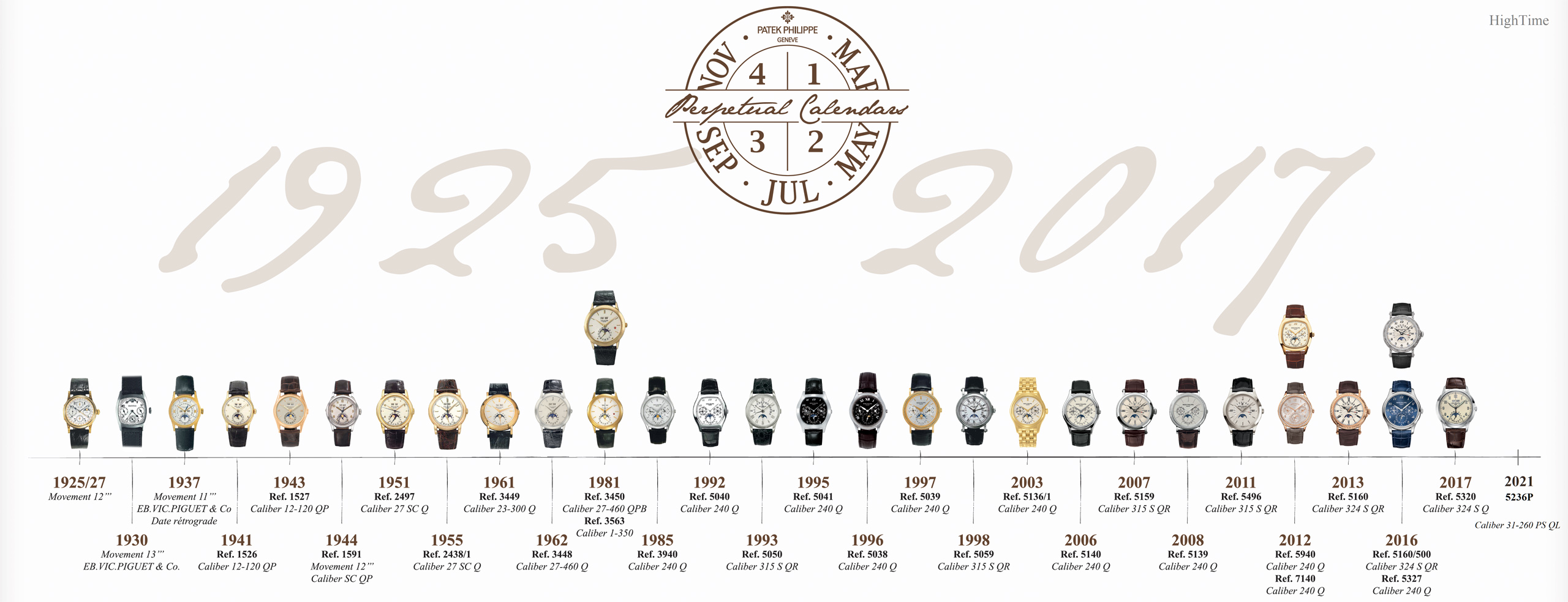
To end with, you may want to have a (long) look at the Perpetual Calendar references rich Timeline from Patek Philippe:
The 5327G’s MSRP is 87 000 € (VAT incl.) as of today (2022) and you can find more details about it here:
The Patek Philippe 5327G Perpetual Calendar on the brand’s website
Thanks for reading!


You May Also Like
Intro to the origins of Patek Philippe’s wonderful Minute-Repeater aura
The Patek Philippe 5270P Chronograph Perpetual Calendar in Green – From the king dial maker