The unusual and gorgeous Patek Philippe 5170P Chronograph
Hi everyone,
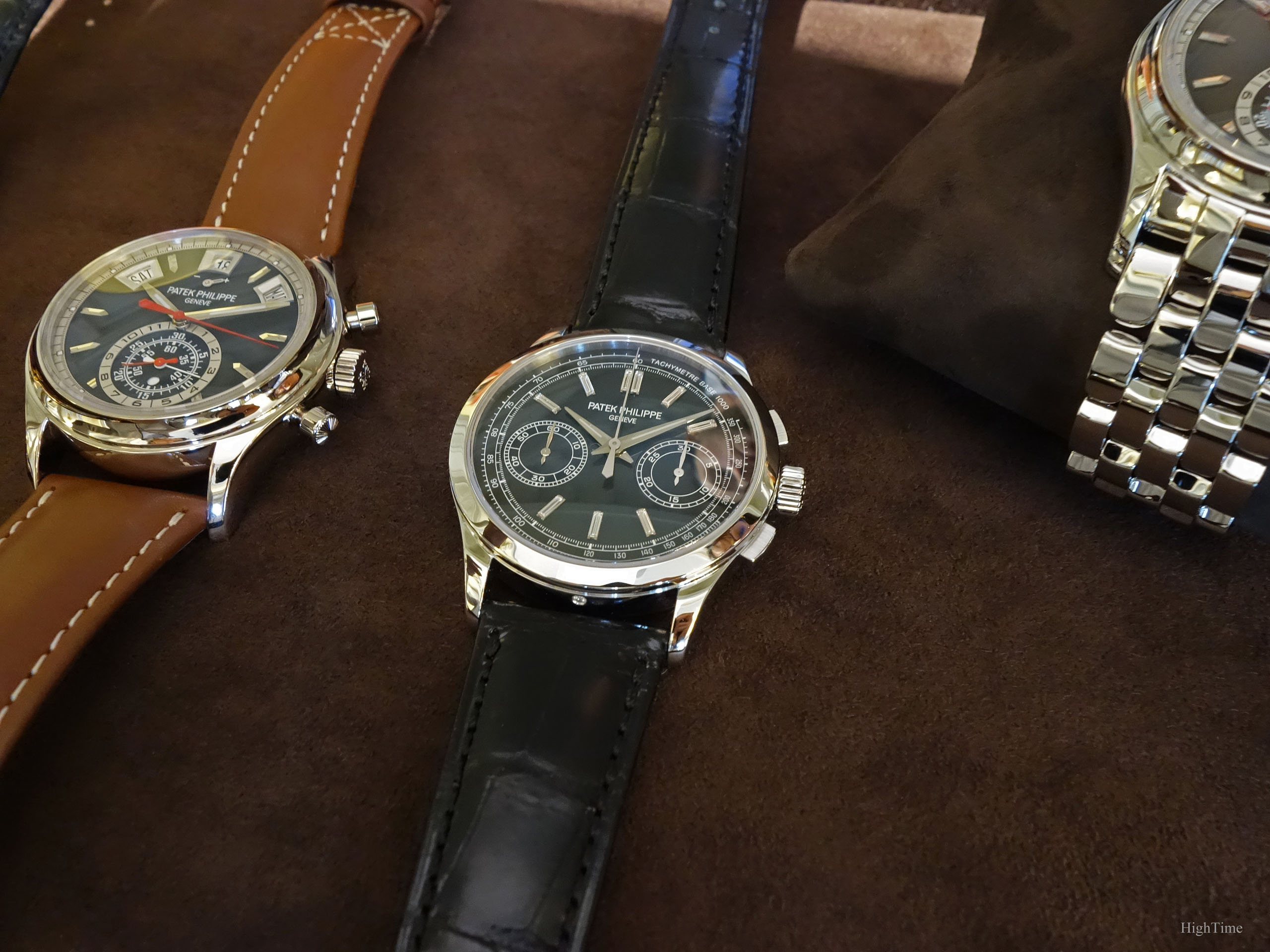
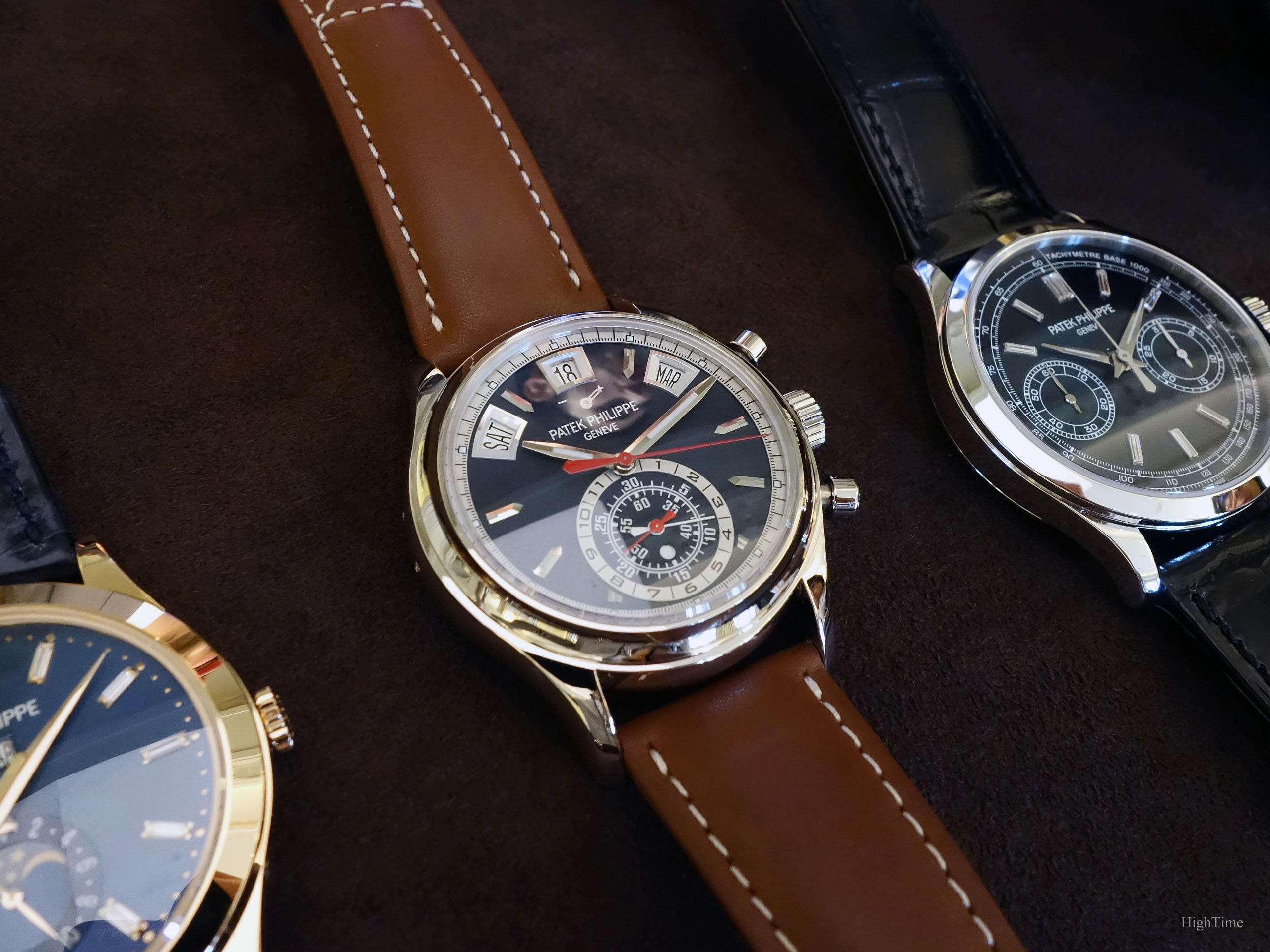
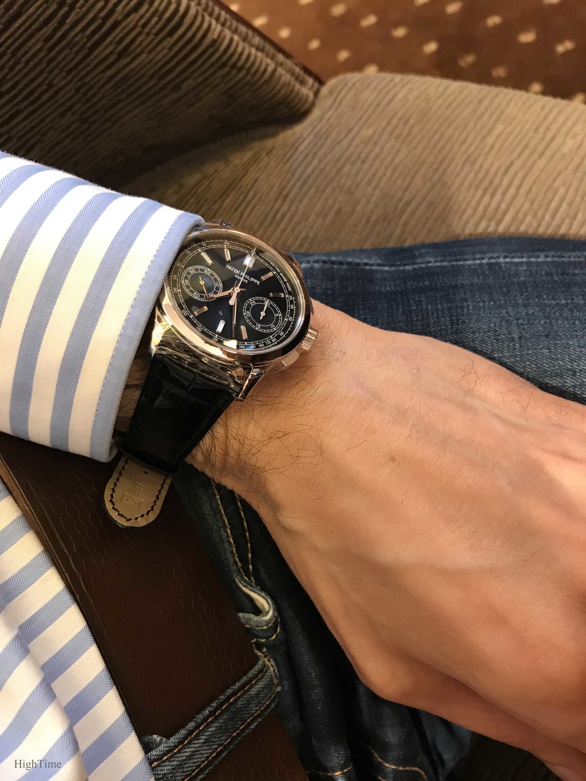
Patek Philippe and manual-wind chronographs is a deep and long story where the brand has established the reference in terms of traditional elaborate pieces, especially since the 1920’s-1930’s for wristwatches. The Patek Philippe 5170P Chronograph was launched in 2017 with a gorgeous dark blue dial. As it is the last evolution of this chronograph generation, I’ll focus on what makes it stand out from the 5170 family, or even the Patek catalogue as a whole. Hence, let’s handle this “unusual classic” model for the brand.
To start with, I think it is interesting to notice that a wide array of customers and collectors has very much appreciated its distinctive feature as time went by, i.e. its diamond-markers-decorated dial. Together with the 5396R blue dial unveiled in 2017 as well, this is a second example of such offer (no diamond-set bezel) in the recent main line-up (thus, not as a side derivative). The first ones were the Nautilus 5711P and 5976G Patek Philippe offered for the Nautilus 40th anniversary (2016).
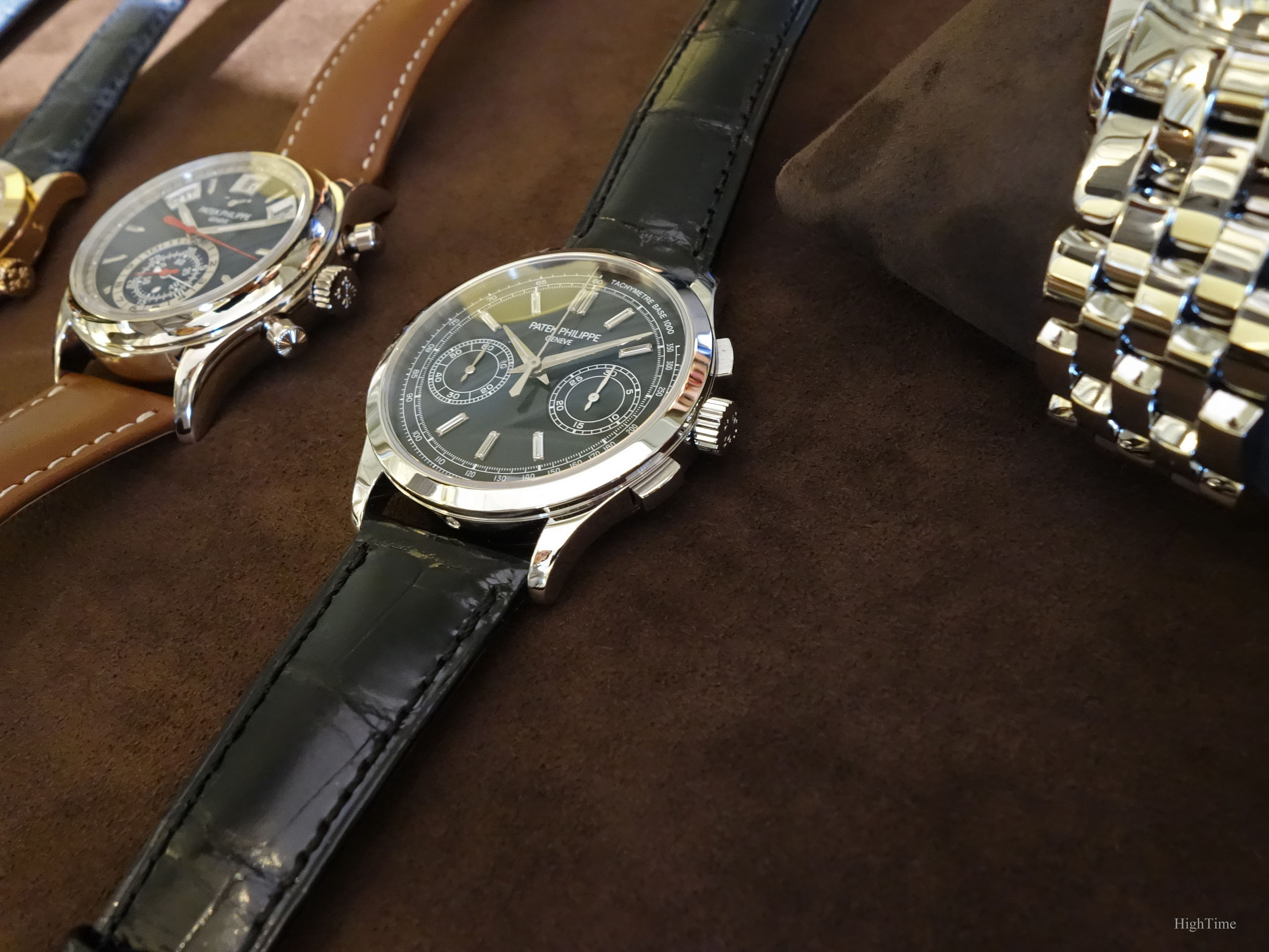
Following the latest White Gold (black dial) and Rose Gold (black and silver dials) simpler versions (both without Tachymetre, Pulsometre or Telemetre scales), the 5170 reference is back in a more technical layout with a Tachymetre ring (like the Yellow Gold “Bayer” limited edition and succeeding to the Pulsometre scale in the early J and G versions).
However, its overall dial rendering is what makes this watch so attractive, bringing a very original touch to usually very traditional watches (which is particularly true for the 5170). And with a lot of class…
Blue dial symphony
Yes, Class.
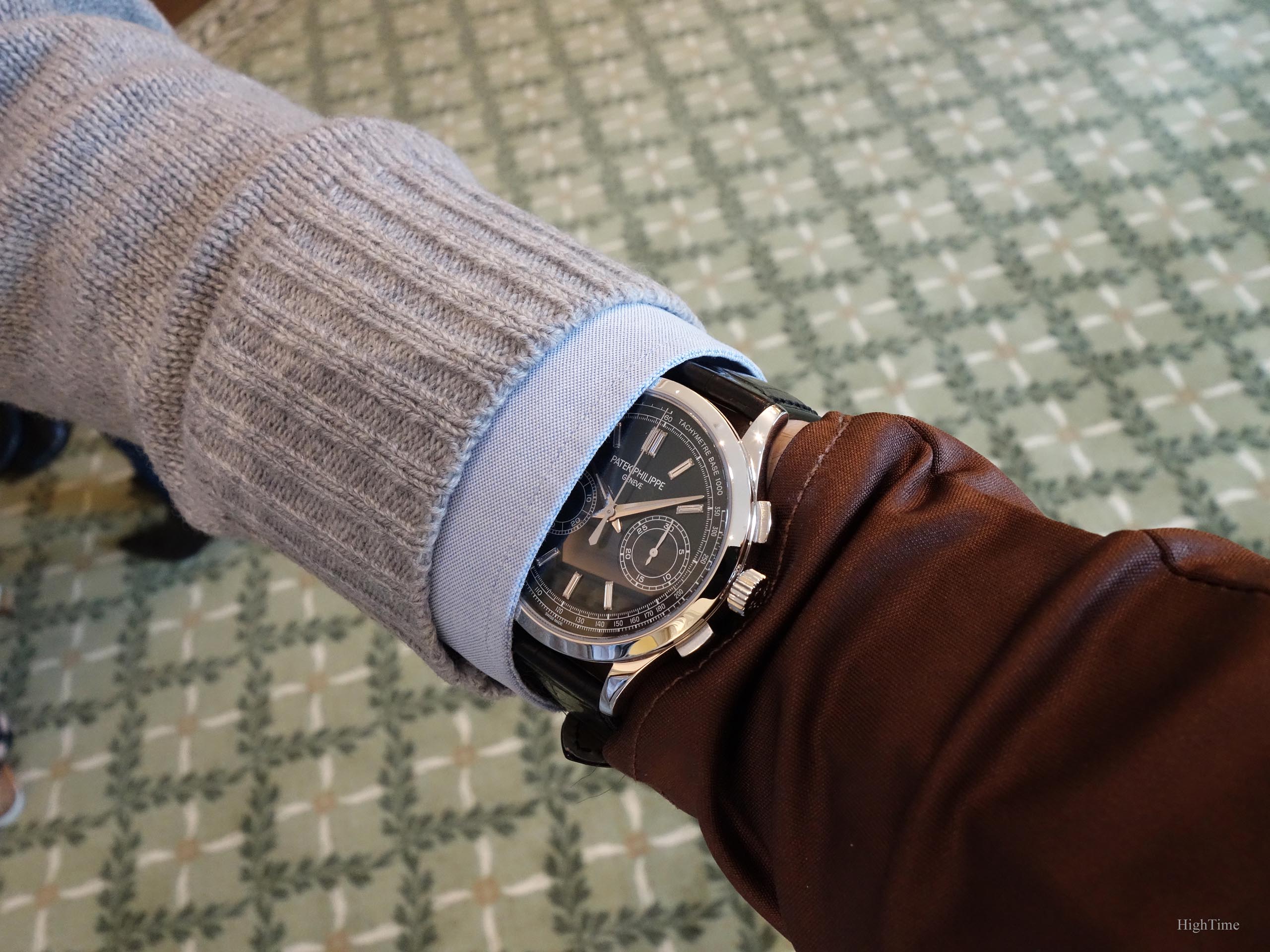
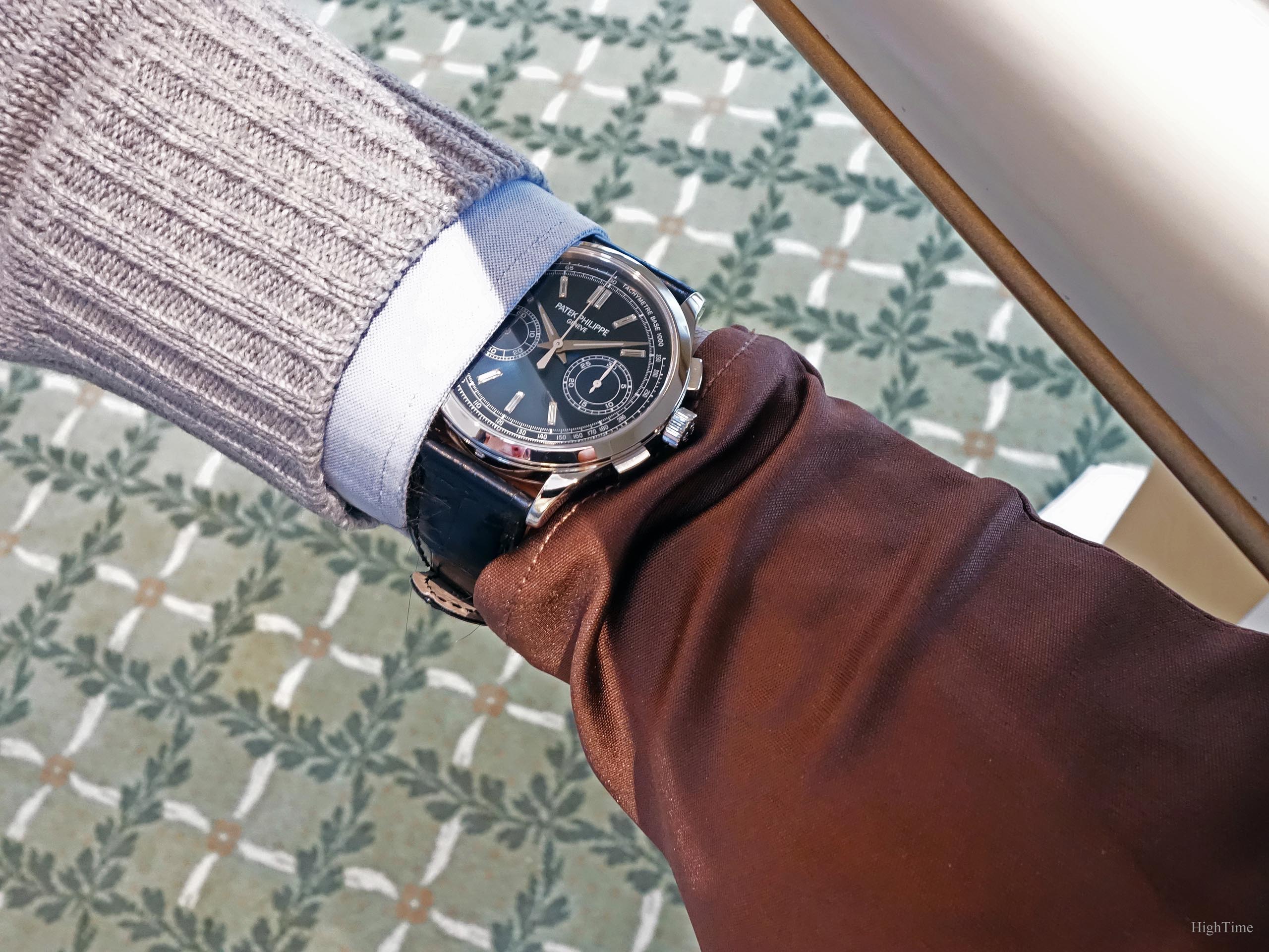
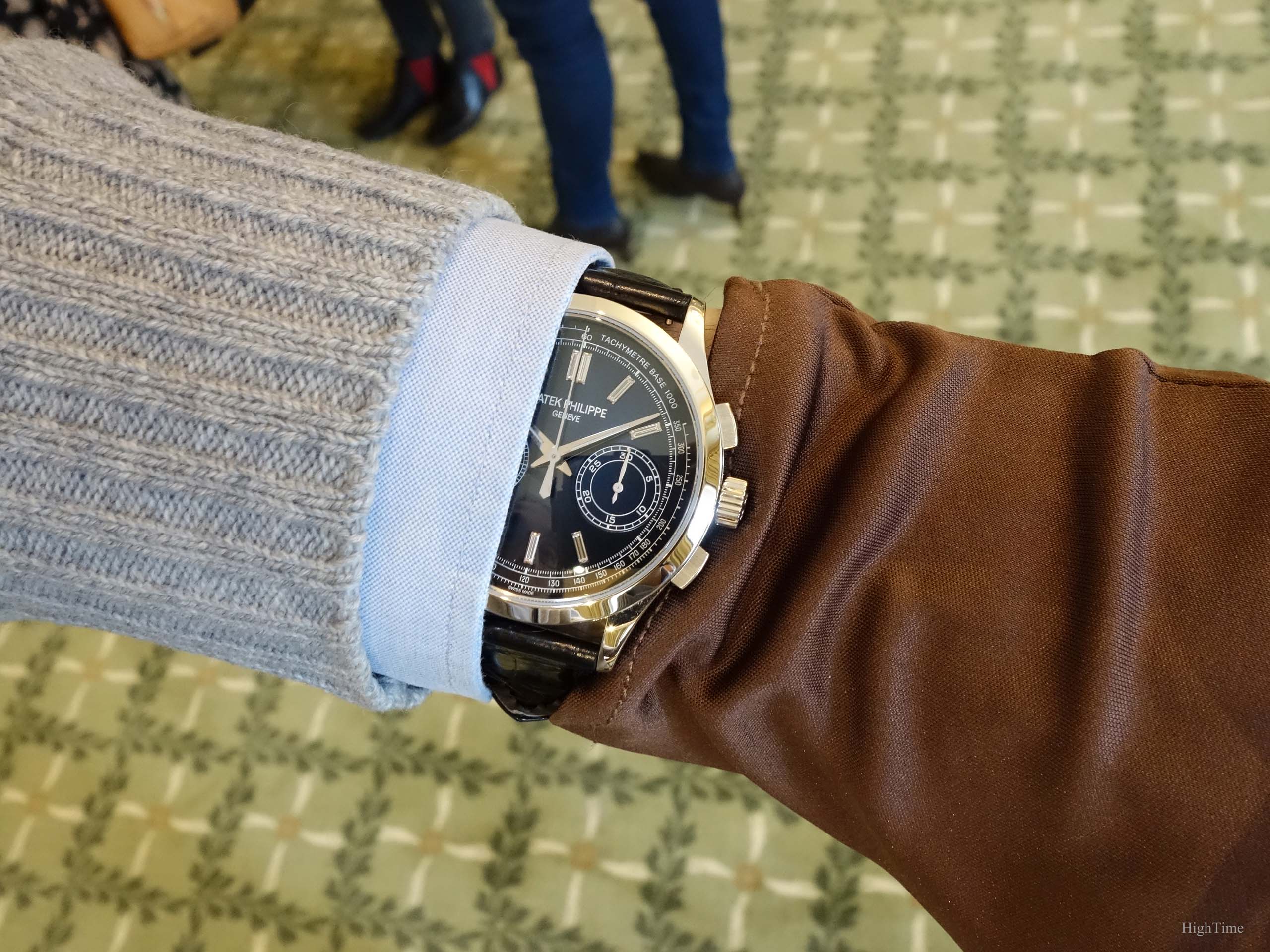
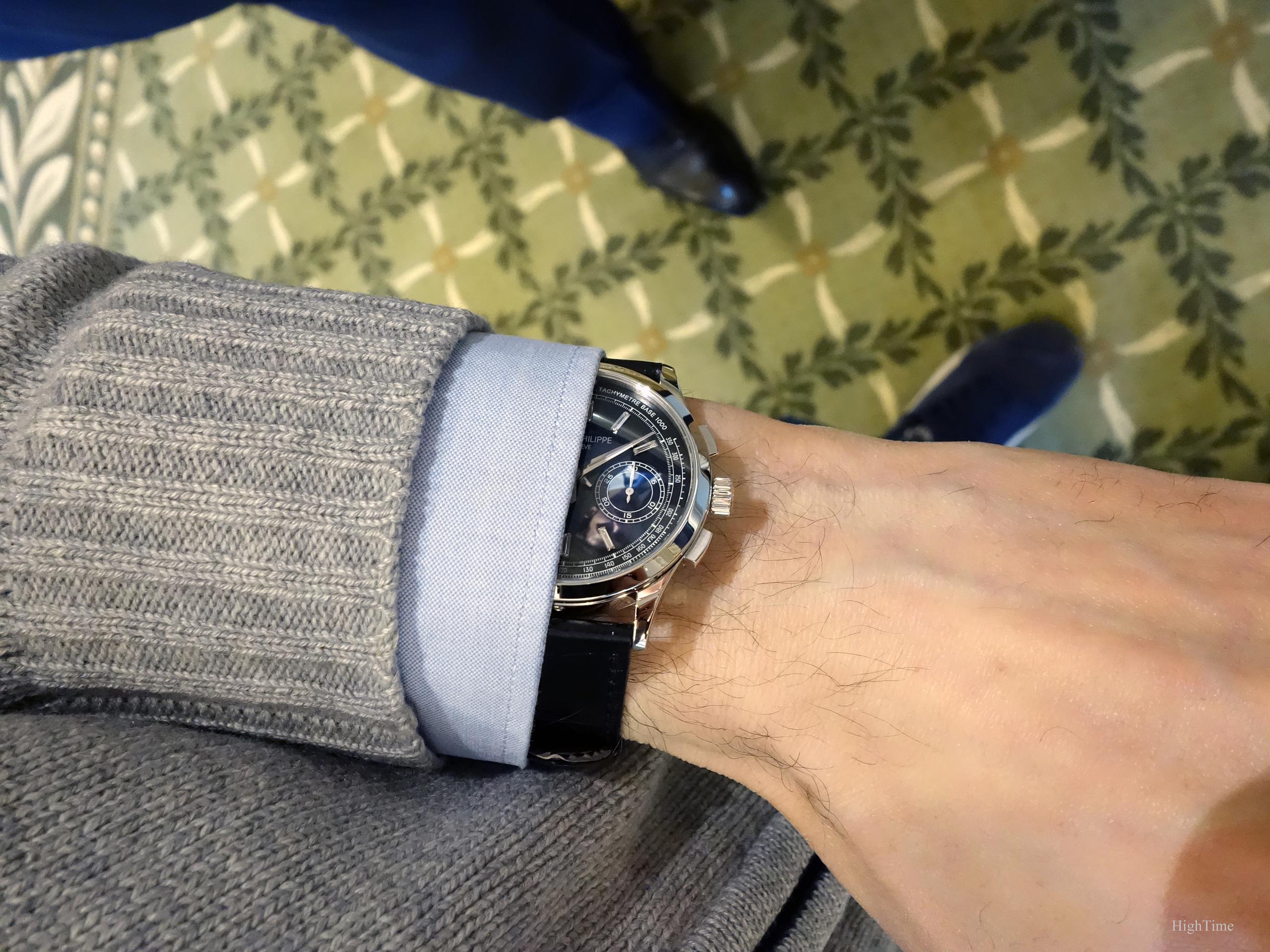
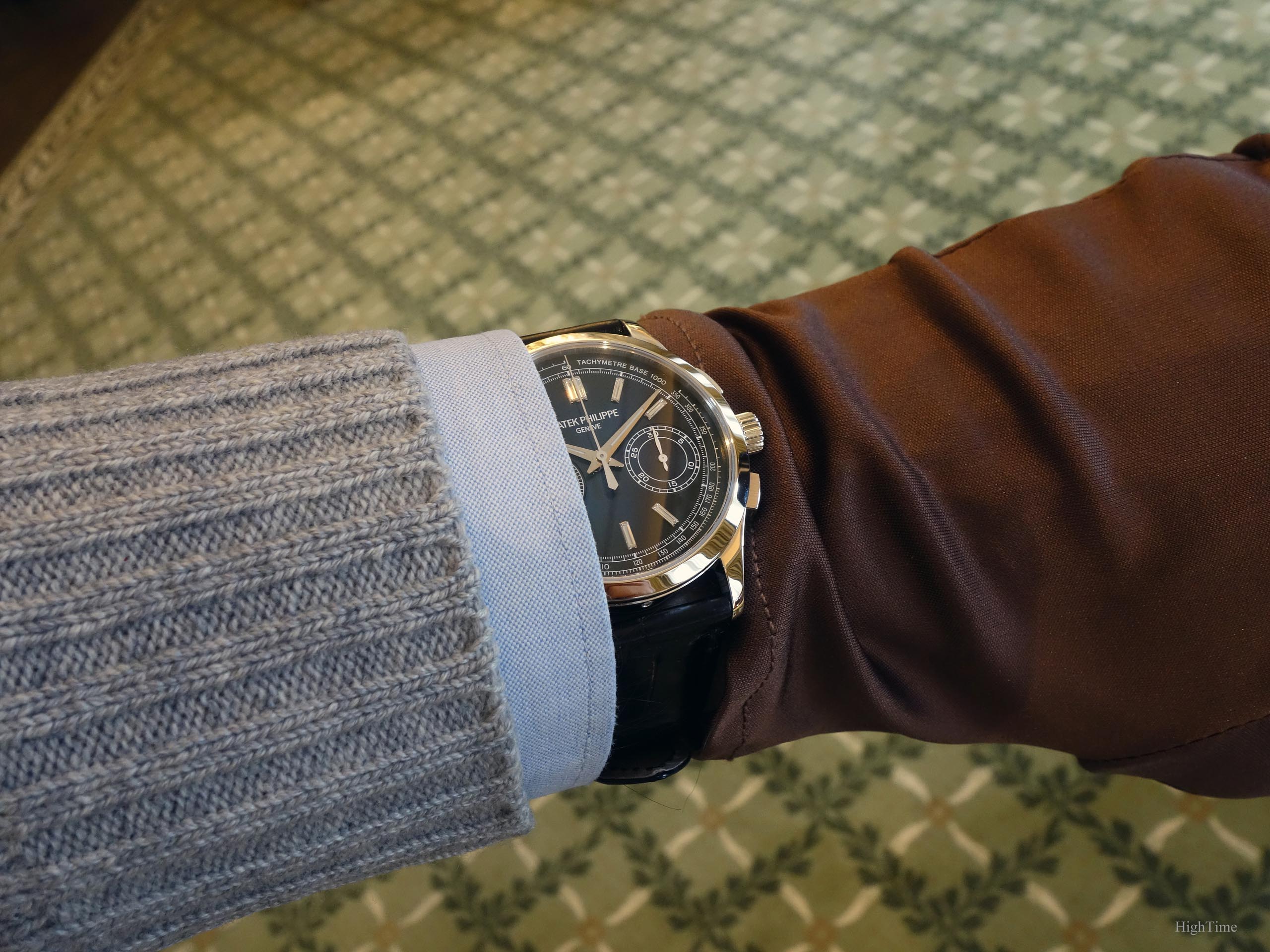
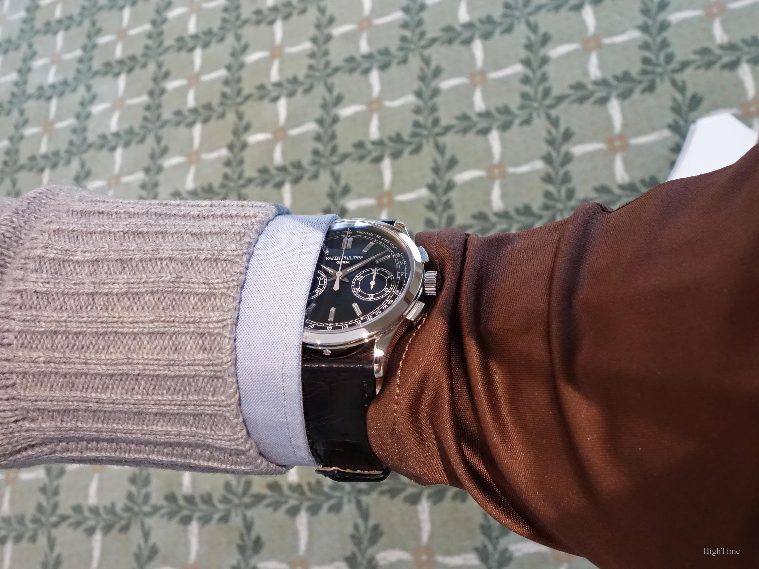
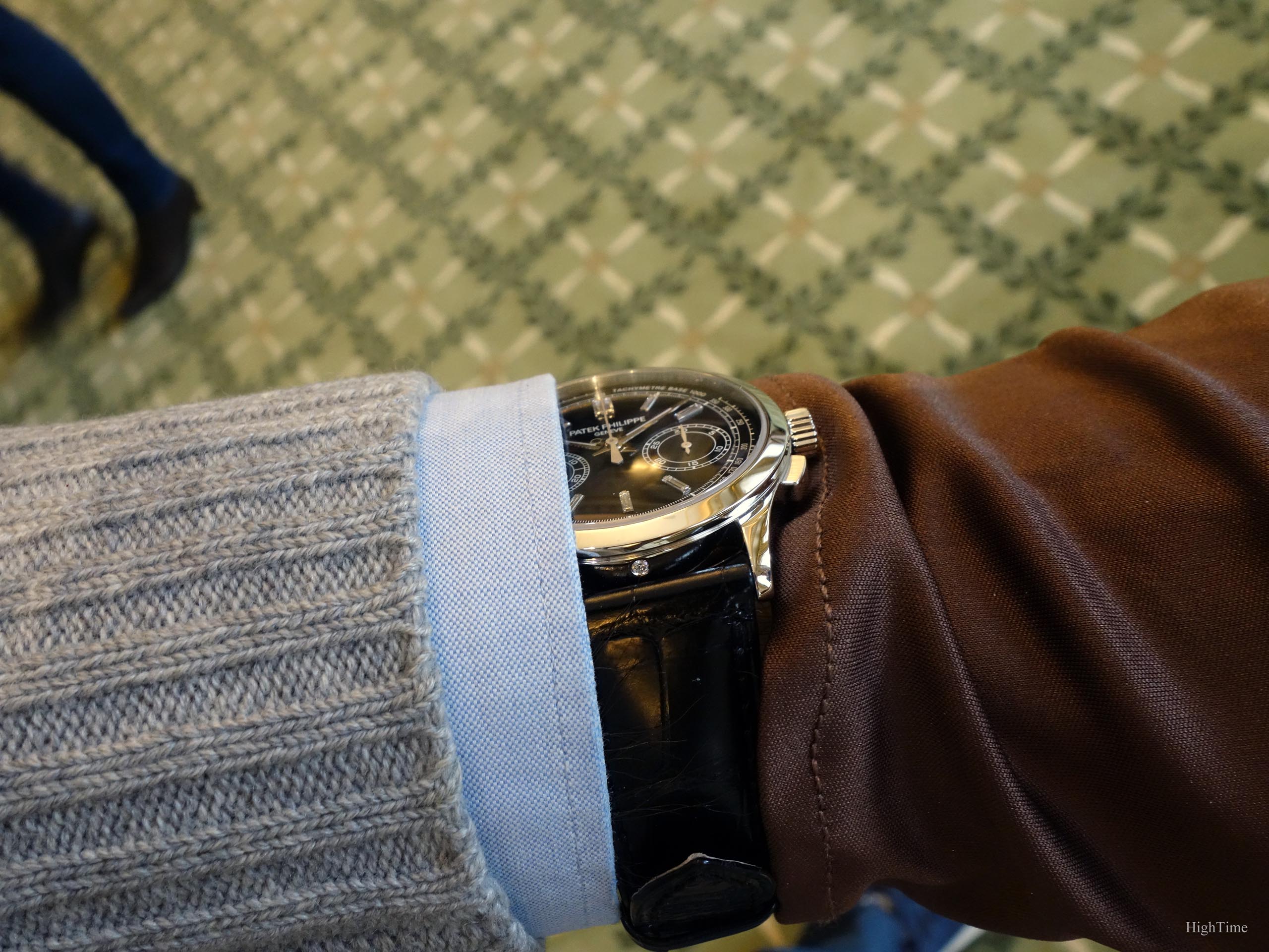
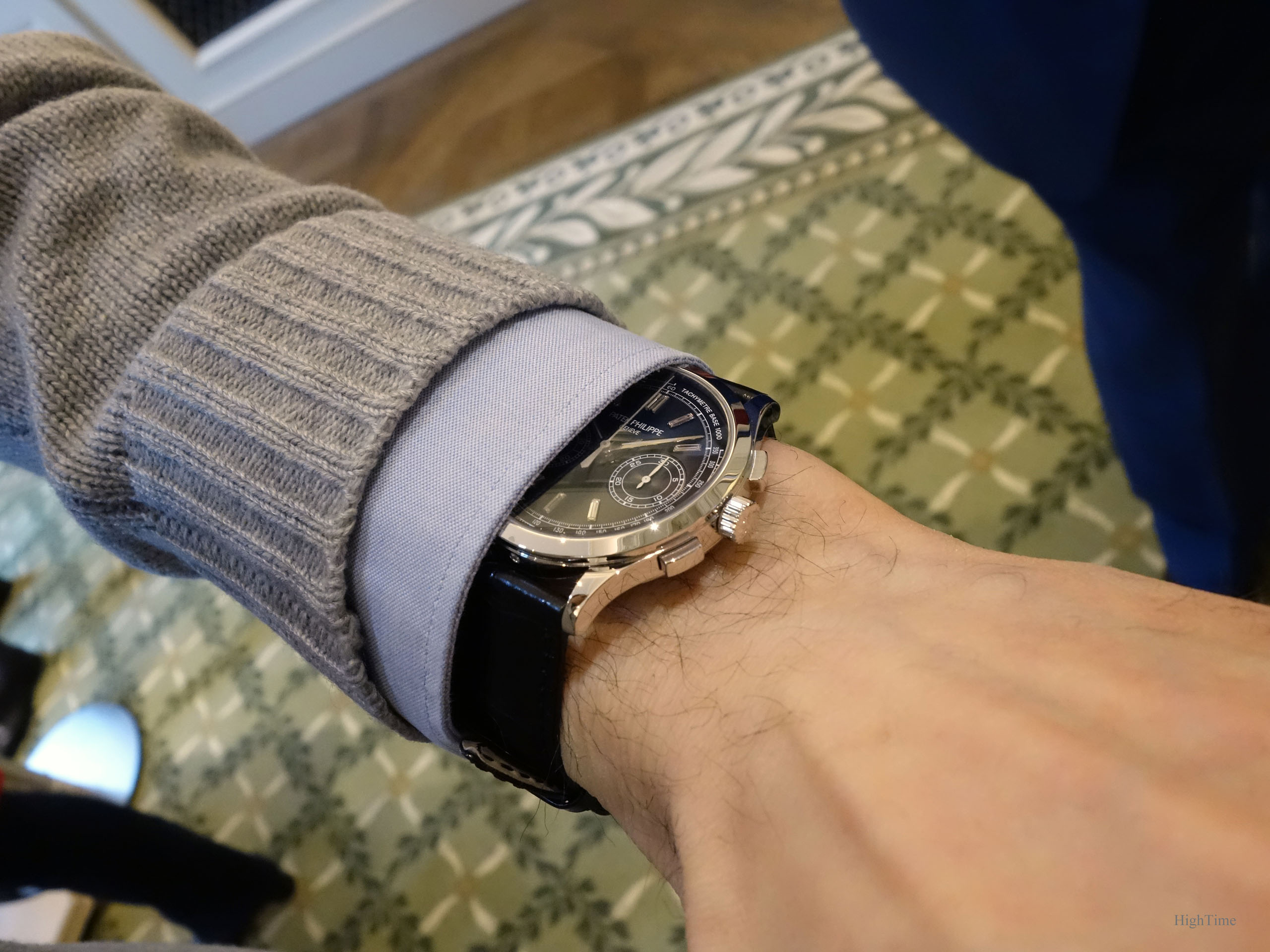
Straight to the point, the dark blue dial is absolutely mesmerizing in the metal. It goes from a lighter tone in the center, to a darker one in the outer edge, which makes it second to none in that field. It is interesting to notice it looks darker when seen from a low angle (nearly from profile view), while it lightens when seen from straight front. On the wrist, it looks so special that the wearer feels he has something almost unique, not only for a Patek but among any other brands. This is even true considering some high-end Independents which can be a reference regarding craftsmanship standards.
The dial greets us with a slight sunburst pattern. it is a little less than a 5905P’s blue dial though. As with many Patek colored dials, it is made of several layers of different colors. This is, by the way, what makes their colored dials playing so well with light and providing such appeal. We can appreciate the diversity it provides. I indeed think that keeping the same color for multiple references is a little “lazy”. The experience and legacy of the Stern family with dial craftsmanship (since “Stern Frères” origins) is here again highlighted.
Yet, it wouldn’t have been enough to reach that epicness. The white markings (scales etc…) have been designed and weighed exactly how it can relate to fine older references. It is not too thick, not too busy, just the perfect balance. The contrast adds some welcome dynamism for a slight casual feeling. Furthermore, one thing that I also noticed in the 5270 3rd generation and that I welcome as well here, is that the scales dimensions are designed to look as pretty. There is a real research to find how it can bring something more than its use. A real style and proportions research work.
The painted chronograph minute and second hands in a satin (sandblasted maybe) light grey bring a little casual touch for it doesn’t look too classical. It doesn’t strike too much either, which makes difficult to guess if it is grey or white. It feels like every aspect is elegantly put at the right place, making this 5170P a fine and traditional watch for today. That’s how I think a brand can create, for the future, the right image and history.
Last but not least, the choice of diamond-set markers that I come to think is a masterstroke. The feedback I observe here and there shows a stronger and stronger appreciation for this “comeback”. Probably because it is shown in a more contemporary context. Some cultures are more open to this subjective decoration matter. It is a subject that makes a clearer separation between people compared to other aesthetical elements like colors, sizes, etc…. Generally speaking, the cultural backgrounds create a very specific context for each country and leads to what our opinion is today. Hence, sometimes disparate opinions. I still remember people lukewarm first reactions during the 40th anniversary Nautilus announcements. I felt that, though a big surprise, the whole picture was coherent. I felt there was a lot to love if I could just get rid of my old perception of diamonds after a while. From then on, it grew more and more in people’s heart (and mine). However, this is the kind of choice that can’t gather everyone because of a daring move. And that’s certainly why it was so cool a choice. Indeed, strong aesthetical choices provide stronger emotions, at the cost of an increased polarisation.
By the way, White Gold markers (usually polished) shine much more than the transparent “baguettes” ones, making the latter more discreet in that way. Round diamonds (used in the 80’s-90’s) are clearly not comparable to Baguettes ones in terms of shine either. As well, I think the 12 o’clock 5271P’s double-Baguette index was also a very nice detail with its black dial (taking aside its specific bezel).
On this model (and the Nautilus), it is made with a lot of taste as they remain very discreet (can be worn outside easily – this was something I wanted to check). They bring this touch of uniqueness and fun that makes it more interesting “with” than “without”. While only you know they are here. It isn’t “I can do with them” but clearly “it looks better with them”. I’m fond of them and it will bring a significant change in our taste in the next few years I’m sure. It is simply a very beautiful watch.
The show-off from the 1980’s is something that was clearly outdated since quite a long time now. Nevertheless, people born in 1990, thus further from this period, are at an age of being serious new buyers, with very “refreshed” tastes and standards. Hence, the renewed attractiveness of such decoration. This is something that can be noticed in clothing or decoration as well.
As in many aesthetical and fashion fields, a capability of a product to remain timeless is in the support it gets from the brands. They can outdate something very quickly today to make people buy the following collection. If a product is updated continuously, it will age well. The RO, the Nautilus (or the 911) are excellent examples. If they had been discontinued in the 1980’s it would certainly not have the same modern image and timelessness they have today.
This is all what makes the introduction of this decorative feature a courageous move and I personally think at the right moment. It gives a distinctive personality to a watch, can be worn in a very specific way (even as an everyday wearer) and hasn’t been restored in the regular collections since a long time. Hence, I think now it is high time, considering the evolution of design today.
Finally, one thing I feel is that it brings something original, with a young and dynamic touch and a little something that makes the watch more exciting. As long as we can accept it and like to wear it that way. We can of course keep it for dressy events only, with a stunning look, however this is maybe not the way I would like to wear it if I had one.
The case and movement
This case (39.4 x 10.9mm) is one of those that are here to support other parts’ work but not made to be the main attraction. As it happens for some bezels or dials, there are parts that are chosen to remain discreet. They whisper that touch of elegance that you hardly notice but which gives that peaceful charm we like in a slimmer or dressier watch. It isn’t what I personally would enjoy very much with “clean” dial designs (as with some elements of other 5170 models, making them sometimes a bit cold). It’s the opposite as it matches perfectly with more a contrasted dial, combining to make this 5170P so appealing.
This allows bringing a touch of audacity that can combine very nicely. A very clever and daring move from Patek that I think we’ll fully recognize in the future.
On the movement side, we are still able to admire the manual-wind 29-535 caliber’s work and finishing. The chronographs really stand high when it comes to demonstrate watchmaking mastery. Such caliber is the final element that makes this very watch (not only as a 5170 reference) so perfect.
Conclusion and Thoughts
As you imagine from above, this Patek Philippe 5170P Chronograph would definitely be my exciting everyday wear. The one that I’d be the only one to know it has diamonds, elements that look like water drops (thus the reason I think they match so well with the Nautilus). Others would of course love to limit that exciting experience to a moment but I think that, as far as I’m concerned, it wouldn’t be enough.
Standards evolve and the image the diamond-set markers had a few years back will be different in several years. It will depend on how they are used and worn in the future. In a context where we combine many opposite elements (clothing, with jeans or more classical attire, to material, architecture, interior decoration etc…), diamond-setting is becoming something totally different from the 1980’s image some of us still have in mind today. I’m curious to remain open to that for I don’t miss something. Doing “standard” is easy but will have less chance to bring interest. On the opposite, taking risks can be very rewarding.
This use is maybe a part of what is really new in that model and that is also maybe what makes this Patek so special as the 5170’s apotheosis. In fact, to me, maybe the most beautiful from the last decade. We’ll see!
The watch was discontinued after 2 years in 2019 and was sold at a MSRP of 87 450 € (VAT included).
Thanks for reading!
PS: a last shot during another try to show its color and beauty…
And you’ll find here below the main improvements brought within the 29-535 chronograph caliber.
The 6 patents behind the CH 29-535 PS movement (from Patek Philippe’s website):
IMPROVED SYNCHRONIZATION BETWEEN THE CLUTCH LEVER AND THE BLOCKING-LEVER
Ordinarily, the clutch lever and the blocking-lever are synchronized by the column wheel. The engineers of the CH 29-535 PS eliminated this intermediate step by fitting the clutch lever with a finger piece that directly synchronizes both the clutch lever and the blocking-lever. This solution simplifies and improves the precision adjustment of the control sequences because the watchmaker only has to adjust one point instead of two as was the case in the past. Moreover, this approach suppresses the jump of the chronograph hand when time measurements are started and stopped.
IMPROVED PENETRATION ADJUSTMENT BETWEEN THE CLUTCH AND THE CHRONOGRAPH WHEEL
The adjustment between the teeth of the clutch wheel and the teeth of the chronograph wheel is performed by a large eccentric column wheel cap, working directly with the tip of the clutch lever instead of the conventional eccentric placed next to the clutch wheel. This new system enables a more precise adjustment of the penetration between the clutch and the chronograph wheel.
SELF-SETTING RETURN TO ZERO HAMMERS
The reset hammers of the chronograph counter are equipped with a self-setting system that makes it unnecessary to mechanically adjust the minute hammer function and thus increases the reliability of the mechanism.
OPTIMIZED TOOTH PROFILE
The wheels of the chronograph mechanism feature an exclusive patented tooth profile (presented for the first time in 2005 when the ultra-thin caliber CHR 27-525 PS split-seconds chronograph was launched). It eliminates the risk of hand jump in both directions when starting a measurement; limits the quivering motion of the chronograph hand ; increases energy transmission efficiency, and reduces friction as well as wear in the movement.
PIERCED-OUT MINUTECOUNTER CAM
A new minute-counter cam was created with a slot to prevent abrupt blocking in response to the reset command and therefore eliminates hand quivering.


You May Also Like
The Patek Philippe 5172G Salmon dial – Expression of tradition or…
The Patek Philippe 5235R Annual Calendar – The Regulate