The “contemporary” Patek Philippe 5140P Perpetual Calendar with grey dial
Hello everyone,
The Patek Philippe 5140P-017 Perpetual Calendar with Grey dial was the last version, unveiled in 2016, of the former Perpetual Calendar-only generation. The first 5140 reference was launched in 2006 and, aesthetically speaking, was known as a very classical design. Though the “contemporary” qualification sounds like a contradiction with the 5140 collection, it is I think perfectly relevant in this very case.
Even if its launch was quite discreet on the internet, I think that this last version deserves a very close attention as it stands out from its 5140 predecessors and maybe announced some of the brand’s styling evolution that came afterwards.
This ultimate version was the only remaining 5140 in the catalogue until it was discontinued in 2018.
The background
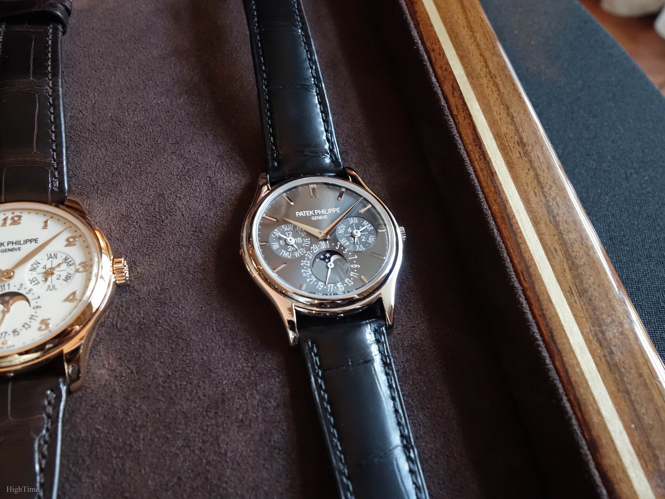
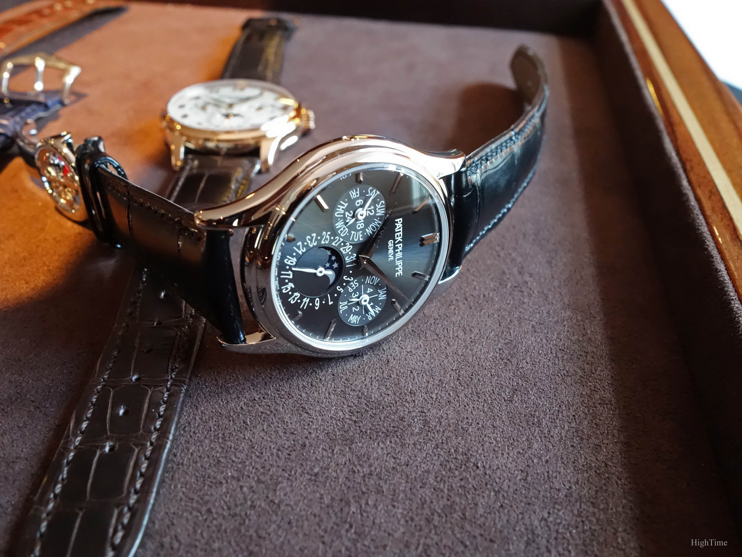
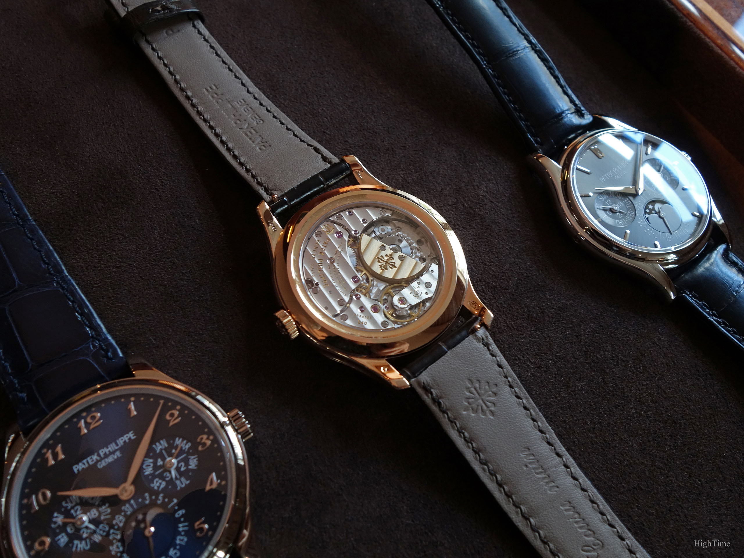
Firstly, here below is this Patek Philippe 5140P grey dial (called “charcoal grey”) next to its successor, the 5327, that was surprisingly launched at the same moment (in rose gold, with its Breguet numerals and its wonderful 5227-inspired case).
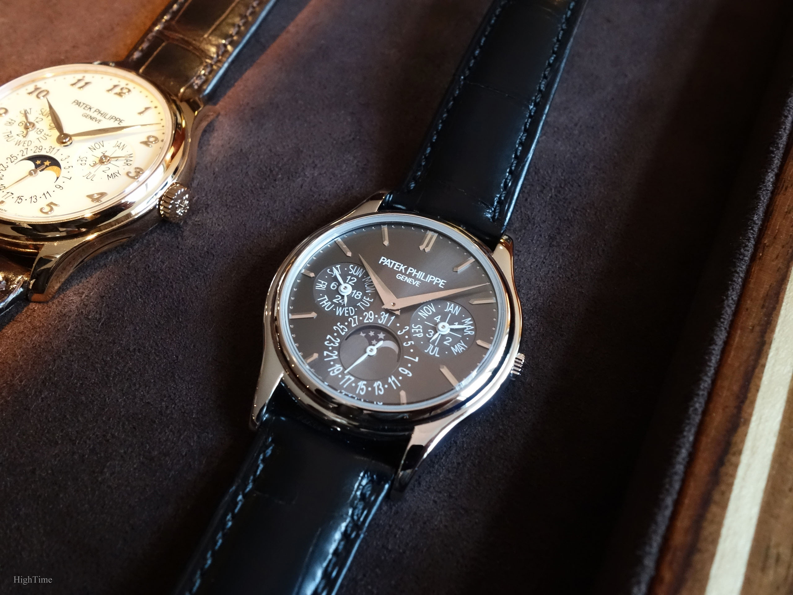
When we talk about Patek’s Perpetual Calendar models, we still have in mind its famous predecessor, the Patek Philippe 3940 (through different series). In spite of some small changes on the dial side (thinner and smaller markings, different fonts…), it had a smaller 36mm case (-1.2mm) yet with a similar aesthetical approach (especially on the whole case side). Some may however qualify those latter differences as significant.
I think the evolutions the 5140 provided echo the following period’s standards (aesthetics but also improved legibility…). It was a consequence of the will and need of new collectors and clients but also as wrists are getting bigger as we get taller. As always, some older collectors and vintage fans may regret the 3940’s smaller size and dial decoration choices while others called for such evolutions.
However, if we hold and observe the 5140 with an objective and open mind, it is among the most elegant and dressy complicated Patek watches. This is visible through its thinness (thanks to the beautiful 240 caliber), its overall smooth and classical lines and, naturally, to the major QP complication it embeds. A truly very different proportions ratio compared to the older vintage models (3450 reference and previous).
Personally, even if I like the 3940’s more traditional charm as a dressy piece, I appreciate these evolutions. However, if this evolution was made within a classical context, the watch we handle today is another story in the 5140 line-up: still classical and refined but updated with a more “casual” feel to it. This combination makes the aesthetical evolution even more relevant and homogeneous.
The refinement
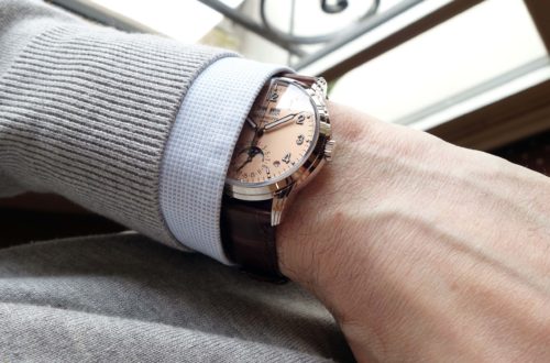
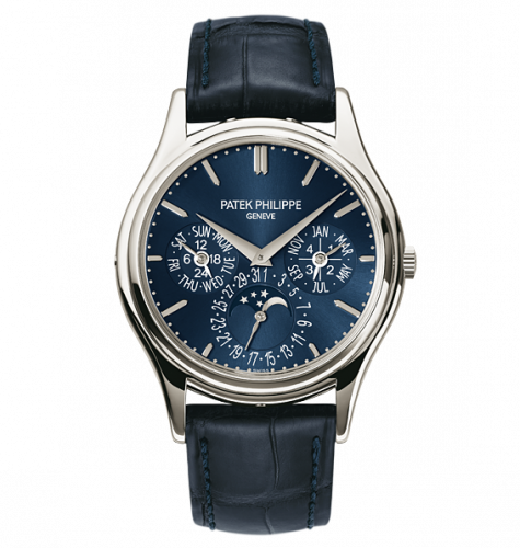
Indeed, as you can see from the photos, the main difference with previous 5140 versions is the more contemporary spirit (which the blue dial Platinum version approached, with its specific colour and only 2 small white hands versus 5 in the grey 5140).
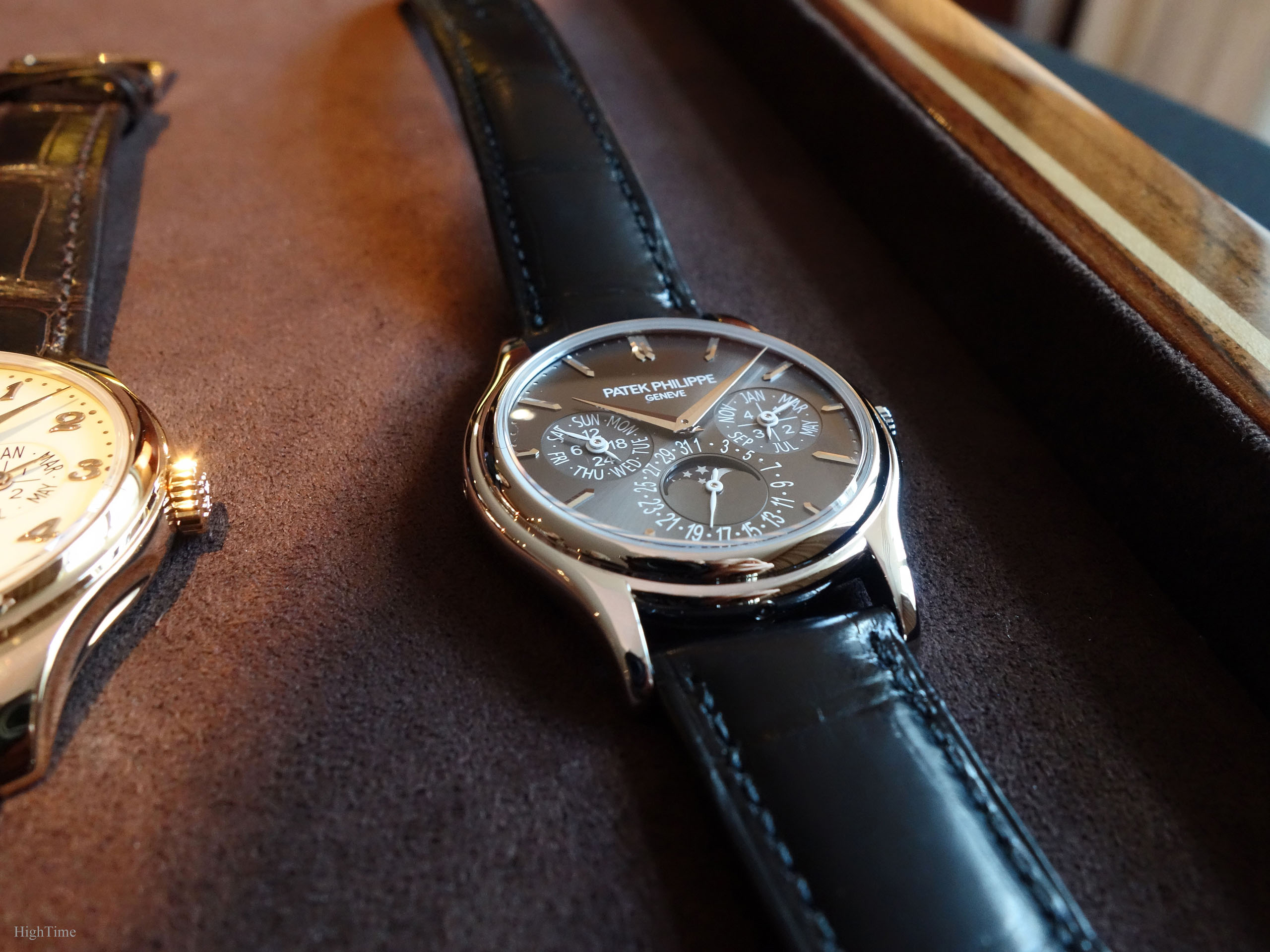
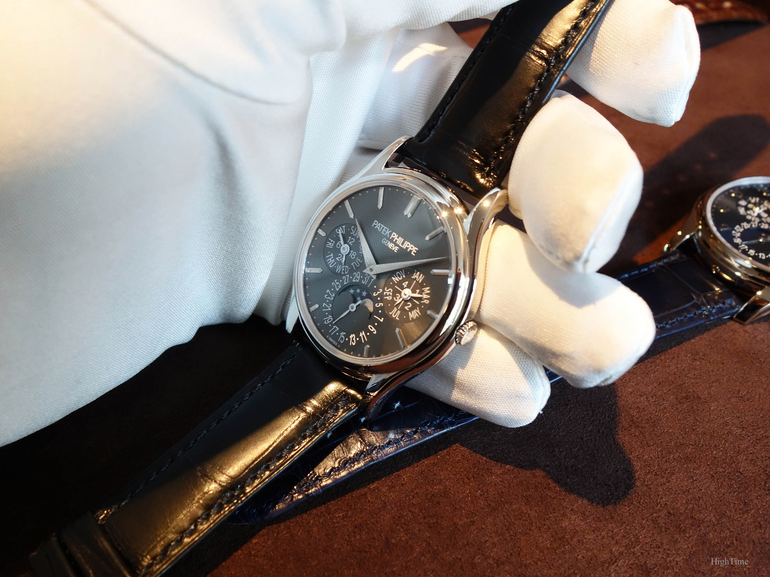
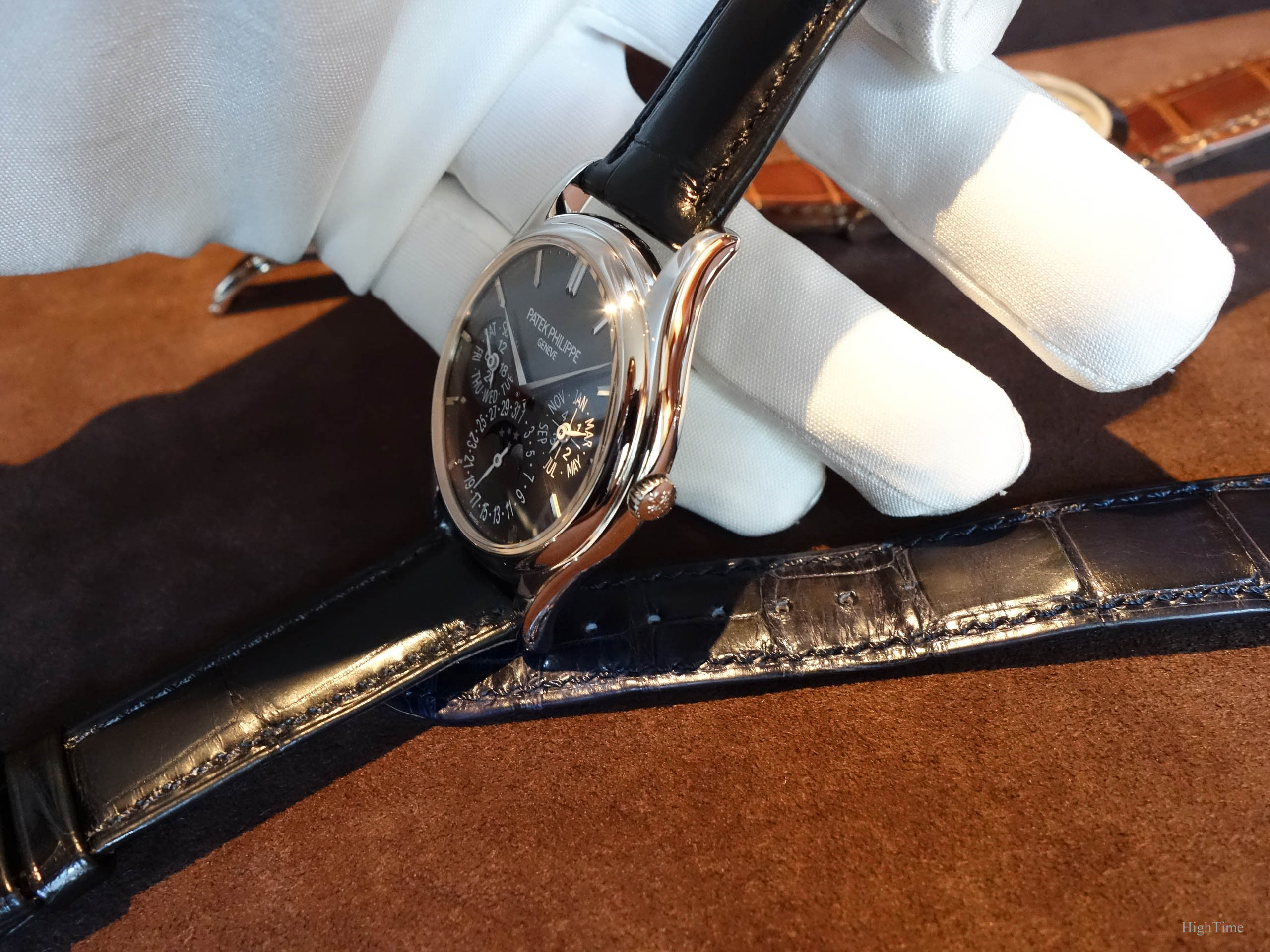
This is mainly visible from the combination of the charcoal gray sunburst dial with the white painted hands. The overall picture is very nice in the metal and provides an updated and refined watch for someone who wishes to enjoy a more modern design from such Patek classics.
The indexes remain polished white gold applied markers with minute dots alike. In such a classical and elegant watch, it is an excellent choice as bringing too much white coating (always 100% visible whatever the angle is, on the contrary to polished metallic surfaces), would have weighed too much over the rest of the decoration.
Furthermore, the white gold polished surfaces bring that shine we can really appreciate compared to average finishing standards. To me, this glittering effect is really something of the outmost importance for such high-end watches, even if it is applied to very few elements (and never well rendered on pictures).
The polished white gold Dauphine hands remain, following the previous 5140 versions. Meanwhile, the subdials’ hands are painted in white, matching the dial’s printings. This allows to clearly separating the time form the date indications. The white/grey dial contrast is perfect with enough strength to remain attractive, without being difficult to mix.
All the information, including the brand’s name, are a little bigger compared to its ancestor. When having a global overview of the watch (in real, hence at 1:1 scale), it is I think spot on. Especially since the case has increased its dimensions to 37.2mm (+1.2mm) which can seem quite the minimum today. That way, it keeps its elegant and refined feeling whereas a smaller brand size might have felt a little “lost” in this wider dial. It is all about details on what remains a subjective appreciation vs current standards.
By the way, from my own experience handling watches, let’s remember that the printings’ size differences we are usually noticing are “exaggerated” by the fact we compare close-up pictures on the net. Besides, the way we perceive the watch is clearly depending on what our eyes used to see in the past.
In the end, a brand can keep the current decoration, stamped or painted, on a bigger dial or choose to preserve the same proportions by increasing each element accordingly. Furthermore, remember that watches look always smaller in real.
In fact, I would say the proportions have led to and allowed these dial changes. It is coming from a case width evolution that people are demanding and that standards are encouraging. But it is also a significant will from customers to have a legible dial, unlike thin and small fonts more people had problems reading before. The space we had between subsidiary dials and between writings (with their beautiful old serif style) in the 3940 was more appealing to me on photos (which look bigger than the 1:1 scale) but they were in fact far more difficult to read in the real, especially for the amount of information a QP provides. As a matter of fact, the 5140’s room has allowed including proper 3 and 9 o’clock markers.
I have learned over time that Patek never does such adjustments without having very thoroughly studied the subject from different angles and various patterns. Just like they do for new mechanical designs. While this doesn’t mean the result will always make a hit on the short run, they all have an initial reason to exist. Yet, experience has shown that most of them end to reach success on the long run.
I didn’t have time to take a picture of the watch on my wrist but the wearing pleasure with such thinness (and its impact on weight), without mentioning the always very well designed caseback shape, is second to none. The 5327 is slightly bigger (39 x 9.71mm), thus this 5140 (37.2 x 8.8mm) is even more enjoyable on that matter for smaller wrists or owners looking for smaller watch/wrist proportions.
I would add a last note mentioning the thin but not so small crown that is made to “merge” with the case inside this groove.
Mechanically…
Concerning the caliber, in order to keep such thinness, the 5140P houses the beautiful automatic 240 Q caliber. It is offered with its Spiromax balance spring made of Silinvar, their Silicon-based material (amagnetic, less wear, no lubrication). This 3940, 5140, 5327 QP lineage greets the owner with a splendid view through the sapphire caseback (a solid case back is provided as well with the watch) thanks to the unique and rare micro-rotor playing with the beautifully decorated bridges. As enjoyable as the first time we observed it.
The picture here below shows the same caliber embedded in the 5327R:
Let me add that I would really love to see a middle or light grey strap on this version.
The watch was sold with a platinum fold-over clasp.
Conclusion and Thoughts
Patek really has a kind of “signature” about these very thin Perpetual Calendar Calatrava-based pieces. Not only with the 5140P presented here, but also with the 5940 (cushion-shaped version), 5496 (retrograde-date) as well as the “clous de Paris”-decorated 5139 (and which comes back in the 6119 Calatrava introduced in 2021) or the recent 5320G.
It is a reference I wasn’t paying that much attention to (I was more into the “clous de Paris” one) but that really surprised me when I tried it in 2016. I thought the Calatrava case was a little too conservative to my taste but seeing this more casual version on the wrist was a totally different experience.
This is the 5140 model I would have really enjoyed possessing (which is quite something since I wasn’t a big fan of the 5140 collection at the beginning).
I saw the 5550P recently (on Mr Barat’s wrist, Head of Watch Development at Patek Philippe) and the same case brings something really appealing because of its thinness and rounder shape. An element not to miss when considering a Patek Perpetual Calendar model, imho.
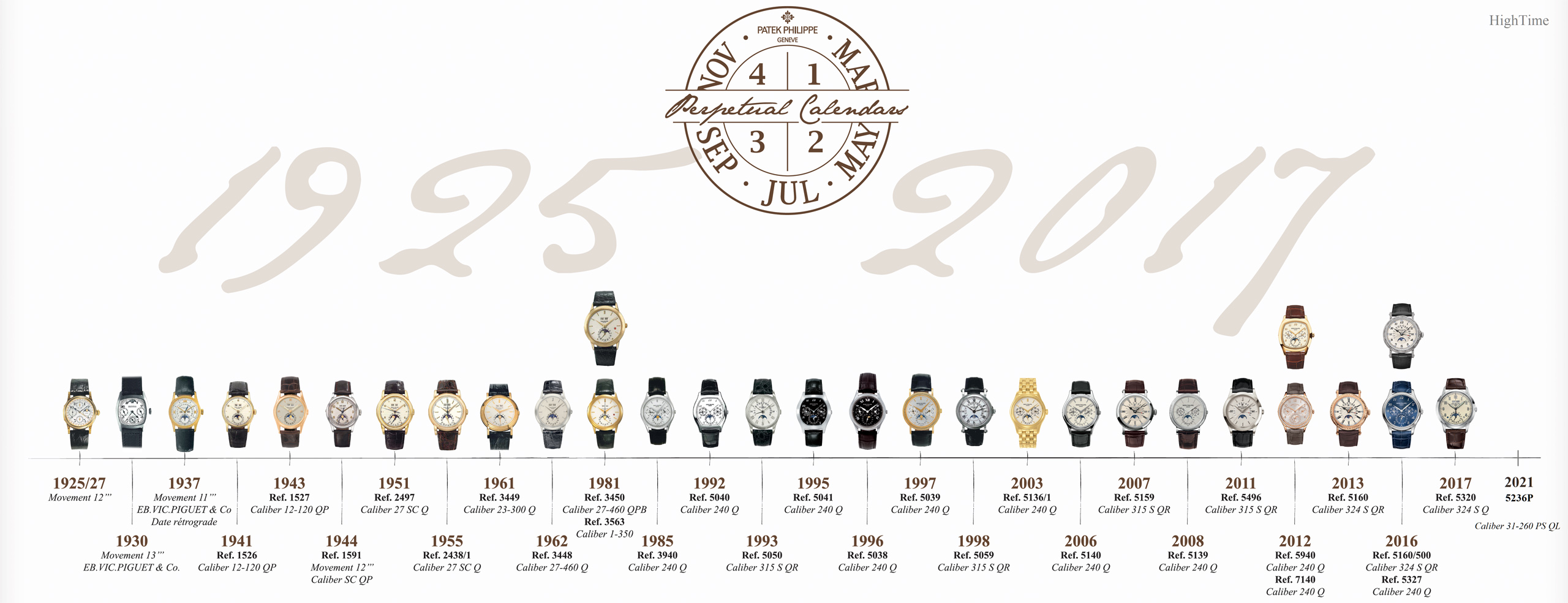
Here is the timeline of Patek Philippe’s rich Perpetual Calendar history:
For sure, they’ll be quite rare to see around after that 2-year production period.
The 2017 MSRP was around 96 090 € (incl. VAT).
Thanks for reading!


You May Also Like
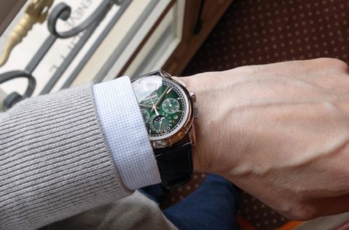
The Patek Philippe 5270P Chronograph Perpetual Calendar in Green – From the king dial maker
The Patek Philippe 5327G Perpetual Calendar – A traditional QP desire