The Patek Philippe 5320G Perpetual Calendar – DNA revisited with a Salmon dial
Hello everyone,
In 2017, we’ve been granted with the launch of the first 5320G Perpetual Calendar reference, cream-colored lacquer dial. This new 3448-style dial layout was presented one year after the traditional 240-caliber-based 5327 references (the natural successors to the 5140) were unveiled. It is a clear new offer next to the already available PC-only collection (5159/5160, 5140/5327 and 2021’s “in-line” 5236). As a reminder, the 5496 family was discontinued in 2020. The brand is therefore presenting today 4 main QP mechanical profiles in parallel.
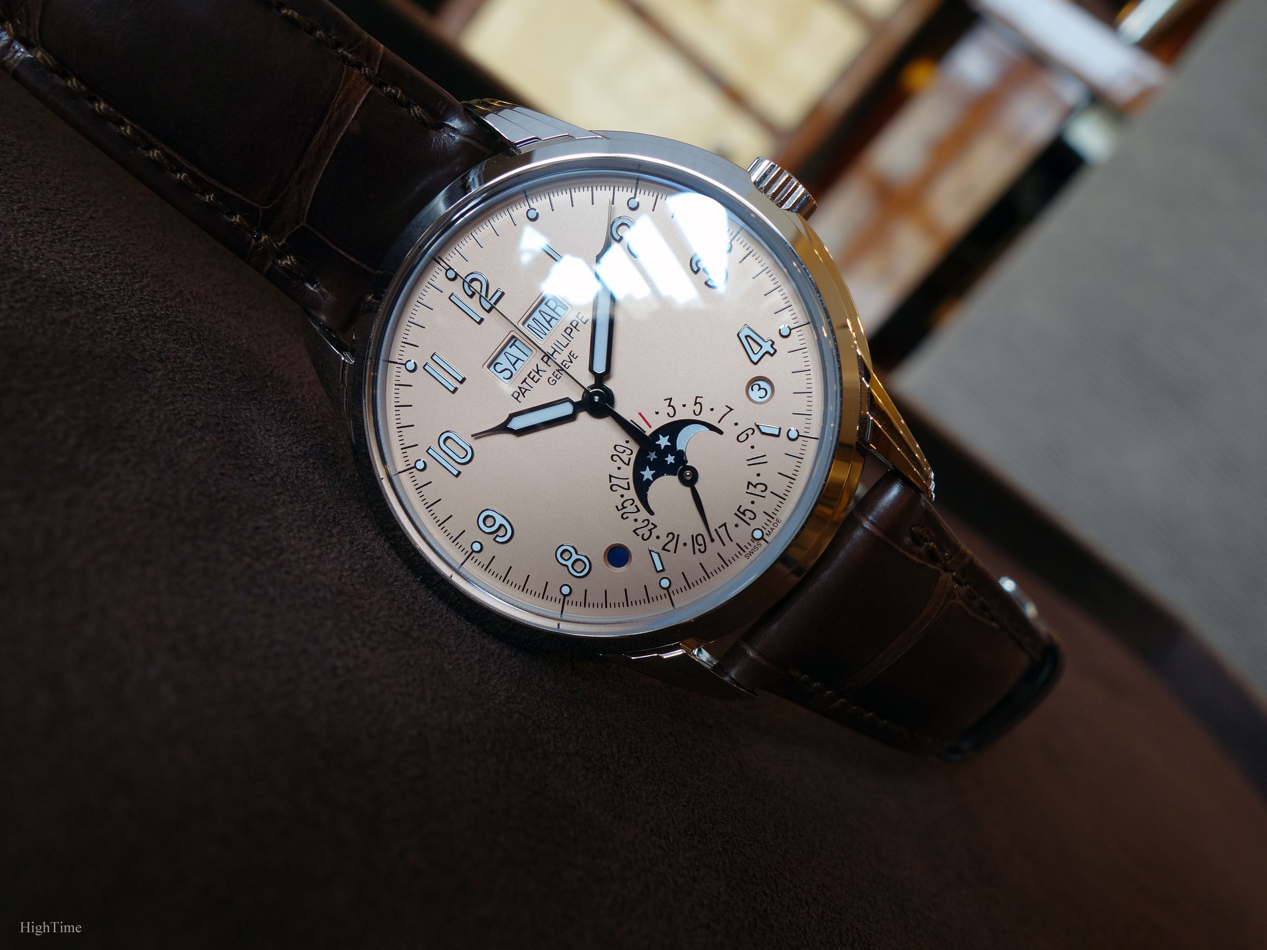
However, two months ago, we have discovered a very seductive new version of the Patek Philippe 5320G Perpetual Calendar with a Salmon dial! It is a very different looking version compared to the first one. It looks a little more classical, though remaining casual thanks to its contrasting numerals.
It is worth noticing the 5172G, sharing the same whole case design, was also provided with a Salmon dial in the mean time. Hence, this year confirms the success of this specific 3-tiered-lugs case with “box” glass design orientation in coordination with a dial color that remains second-to-none. The sign it is very well born.
New style orientation, New line
A romantic case to reinterpret an elegant spirit
The brand has lately undergone a deep overhaul of its Perpetual Calendar models (QP in French). Working around this complication isn’t new for the brand as they handle its secrets since 1925 with the unique 97’975 piece. However, for us, it requires to have a fresh view as, with this 5320, style was modernized to current classics.
To begin with, the case design has represented a major aesthetical change. The 2405 is the historical reference that inspired this charming 5320’s birth (picture below). As a consequence, the core ingredient to this new line is to be found in its three-tiered lugs case: their curves combine so beautifully with the whole case. It is to me a wonderful fulfillment: how to get inspired by a wonderful and rich legacy and not clumsily copy/paste it.
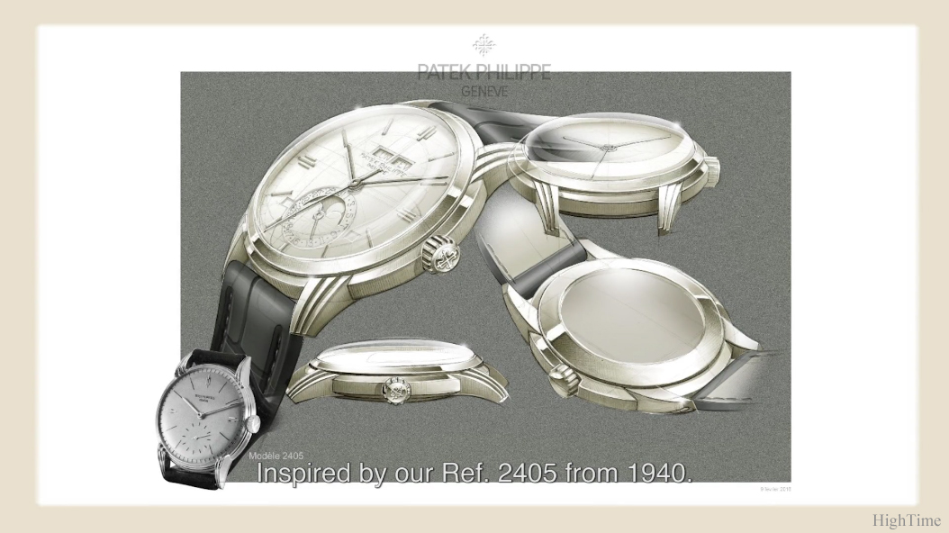
The inspiration for this new case doesn’t go as far as the very traditional early part of the 20th century but more from the 1940-1950’s era. As often with Patek Philippe, the case is a masterwork that, for someone who likes to discover what details a watch has to offer, is a must-see. The manufacturing process, even with current modern tools, is more time-consuming and requires more work than usual flatter, cylindrical shapes. This year’s 5226/5326 case is another example of such dedication. It is about searching and offering style as well as craftmanship to future clients.
For such decorum the 40 x 11.13mm size is just perfect, especially considering today’s bigger wrists and tastes evolution. I would even say, from trying the watch on, that this Salmon version looks a little smaller than its official size suggests. The proportions are perfect on every level.
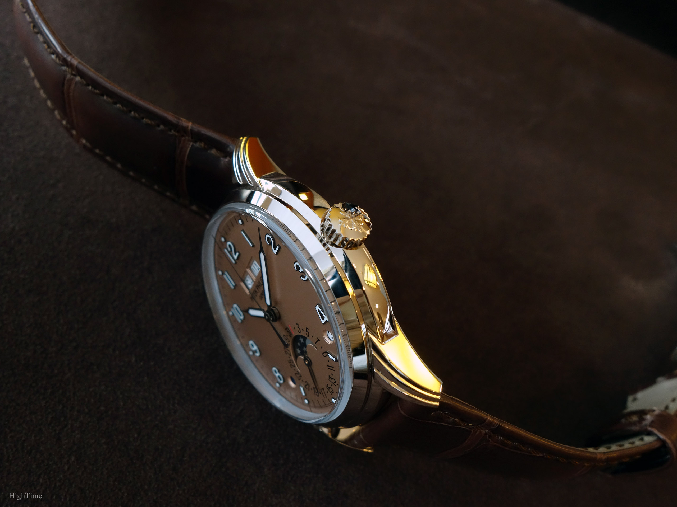
Just a few words about the case. The work performed on such elaborated design is much more demanding (thus expensive) compared to plane surfaces. Hence, the skill to deal with many edges especially while polishing the flat sides, like those 5320’s three-tiered lugs, is rarer and requires more experience, several years to master. Patek cases certainly provide the most diverse and complicated shapes among traditional brands and this one is certainly one of the toughest to deal with. The case side bears a middle ring that in fact goes all around the case, including between the lugs.
To achieve such result, the case is first punched, preserving clear edges between the different parts. Then it is milled and receives the hand-finishing treatments.
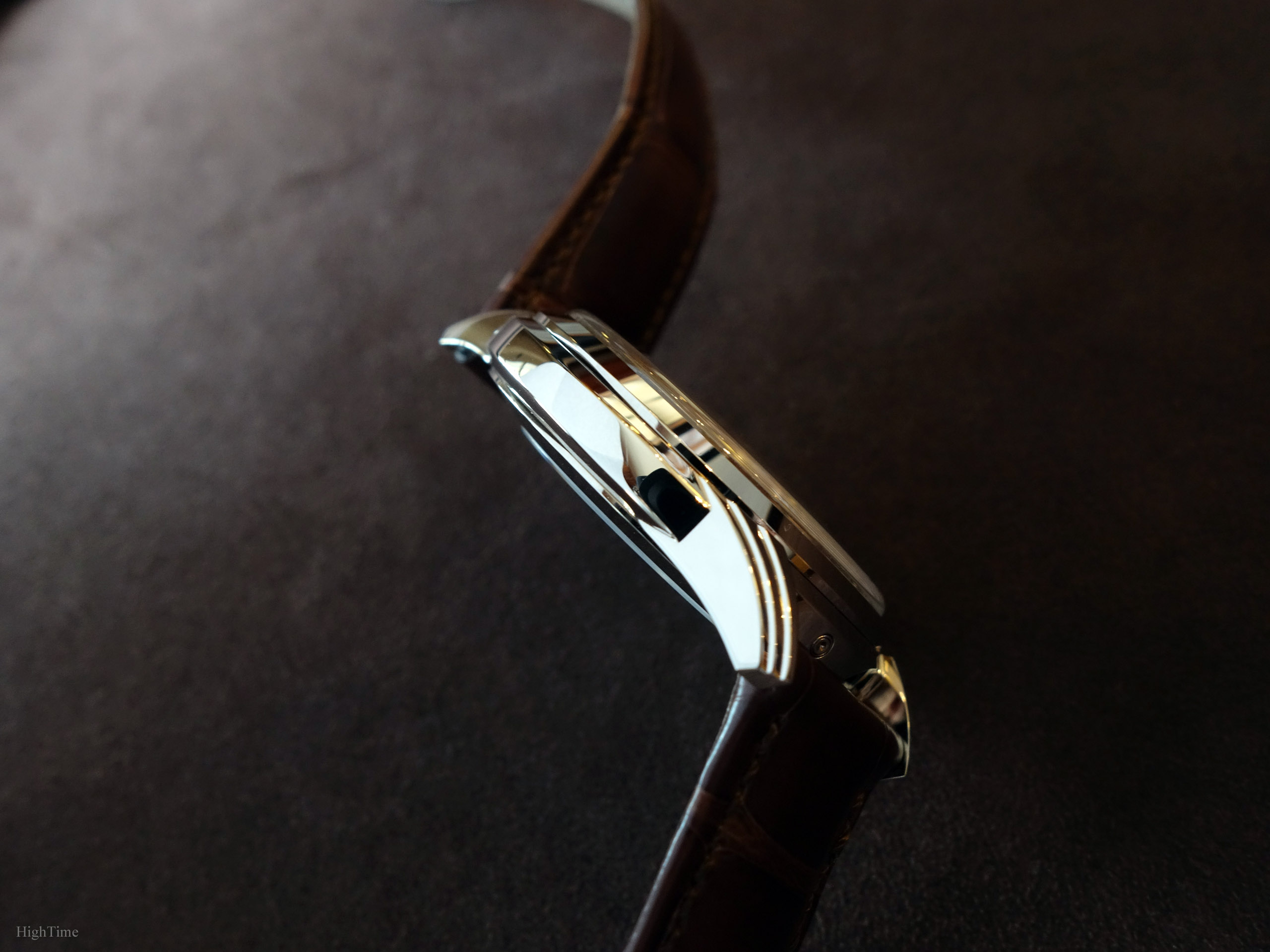
In the end, it is more appealing and interesting in terms of craftsmanship. As far as I’m concerned, the dial isn’t always the first thing that catches my attention or that deserves to spend most of my time on.
On top of the case, Patek has chosen to place a box-shaped Sapphire glass, a reminiscent element of much older Hesalite glasses (a kind of Plexiglas). The vintage charm still works and it additionally limits the visual height of the whole watch as it allows slimming down the bezel as well as the case.
This model doesn’t feel like another modern watch which received a few aesthetical perks to look vintage. It takes its roots in Patek’s history with more contemporary aesthetical ingredients on the dial side as well as an upgraded size from its 35mm origins. In the end, it provides a natural impression and not a “reshuffle” from an old design. Therefore, the 5320 is a Perpetual Calendar an owner of a previous PC reference could add to its collection without feeling having twice the same watch.
And the 2021 new 5236P reference adds again another possibility. It definitely brings the brand’s finishing and design mastery in a shape that can attract younger half of Patek’s customers, instead of standing still and risking going away from what people are attracted to. More importantly, it can seduce clients who had an “oldish” image of Patek’s models.
This is why transitions must be thought in advance and implemented by small touches on a regular basis. There might have bumps on the road but I personally think what the brand did from the last 7-8 years in that regard is spot on. Don’t be mistaken, this isn’t new, this has been an ongoing process since the Stern family’s beginnings in Patek Philippe. Hence why in my opinion it’s a mistake to think that something new (orientation wise) has started to happen only since 2010.
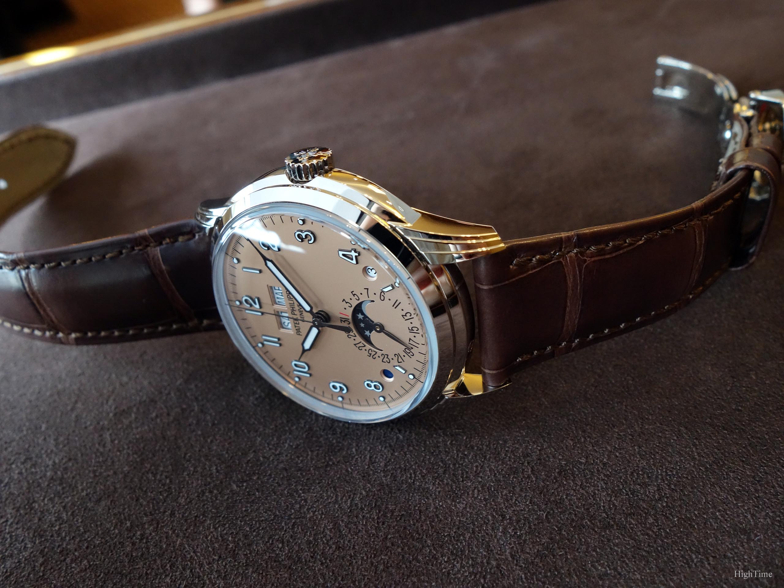
This reference wasn’t the easiest one to digest when it was launched a few years back but it certainly evolved for many of us today. Like the 5130/5140/5960 cases were followed by the 5230/5930 for instance, this is how aesthetical evolutions work on the long run in link with style standards’ settlement. Only then, it will thrive. I imagine the stunning 5172G is viewed as a very nice model because the 5320 was unveiled before. And the years to come will certainly bring even more comfort to this layout. I love the 5960P (grey and black dials for me please), and I love this 5172/5320 case.
A question of generation especially when used to more traditional designs. Nothing new there…
On the dial side
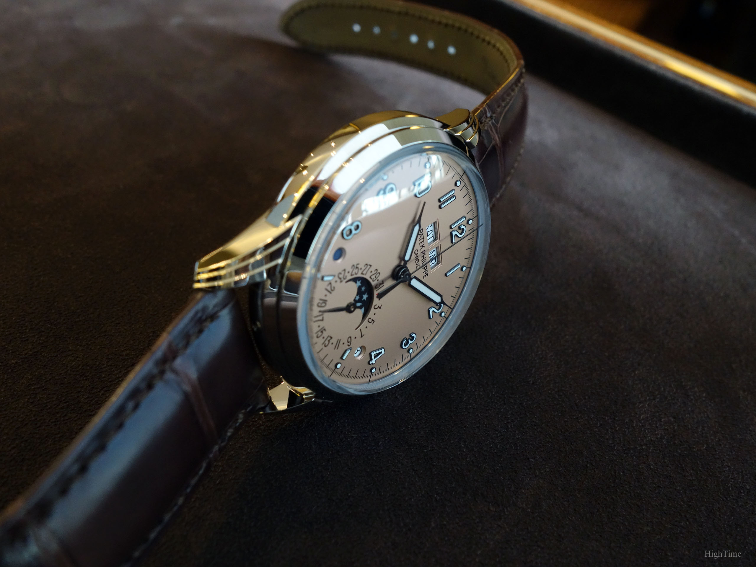
As you can see, the dial receives a new sandblasted salmon dial that we only saw maybe in the 5024G Gondolo. The 5270P and 5450G’s tone is a little more gold colored than this pink salmon iteration.
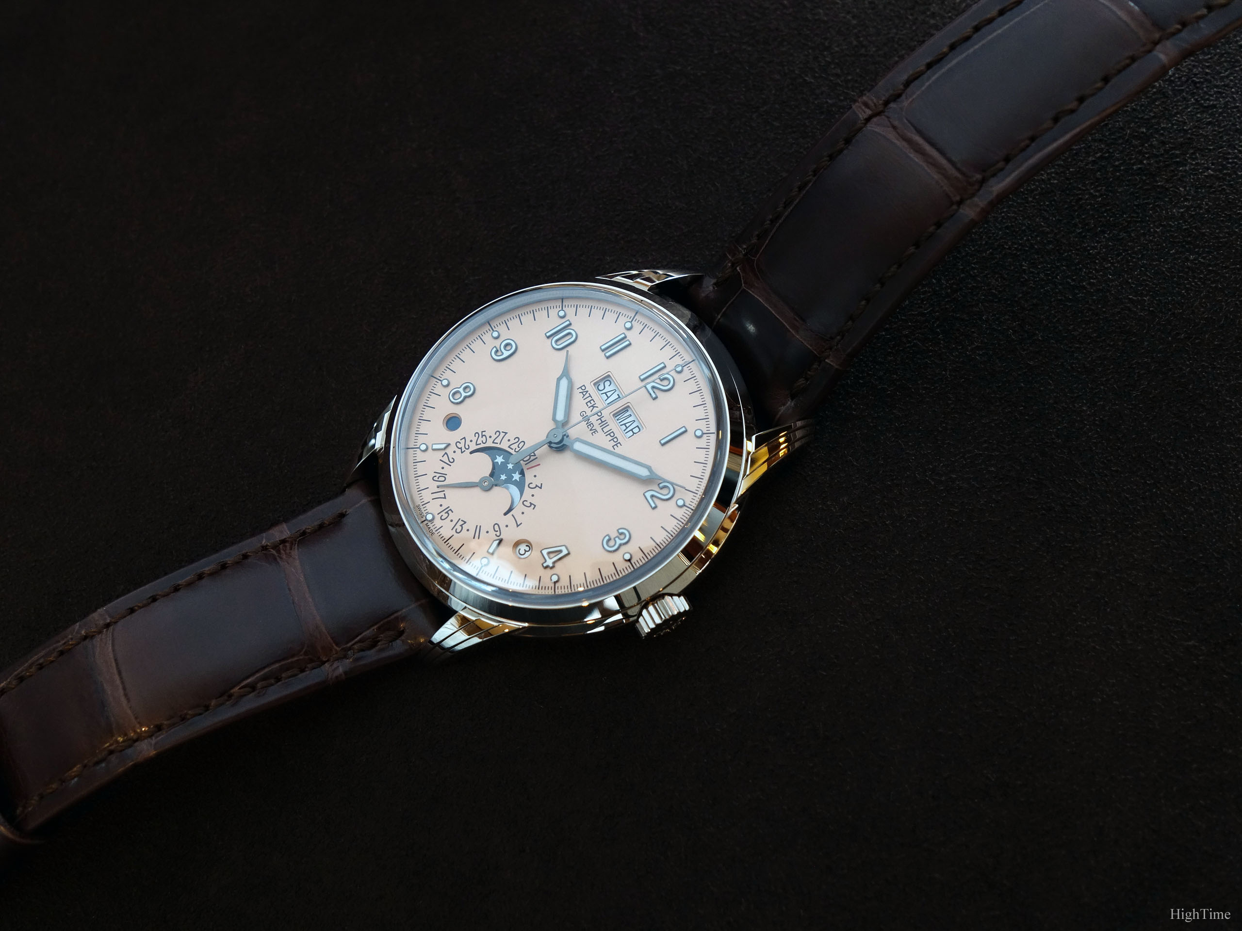
It has been modernized with the addition of new applied numerals fonts which are inspired from the ones seen in a 5070 for instance to the exception they have been filled with Luminova. This combination brings definitely a well balanced updated touch to the design while keeping the classical spirit.
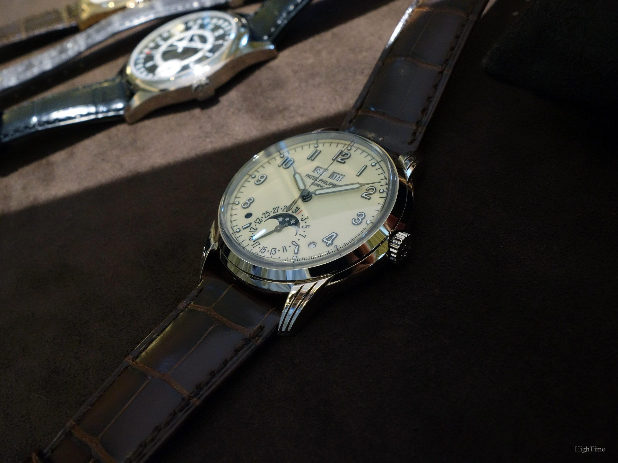
The previous version with its creme-lacquered dial (here below) made it a very different watch.
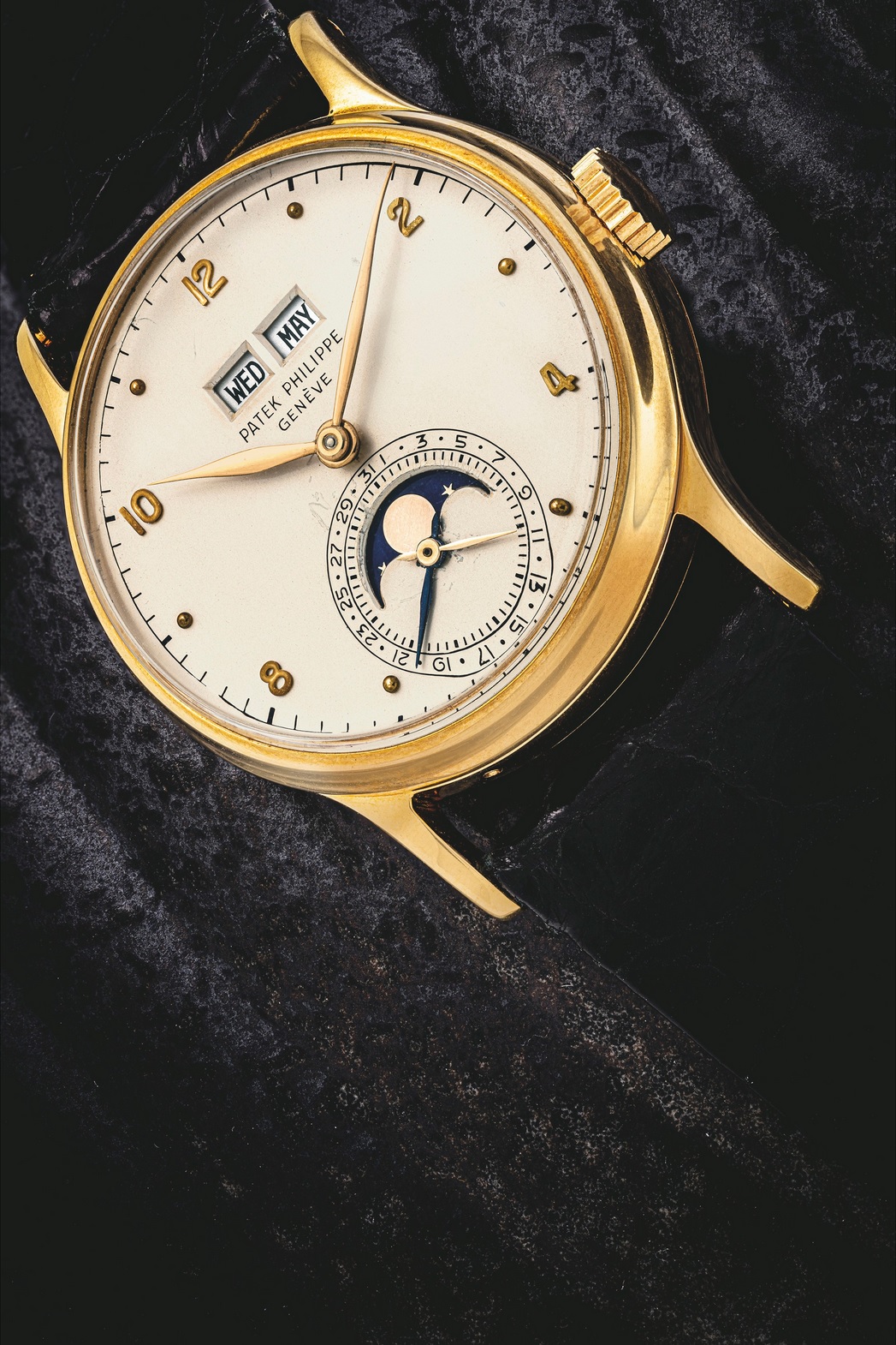
Finally, what is a major change in the dial layout is that it brought back to life the 1526 Perpetual Calendar model presentation (picture below) with currently two additional apertures at 4 and 8 for the Leap Year (as in the 3450) and Day and Night indications.
I like the way the polished blackened numerals work with the dial. I don’t think it would have worked as well if they had been matte for instance. They are applied which means they are fixed to the dial via pins that are clinched behind the dial itself. Furthermore, the fact their sides are thin materializes a light and quite neat separation between the central part and the external side of the dial (with the minute ring etc…). This helps bringing a kind of dynamism to the dial, especially as it provides a quite clear contrast in the metal. It was true in the cream 5320G, it is still true with the salmon version or the 5172G chronograph.
In the metal, as you know, watches and all the elements you see on a dial look much smaller that on the internet. As a consequence, all these ingredients merge very nicely and the blackened (more precisely “dark brown”) elements make a very nice dial to look at together with the salmon colour.
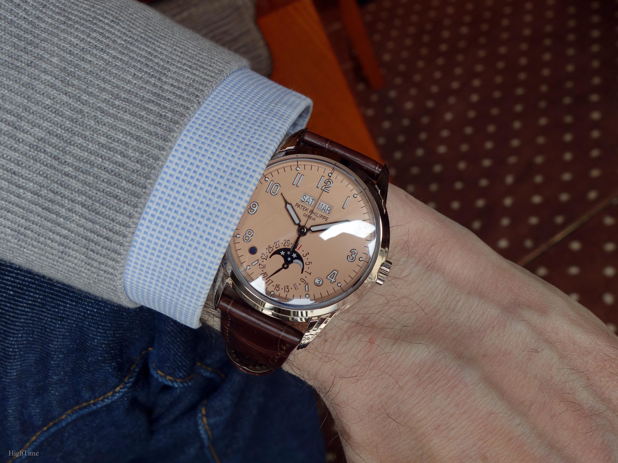
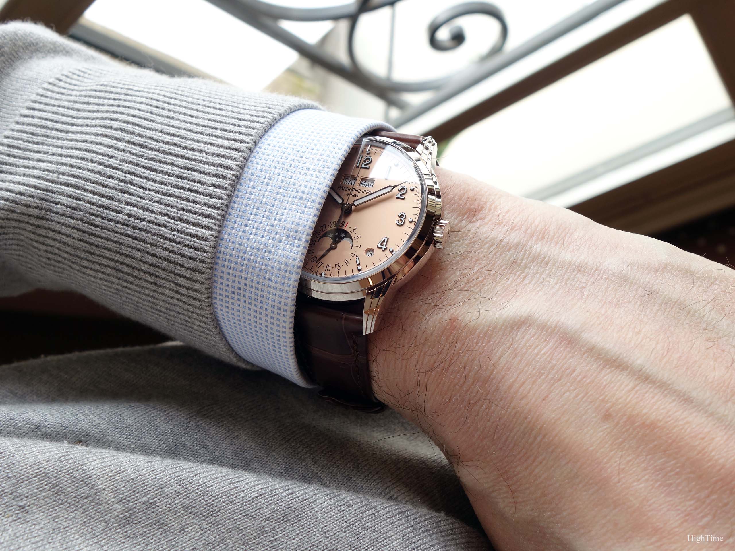
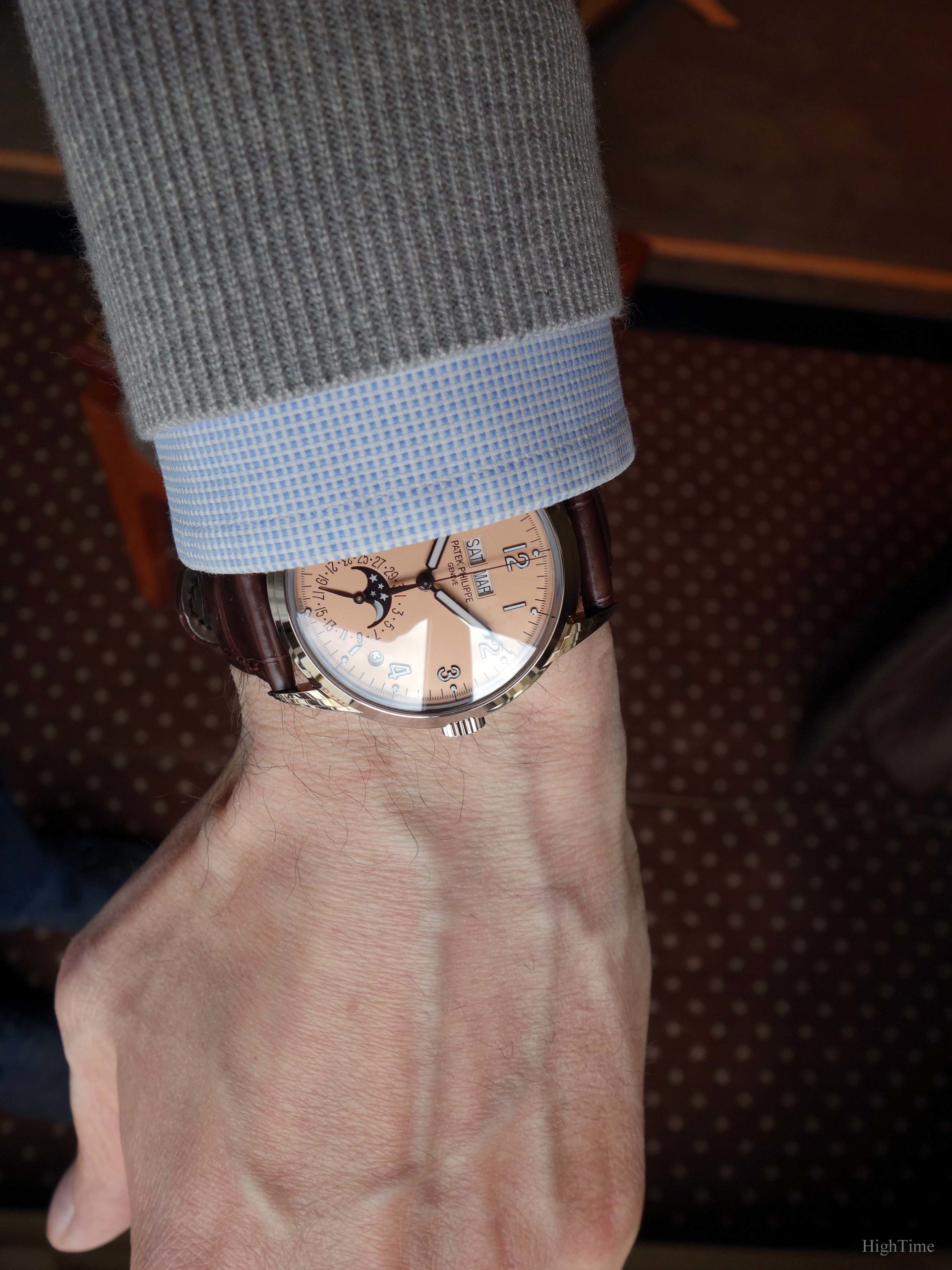
On the wrist, this dial is just stunning because there is a very unusual spirit. It is coming from the dial color, communicating a sort of smoothness, a very delicate texture. It looks like satin and combines with the numerals’ relief which brings the sufficient strength to make it dynamic and not “sleepy”.
This impression I’m trying to describe is particularly visible through the picture below. I found this version bloody elegant, with the shirt and light grey pullover I wore that day. But, more importantly, it doesn’t look like a grandpa’s watch even if it still exhales, with no doubt, a wonderful traditional look.
That’s what is difficult to reach: this modern elegance other brands don’t, except a very few like maybe Laurent Ferrier for people who have handled some of their pieces (or which I truly encourage to, if you have this opportunity).
This is confirmed by the Luminova-filled hands which made a recent come back since quite a while. These hands are borrowed from the 1463 Chronograph reference produced between 1940 and late 1960’s. The applied gold numerals and cabochons (Lume-coated as well) add the perfect touch to make it coherent and away from the more traditional line-up. This requires not making mistakes as nothing is messier than a new line-up you make disappear after a while because it doesn’t sell.
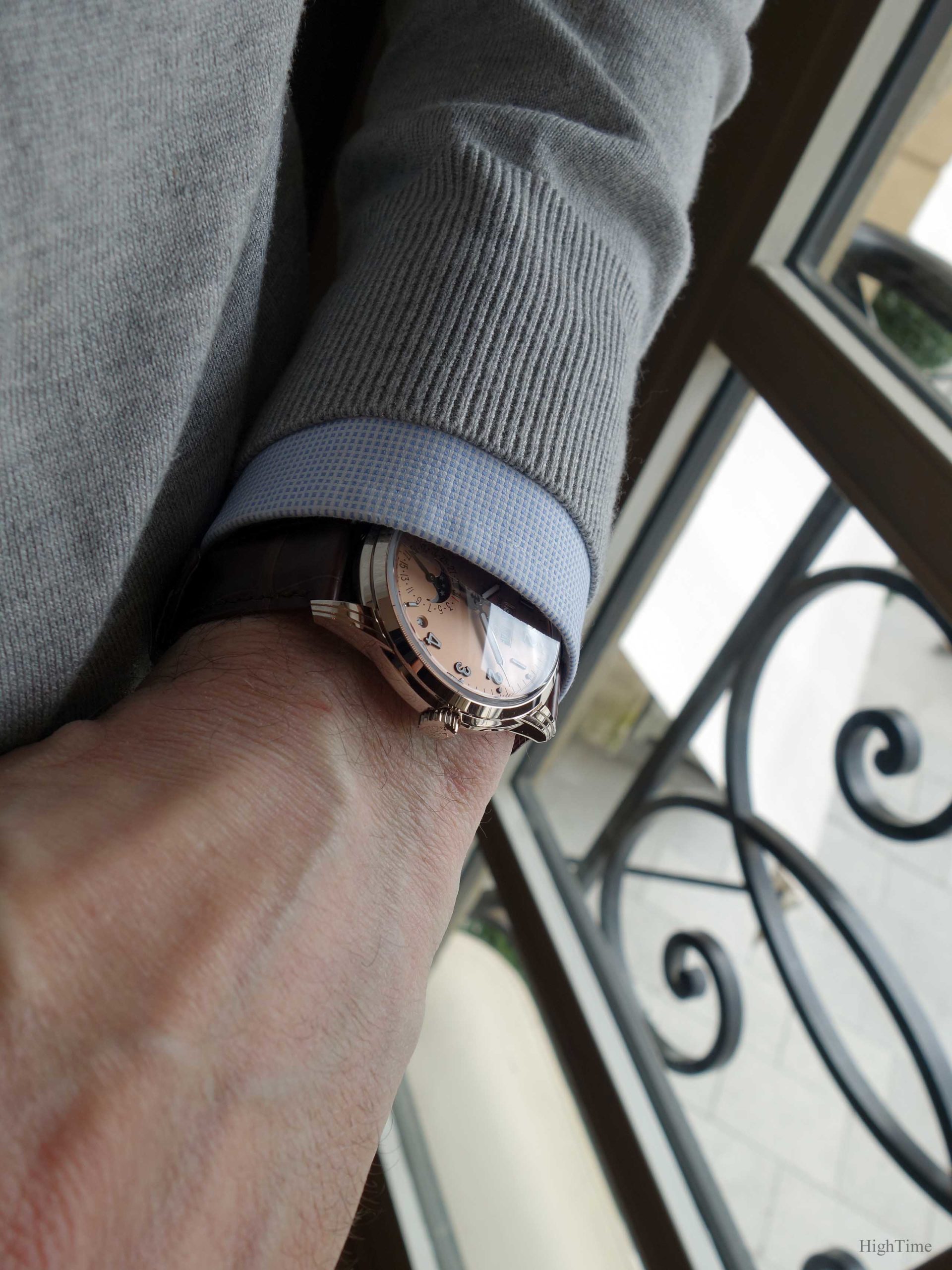
Concerning the strap, I would go for black as I’m not a fan of brown (but that’s just me of course). As we can mix nowadays much more colours than we could in the past (remember the only-2-colors trend?), this “rose-gilt” colour (as Patek call it) can thrive with grey or blue straps for instance. A black one might fit as well very nicely, even if the blackened treatment isn’t pure black but “charcoal”, hence a little warmer than true black. I guess they are close enough to fit together. It is always nice to be able to play with strap colours, which isn’t as easy with a black dial.
In the end, the strap is equipped with a white gold fold-over clasp.
This evolution between generations, from a style to another, is made at a pace where it should reconcile today’s or even tomorrow’s tastes with Tradition. I think that Patek has shown its perfect knowledge of this issue, especially while looking back at the introduction of World Timers or more obviously the Nautilus or the Aquanaut.
The QP mechanism
The 5320 is receiving a different Perpetual Calendar complication from the 5327 line-up. This time, it is based on the automatic-wind 324 caliber compared to the preceding references’ 240. More precisely, it is the 1.65mm-thick module available in the 5270 reference, with a sweep central second (vs none) and Day & Month alignment at 12 (vs subdials).
Of course, it reminds of the 1526 or 3450 layouts which were adored by collectors but disappeared for a long while.
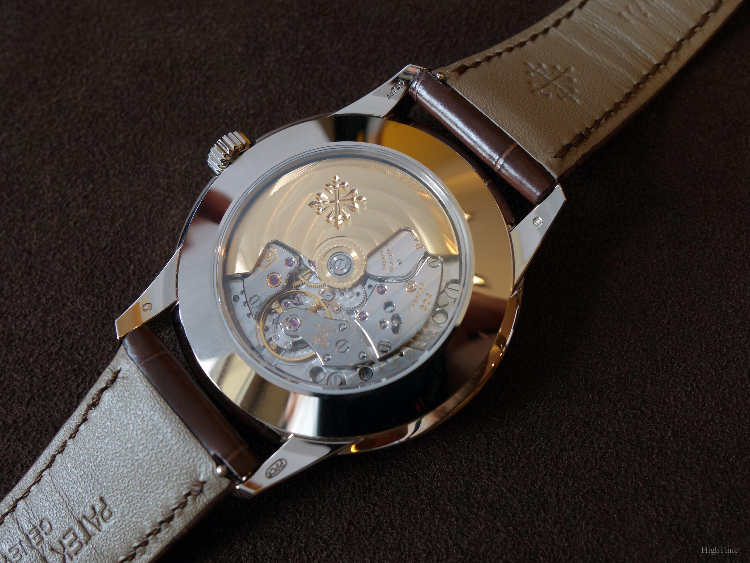
The 367-part movement has a 28,800 vph frequency for a min.35h – max.45h power reserve.
Finally, this reliable movement can be admired through the sapphire glass even if a solid caseback is provided as well. It has a 30m water-resistance.
Conclusion and Thoughts
Back in 2017, it was quite a surprise but coherent, especially next to the 5327, to discover an additional Perpetual Calendar-only classical reference: a very traditional and beautiful version next to a more casual yet still traditional one in the spirit. The Salmon version is bringing a slight oldschool touch to the 5320. I welcome these changes and evolutions to the collection especially since it isn’t a lazy duplication of an existing reference with a few changes. It’s a whole new very appealing line-up, including the chronograph that arrived next in 2019. The brand’s legacy is revived in the 5320, hence preserved, and even reinforced with this charming and cleverly designed watch.
A brand always takes a risk in moving on with its collection. Producing the same kind of design for ages is nice but only until the brand shrinks and eventually disappears. Would we like to see the 1980’s-1990’s style on and on today for instance? We can get bored of everything while it loses its rarity, thus part of its charm. It is easier to use the same lines to make different but this doesn’t help a brand to stay in line with its time (hence the market).
In cars, architecture, there has always been a natural tendency to resist to evolutions. I guess this is human. Collections move on, as they did in the past, even if it isn’t always understood by observers who are used to more traditional choices. As usual, I imagine that it was the same in the early 2000’s while collectors preferred 1980’s watches and their a little more Baroque style (especially regarding the lugs work), until the latest 5070 or 5970 emerged… or, even earlier, when the Nautilus was unveiled. Each around 20 years there is a switch or a new addition in terms of style and I think it is important that this evolution follows the essence of its time. Which doesn’t mean that you have to like them either, but just remaining open.
I see this watch is very successful in particular in North America. To me, the latest 5172G Chronograph (borrowing the same case) looks just stunning.
The Patek Philippe 5320G isn’t the kind of watches people knowing the brand for very long would have thought of at first in 2017 but I think this is exactly the kind of watch that is on the verge to be recognized as a beautiful true Patek Philippe.
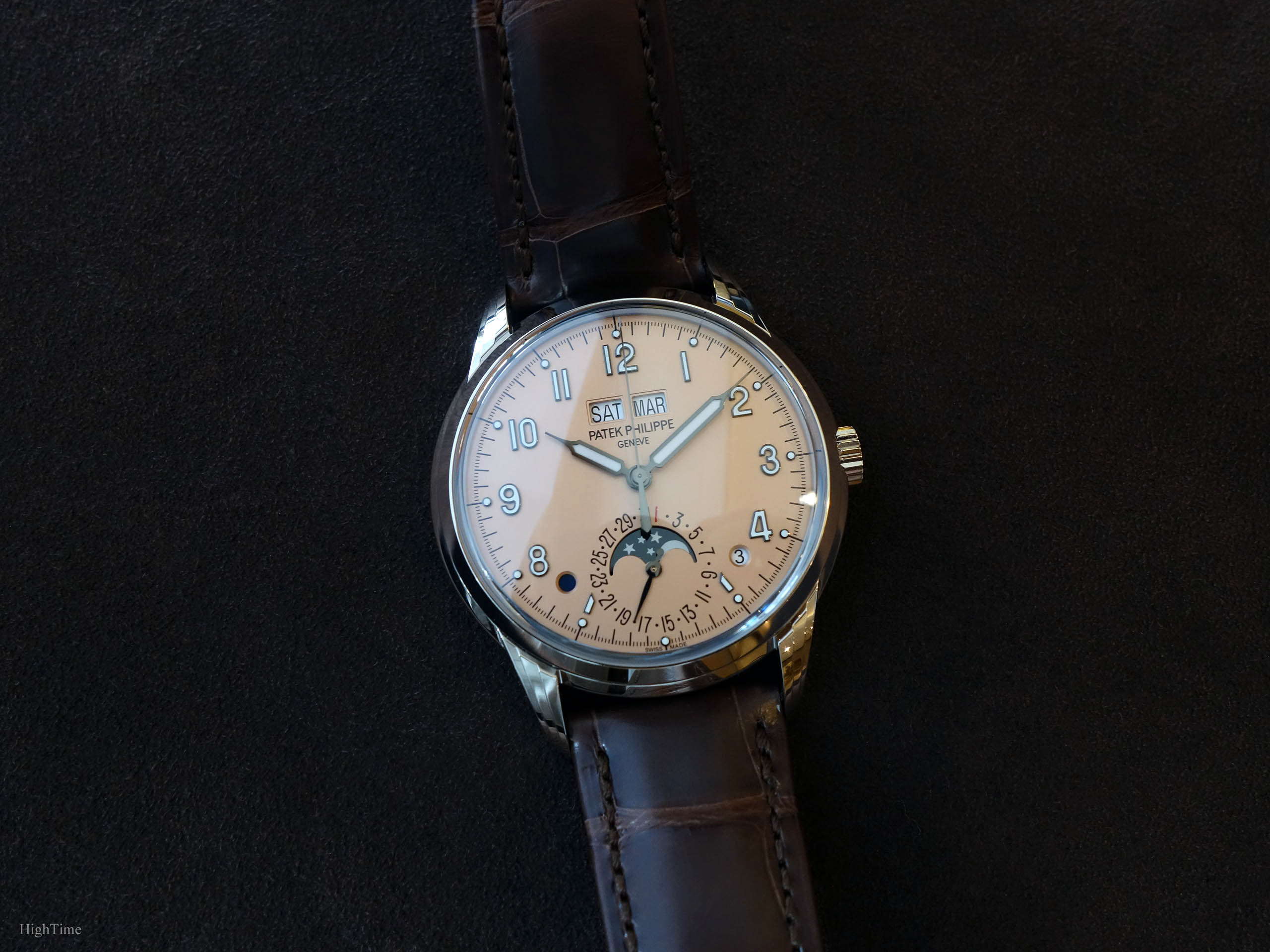
The Patek philippe 5320G references remain to me contemporary interpretations of what remains traditional and the fact it is a Perpetual Calendar makes it even more exceptional.
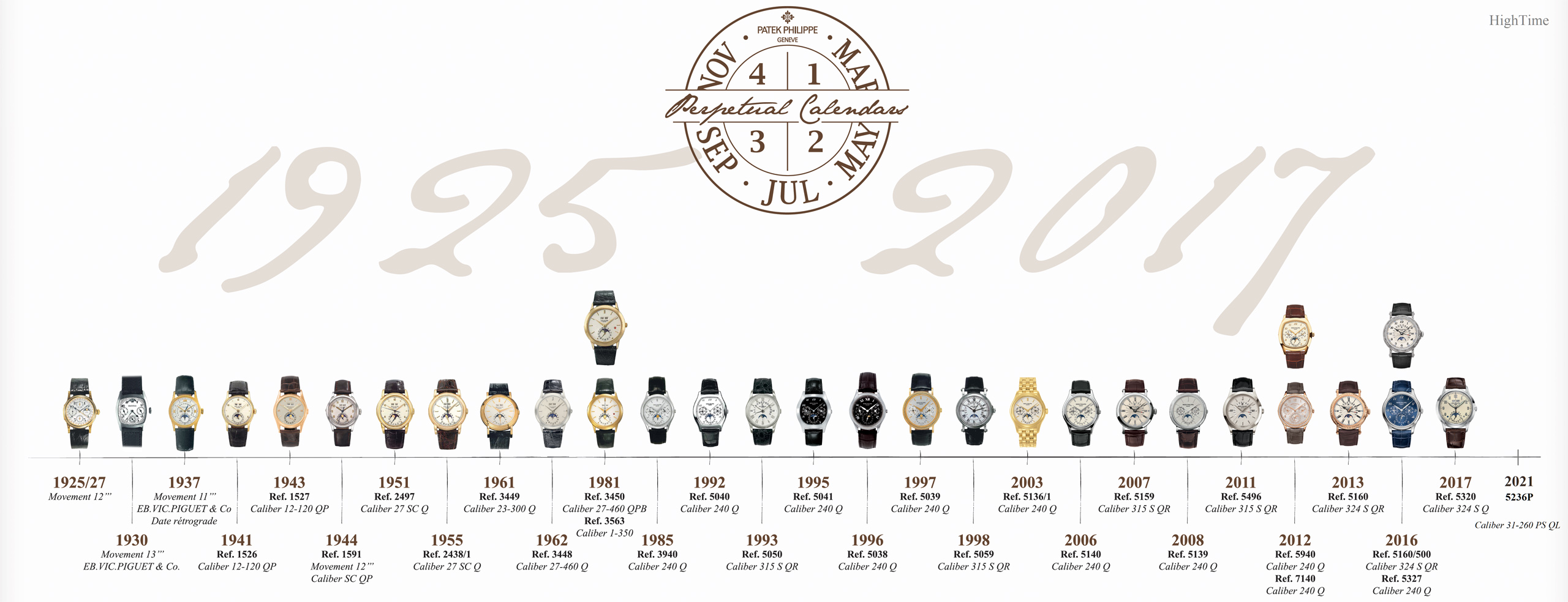
To end with, you may want to have a look here below at the rich history of Patek Philippe’s Perpetual Calendars through its timeline:
Finally, let me recommend also a very interesting video, the 5320G’s presentation by Mr Barat, Head of Watch Development at Patek Philippe:
To date (2022), the Patek Philippe 5320G-011 Salmon dial’s MSRP is 84 700 € (VAT incl.) and you can find more details on their website here:
The Patek 5320G Salmon dial on the brand’s website
Thank you for reading!


