The Patek Philippe 5270P Chronograph Perpetual Calendar in Green – From the king dial maker
Hi everyone,
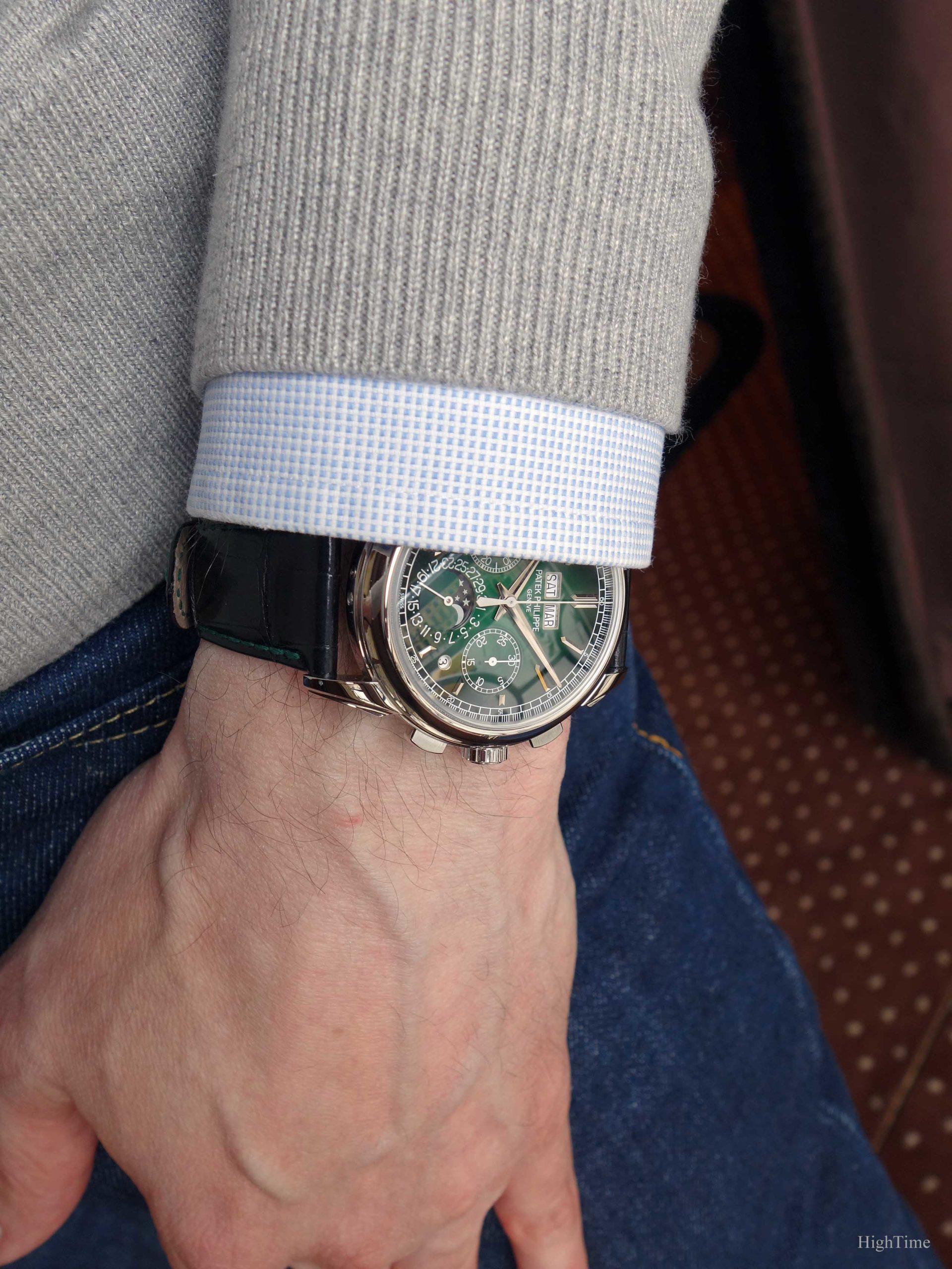
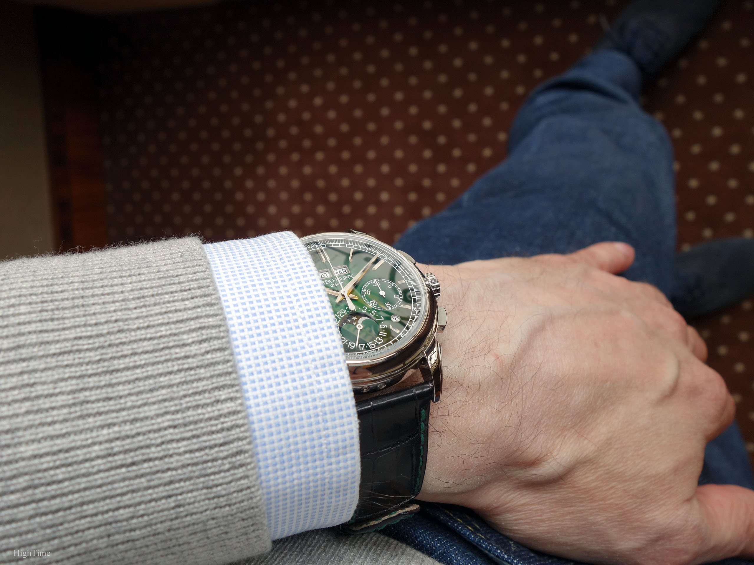
A little over a month ago, the brand has offered a stunning piece to keep uniting traditional watchmaking and an ongoing evolving world: the Patek Philippe 5270P Chronograph Perpetual Calendar with a ravishing new green dial.
In 2018, the brand had launched a rare Platinum version of this legendary complications assembly with a Salmon dial, thus a little more traditional. As usual with the brand, the rarer platinum versions hold a very special place in the catalogue. But in this case today, we surely go even further with this version which stands proudly as a symbol of a new offer. Don’t be misled by the unusual colour; it is done at a high degree of dial craftmanship and it is exceptional in real.
Before we start
As far as the 5270 is concerned, the family was initially launched in 2011. We had since been provided with a few G (grey gold), R (rose) and J (yellow) versions (without mentioning the 2014 gorgeous diamond-set black dial 5271P), in 3 dial layout generations:
- no-Tachymeter scale (in white gold);
- Tachymeter with the 6 o’clock additional external track (called “belly” or “chin”) in white gold;
- Tachymeter without the external 6 o’clock track in white, rose and yellow gold (like the diamond-set 5271P).
While the more casual 1st generation dial (brushed silvery surface and blackened elements echoing the 5970G) bore the task to bring a refreshed and more modern watch which attracted new customers, the 2nd and 3rd generations brought back the more “technical” (busier) and rather traditional spirit. Therefore, the green 5270P is the 4th generation, inspired by the 1st generation‘s casualness, no-Tachymeter scale but with more contemporary hands.
In a field where classicism used to rule rather heavily, sometimes with the risk of standing out of sync with lifestyle evolutions, Patek has challenged itself to explore new territories in order to widen its offer. Exactly as it did for instance with the Ellipse (1968), the Nautilus (1976), the Aquanaut (1997) or even the 5070 (1998).
In many parts of the world, people wear more colourful attire and accessories. The European seriousness isn’t shared everywhere and, even if it requires some effort, this opens new pleasures. Italy is a good example of a leading styling industry, using colourful combinations. Sunnier regions offer generally more coloured outfits.
However, it would be a mistake to think this version is only a watch for other regions than Europe. It is also for more conservative markets. That’s the trick. Because, yes, it is that extraordinary to experience.
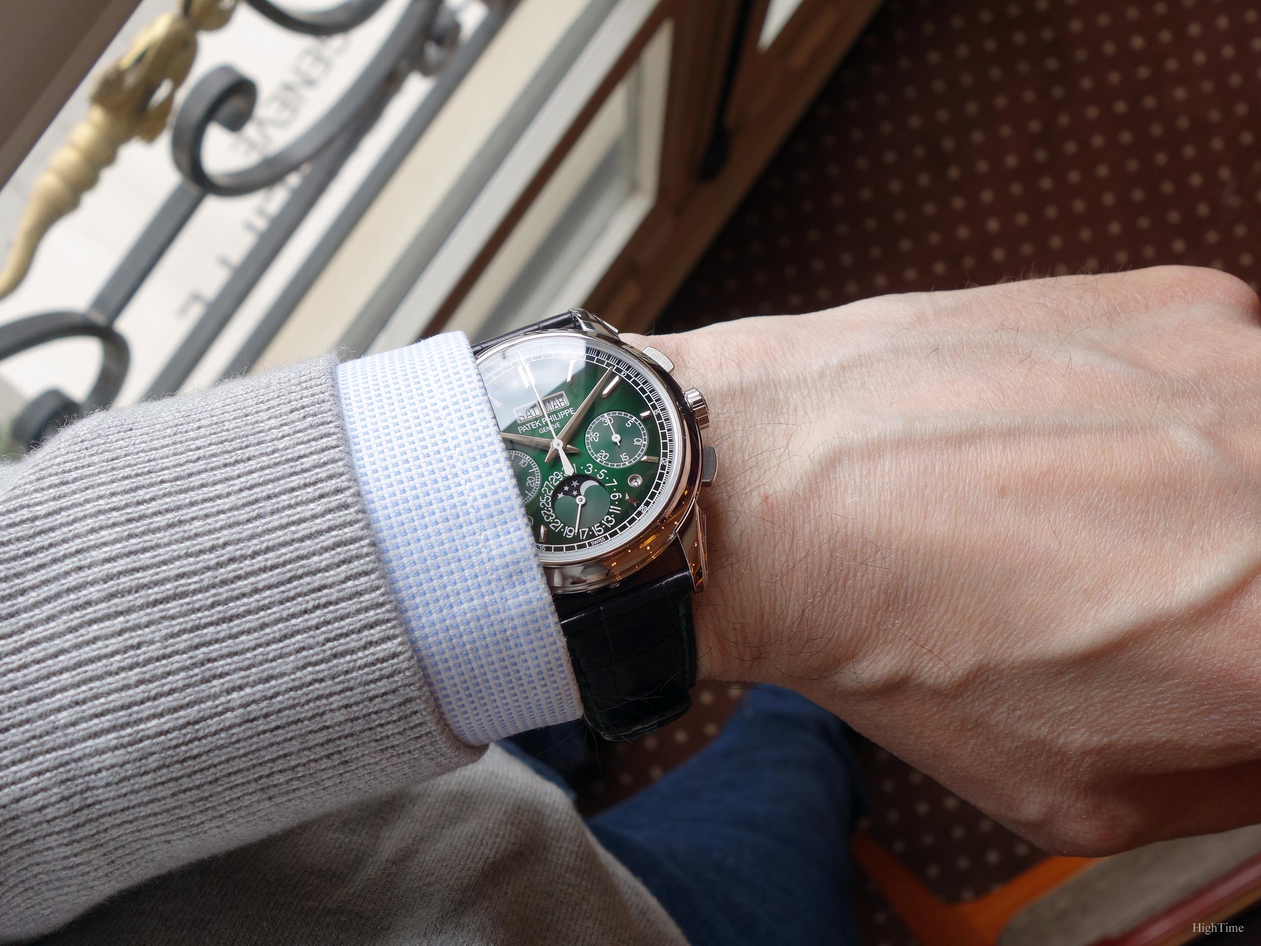
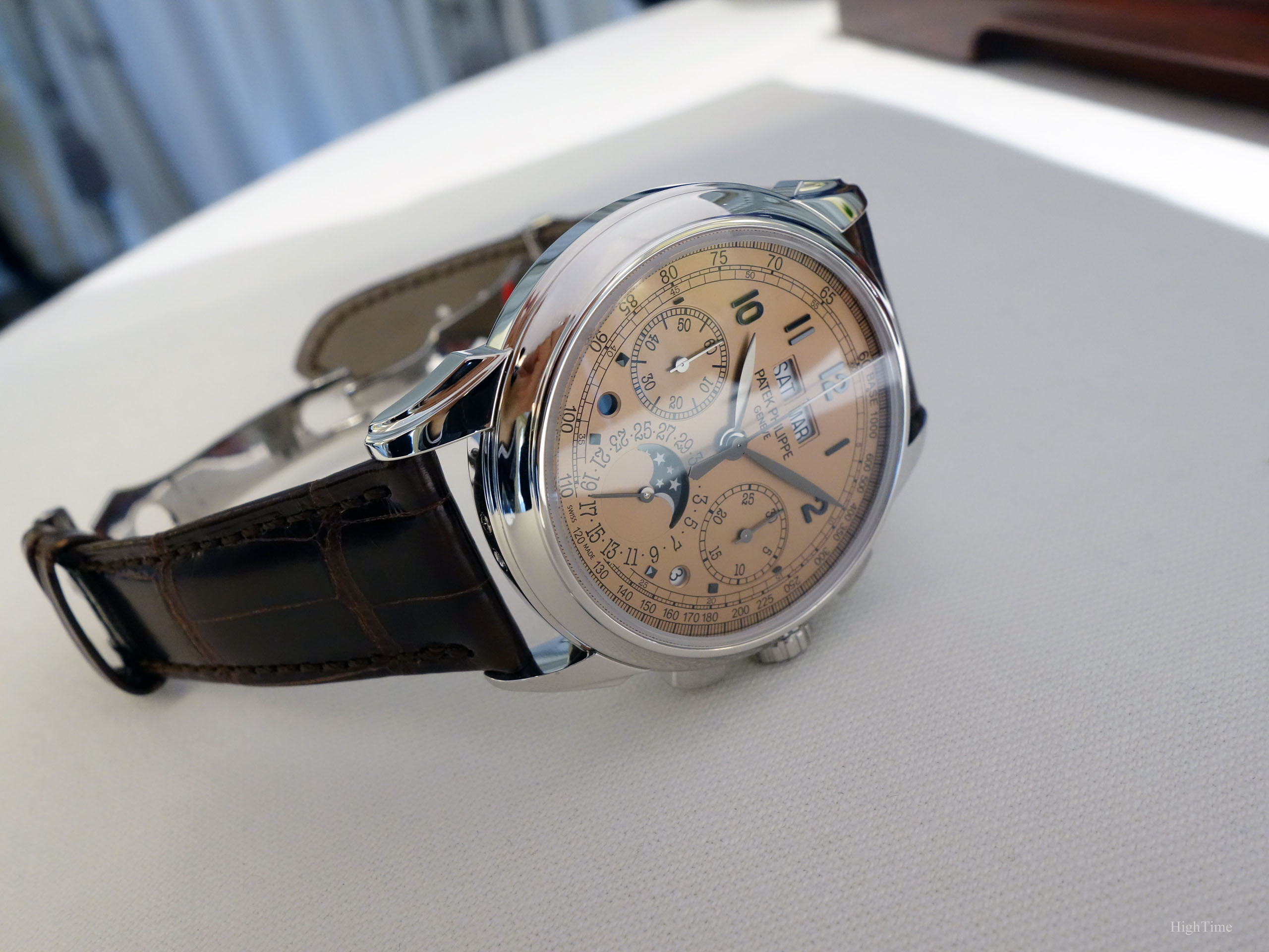
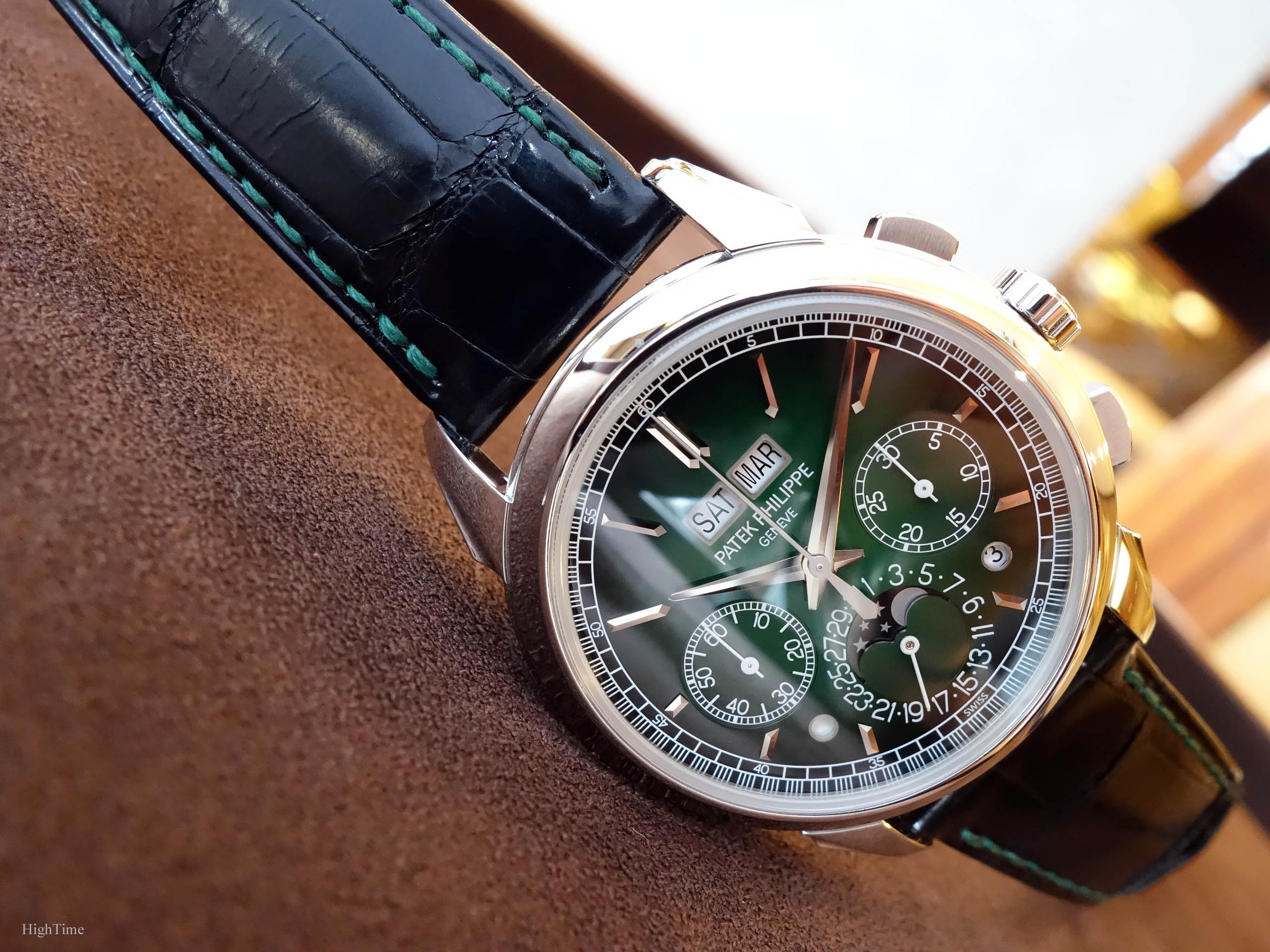
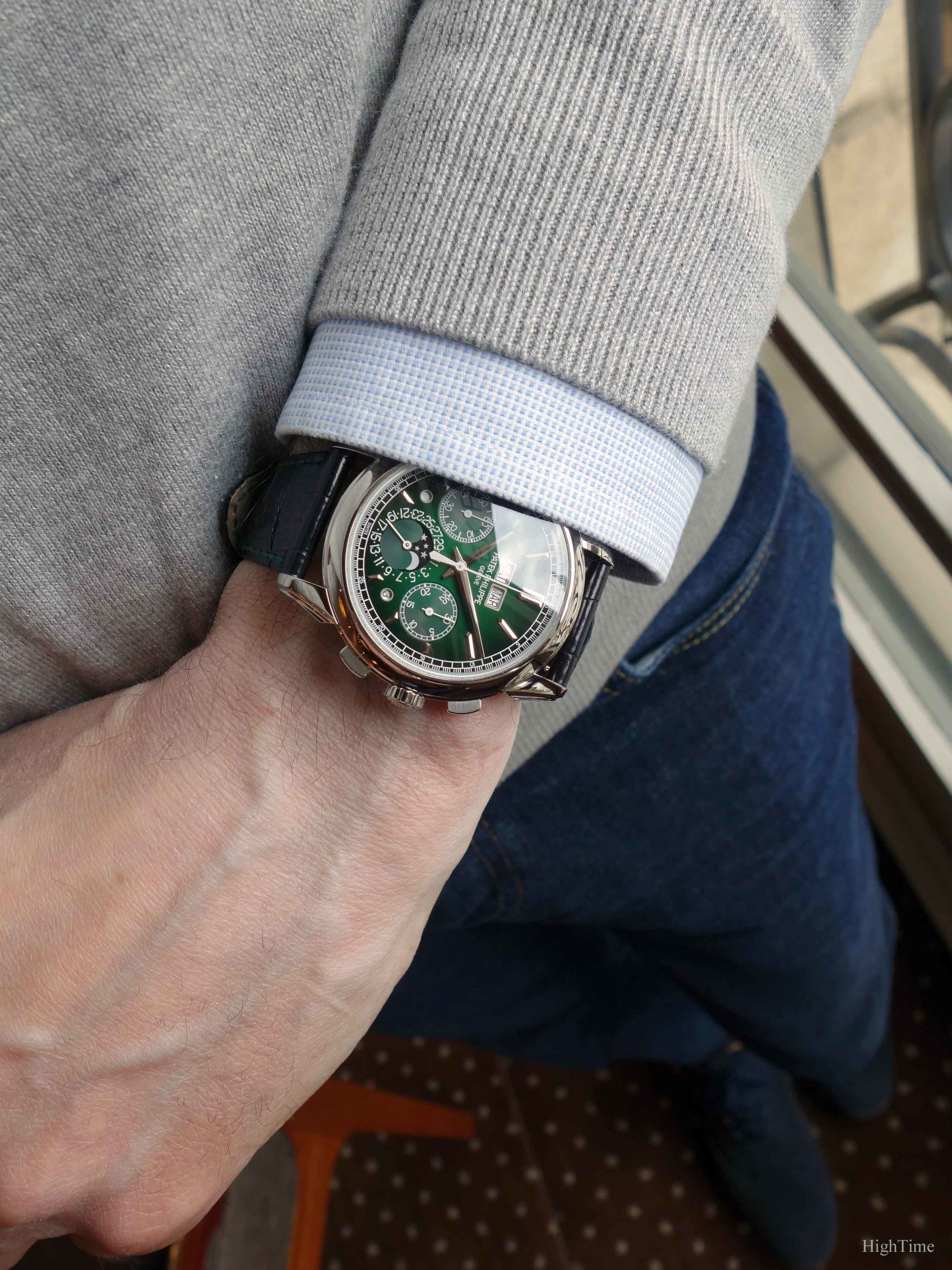
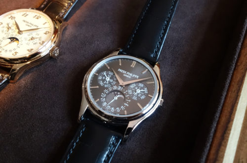
Hence, it is nice to have a look at something new and accept to give it some thoughts. Indeed, after several decades of mainly very sober silver, black and blue dials, we had been given a wonderful honey salmon dial 5270P version, with arabic numerals (not batons markers) and its Tachymeter scale (here below). It brought a little more twist while remaining traditional.
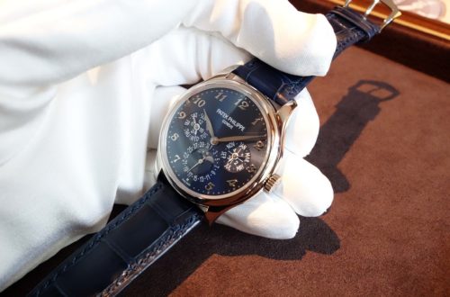
But today, no traditional classic no more in the sense the brand has gone for something much more daring. Patek has chosen the more casual layout and dressed the 5270 in maybe the best green rendering we could have seen or even thought of. It looks incredible and, even more, just “right”.
Oh.My.Dial.
Yes, it is green
We have already been impressed by many Patek dial decorations over their history. It already started from the early beginnings with silvery dials when playing in many ways with fonts, markings, hands and markers’ shapes. However, in terms of dial colour, hence coating technique, I think that it started (for me) with the Nautilus (I leave aside the rare handcrafts like Enameling).
A dial is usually not covered with a one-colour coating only. It would look dull and too fade most often. Textures and coatings benefit from several layers of different colours and/or from different ingredients the material is composed of. Indeed, a colour in subsurfaces remains visible through the last upper layer. This is what makes a colour, especially in paintings, playing with lights, showing different tones regarding the angle, etc…
Adding to this mastery and know-how Patek Philippe is known for (as “Stern Frères” dial makers, before it acquired Patek Philippe in 1932), the way they are applied has evolved as well. Quite recently, the gradated effect is maybe the idea of the century (think about the 5170P, 5205G blue, 5930G “Singapore” or 5930P).
This is exactly were the unique and stunning effect of this green dial comes at.
I know the arrival of a green colour was a surprise and made some amateurs of traditional watchmaking having doubts about it. I wasn’t sure about this move either because I was worried I would get tired of it after a while. It is of course too early to tell but what I can tell you here is what I think one month after they were released, a few days after I handled it twice. Overall, to be short, in this very case, trying is adopting.
Indeed, yes, as usual but especially for such colour, the “live” experience is mandatory to make a reliable final opinion. This dial provides a “wow” effect that remains impressive each time you see the watch again and again.
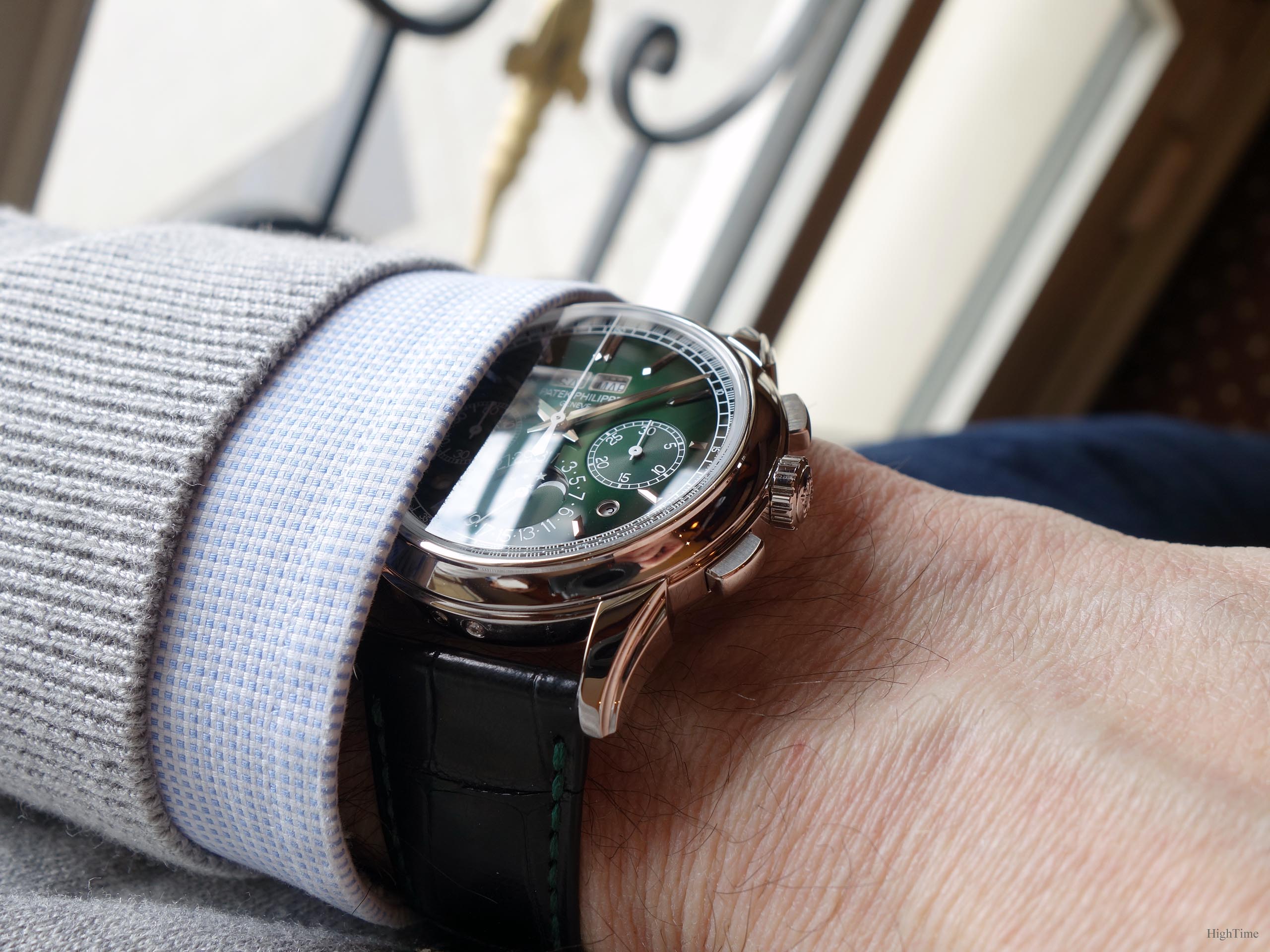
A huge part of this lies in the fact it is lacquered. We already knew a few Pateks with lacquered dials in the past but not in green obviously (until last year’s 5930P which is similar). The result is that the dial is shining, the colour looks very clean, the contrasts are sharp while the gradated effect remains very smooth and progressive.
As you may have noticed, it is darker near the edge, making a contrast with the center. This also participates in decreasing the dial’s visual size, hence the whole watch. A homogeneous single green dial would have looked a little lacking of originality and would perhaps have been a little boring to look at. Hence, would have been at risk to go out of fashion.
Together with the more casual white markings and the more modern non-serif fonts, I think this dial showcases a contrast increasing the powerful impression the watch leaves. I guess this is also a reason why the dial is (a little) cleaner, why the Tachymeter scale was removed.
This being said, I don’t think I would use it as a daily wearer, several weeks in a row. It is a watch that will, each time you get it back on the wrist after a few days, provide the owner with instant renewed joy. Hence, it is the kind of watches that arouses excitation on the moment you think about wearing it again or at least having a look at it where you store it. Imagine yourself during the day thinking about how eager you would be to come home sooner to see it again. That’s the idea. Personally, I wouldn’t wear it everyday but certainly won’t remain too long without wanting to feel this experience again. To say it differently, it isn’t a piece you can leave in the bank safe.
Only a few watches can provide this kind of excitement regarding a dial, really not many.
We often talk about finishing, which usually deals with metallic parts (bridge edges, dial-side elements…), as a sign of craftmanship long trained skills, hence value. However, I believe that dealing with dial coatings (lacquers especially or galvanic treatment) is something that not many brands can master the same way Patek does. Metallic dials (sandblasting, brushed, sunrays…) aren’t as difficult to perform than choosing and mixing tones, applying a flawless texture while dealing with subdial differences, etc…
Yes, this 5270P doesn’t wear a classical outfit but the dial flawless surface is of the highest level. More than that, poviding the kind of pride and pleasure we seek regarding watchmaking and that not many pieces can offer. Besides, people who prefer much lighter, purer and more modern dials will also favor this iteration.
To say it differently, this dial is more exciting and appealing on the moment than a silvery one. I don’t say it is better on the long run or in absolute but just that (as long as you don’t hate green) it gives much more on the moment. Like a slice of Tiramisu: it may be too rich to eat a whole plate but eating a small portion from time to time is a supreme delight.
More on the dial side
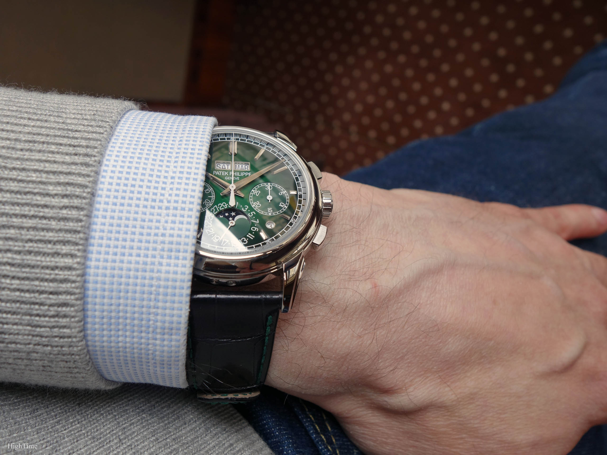
Aside of the colour, applying any kind of markers (numerals, batons, cabochons…) is another of the obstacles that can lead to higher mistakes (cracks…), thus ruining the dial during the crafting process. You can by the way notice the subdials have a circular micro-groove decoration which the white printings mark the place.
These specific Dauphine hands are the kind we’ve seen only quite recently in the collections. They are squared and 3-side faceted. Yet, they don’t have Luminova on the contrary to the 5170P or 5204P as there are enough white parts already.
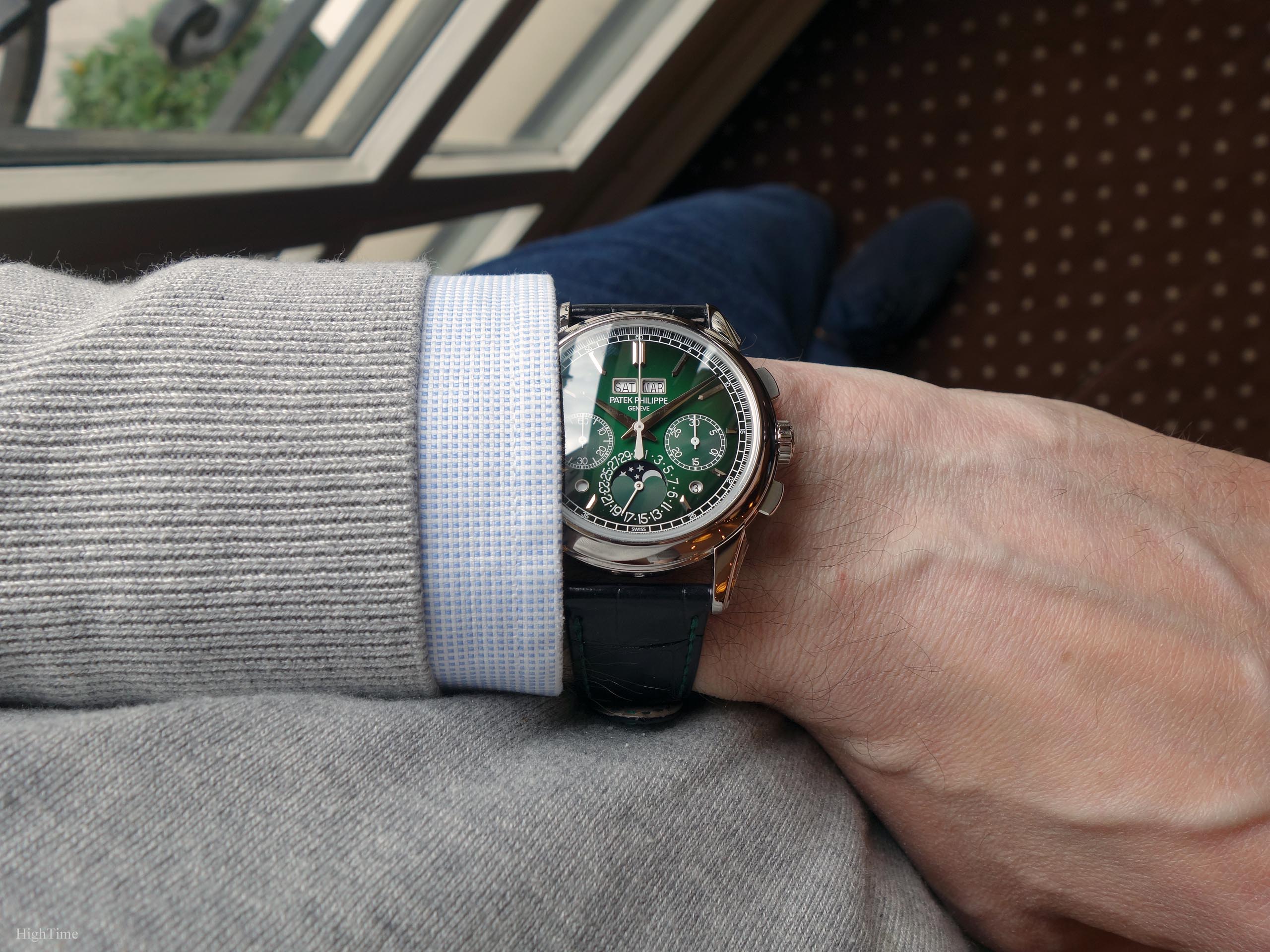
The small subdial hands are extremely thin and bring more lightness and a little modernity to the dial (vs leaf ones). It reminds us that watch mechanisms are made of very small and thin elements. It brings coherence and lightness as well.
For the rest of the dial, we notice the applied faceted markers (with pointed ends). They shine in a harmonious way and demonstrate the high finishing these watches hold (not only the 5270).
The romantic case
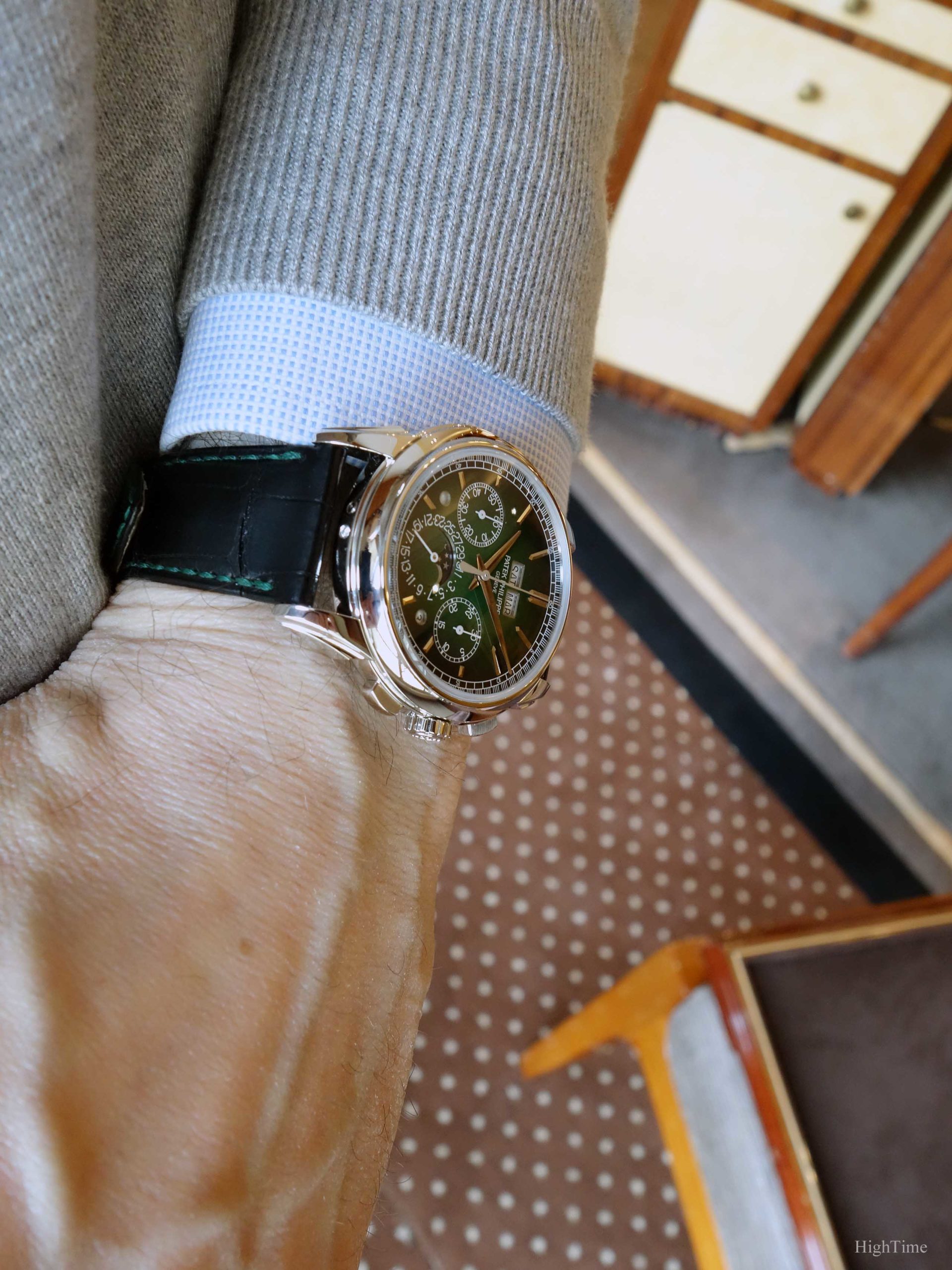
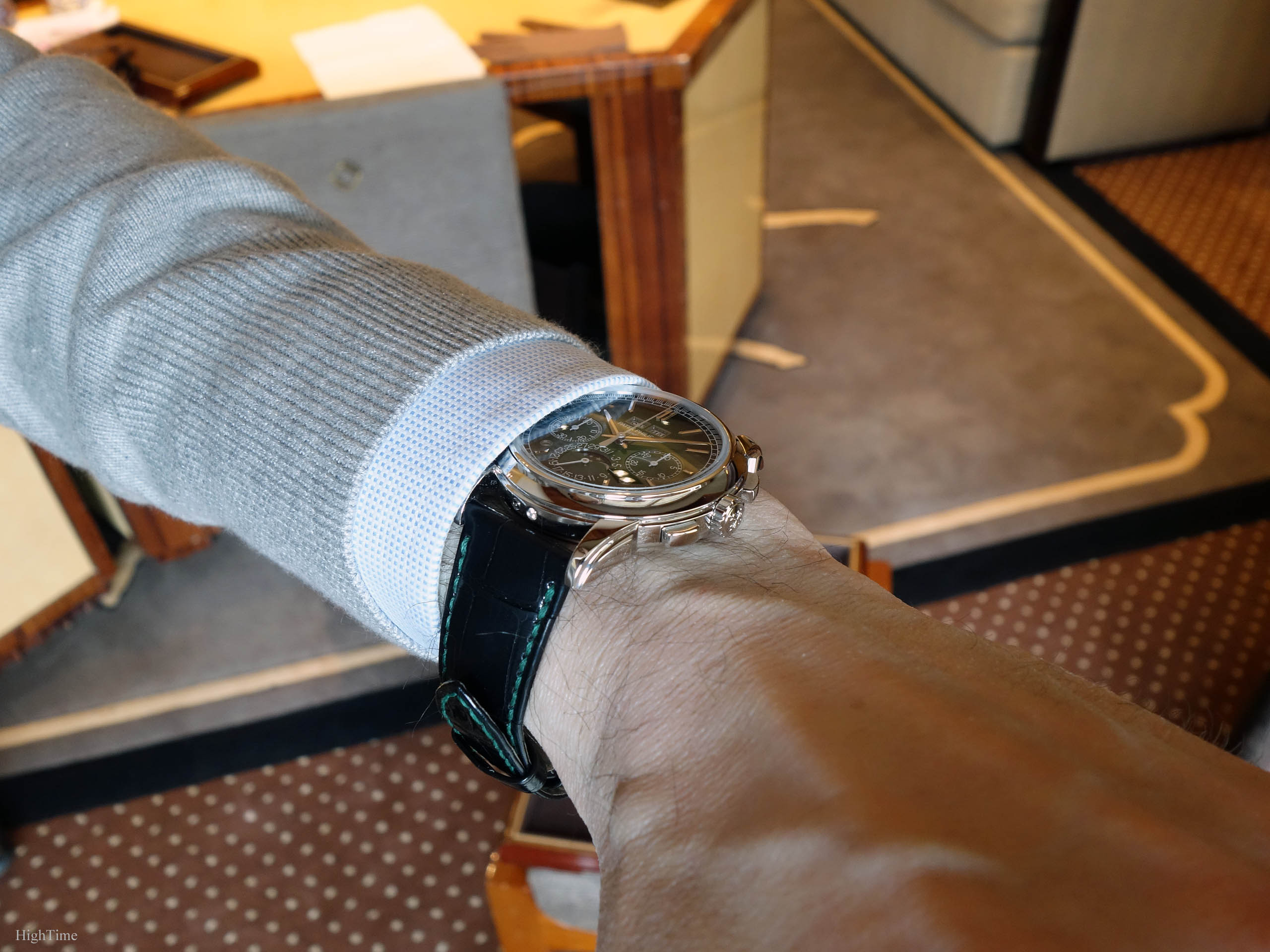
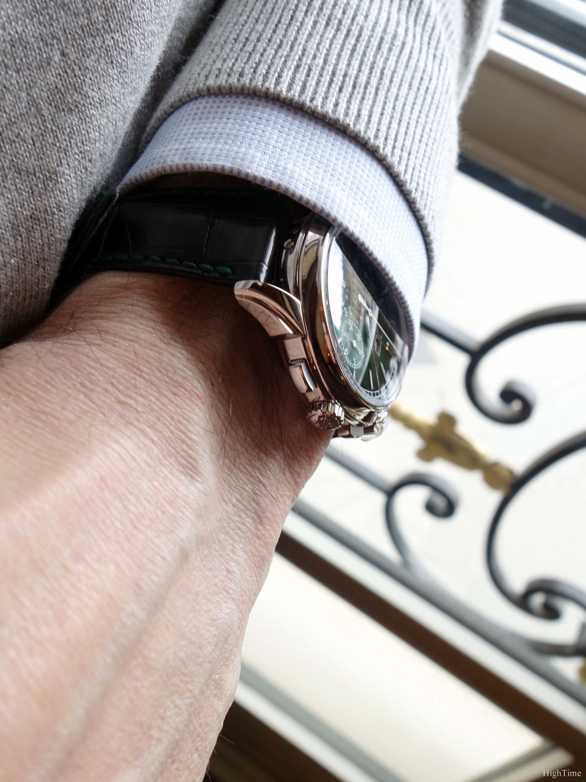
The 41 x 12.4mm case, especially when paired with the gradated dial, looks surprisingly thin for its complications. I think the last time I saw a 5270, it was in 2019. I had forgotten that aspect, hence it appeared more clearly when I tried it.
This case is one of the examples showing the effort the brand puts in their designing and making. Many different shapes to craft, requiring polishing while preserving the edges.
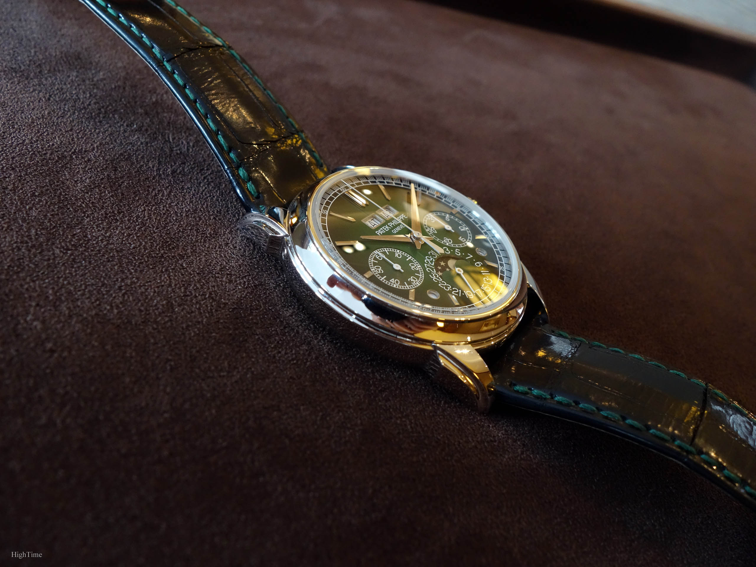
The case still has its very appealing and updated lugs‘ shape. I particularly like the grooved upper edges of these smoothly refined lugs. Together with the concave bezel curves, the case is elegant, remaining on the traditional side (on the contrary to the dial) which provides this 5270P’s adequate aesthetical balance.
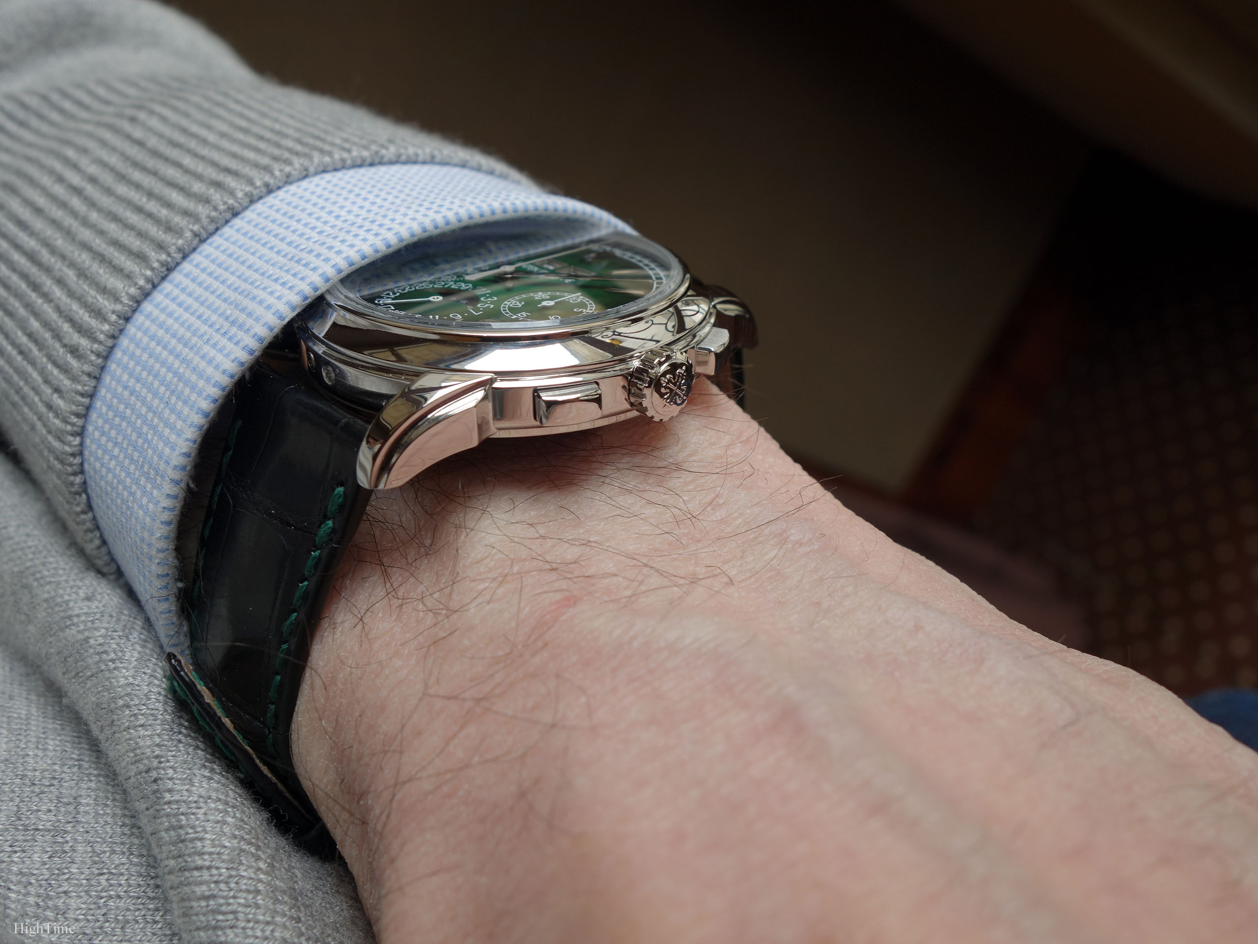
The crown is very comfortable to handle and is dynamometric, hence equipped with a kind of sliding flange in order to preserve the spring barrel from over-wind pressures. It also provides a stop-second feature.
In addition, the pushers are rectangular with brushed sides: the perfect combination, as it limits the amount of light reflections. Elegance is in the right proportions, it is classical and modern. The pushers’ activation is very smooth thanks to the presence of a column wheel and the quality of the parts’ finishing. As I mentionned before, they still allow the owner to feel a light “click” when activated and avoid being too “buttery”. This comes from the addition of jewel bearings (lightening the load on pivots) and the improved cam settings design.
The 5270P green dial is provided with a black shiny Alligator strap with green stitching and its platinum deployant buckle. It is provided with a platinum solid caseback in addition to the sapphire one.
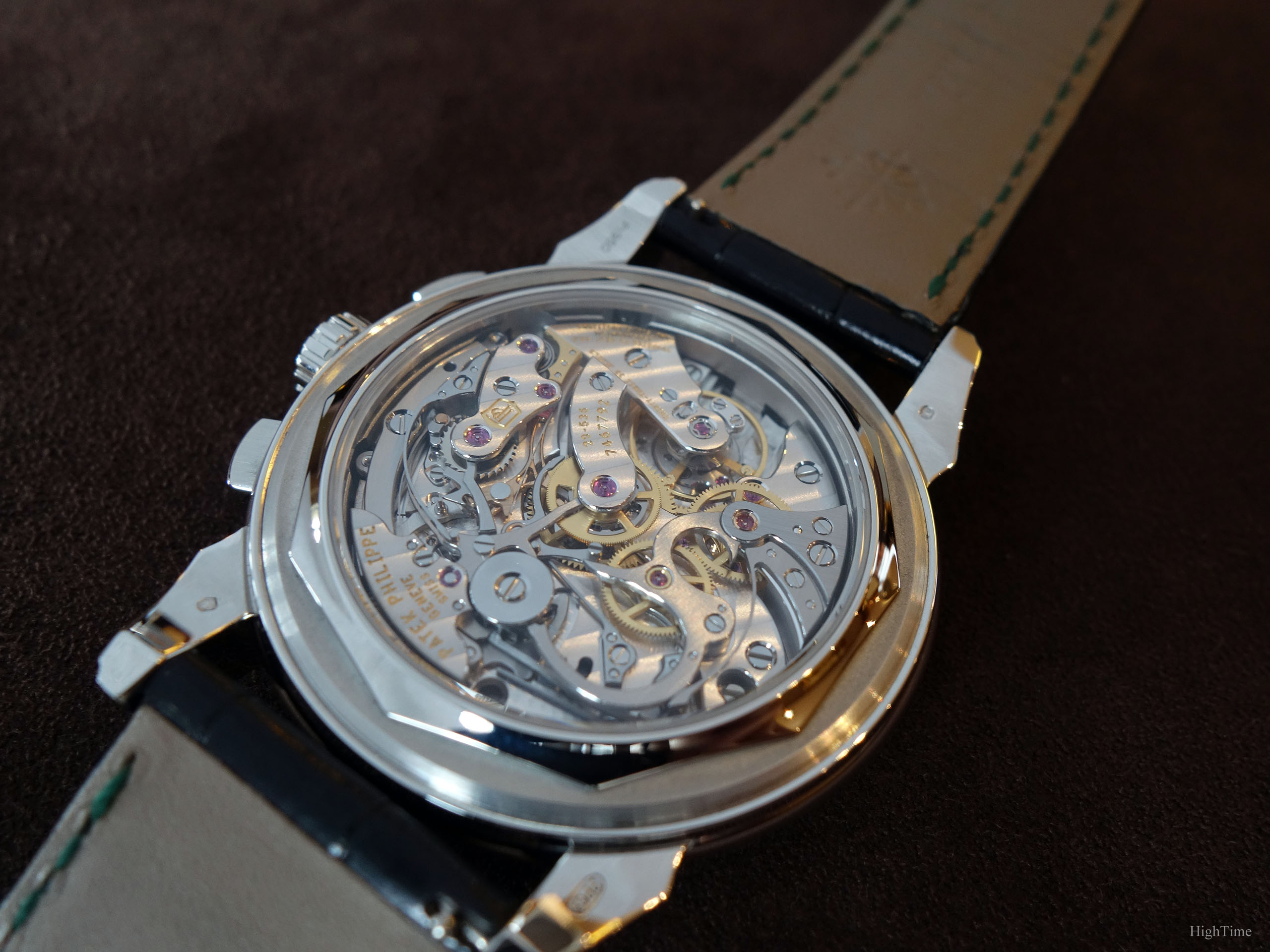
An exceptional movement for a drooling dial
I won’t talk too much about the movement as it is quite well-known but we are dealing with the manual-wound CH29-535 caliber (in the PS Q specification).
The movement is very well finished, with very thin beveled edges (whether on bridges or cams and levers), beautiful Cotes de Genève (which remain hard to make without flaws) and extraordinary perlage patterns. It is very well balanced and was made with very fine taste, in terms of rubies with golden chatons or colour choices; it doesn’t look “heavy”.
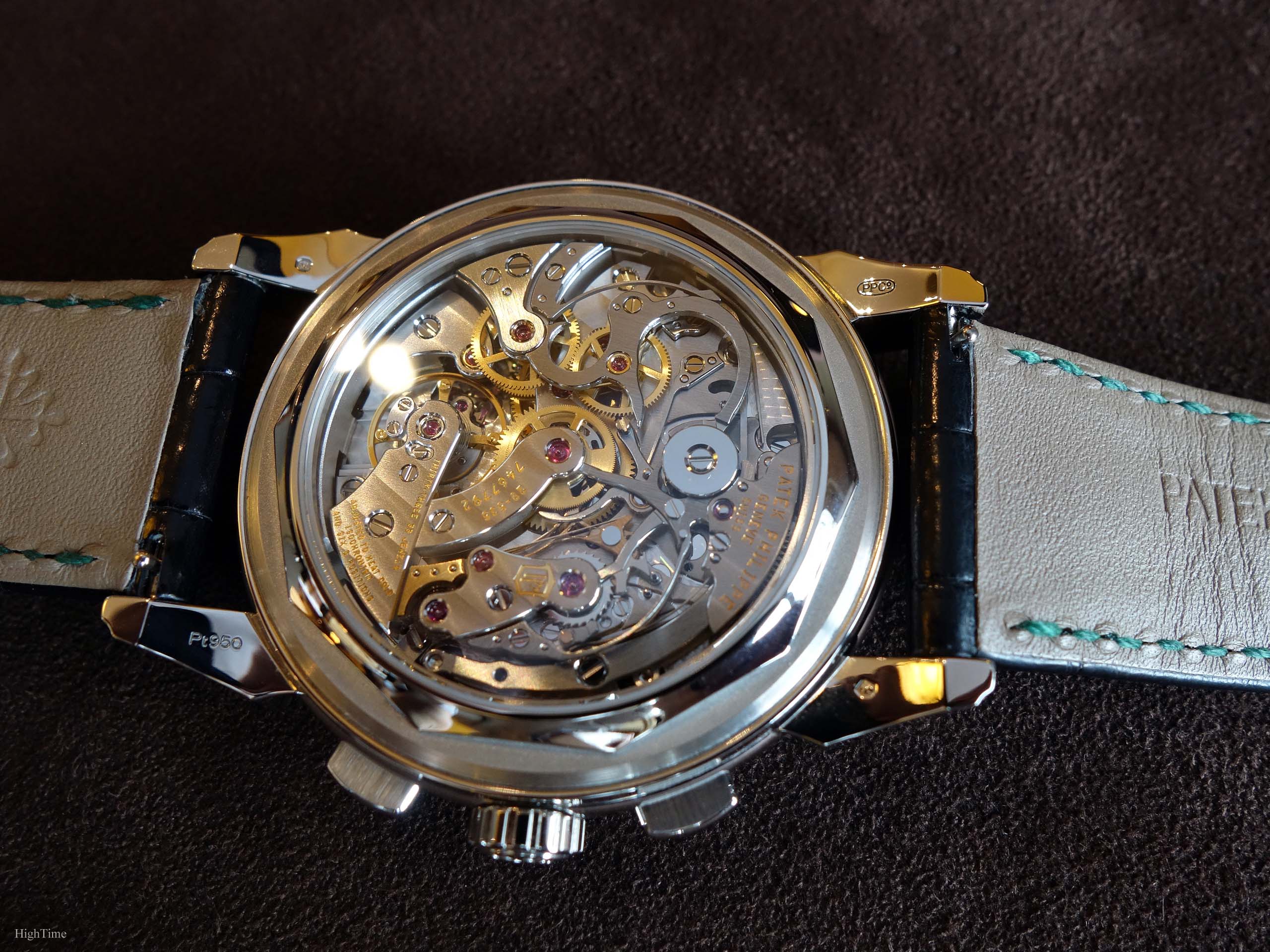
The main lever used for the chronograph clutch mechanism is beautifully shaped and finished: it marvellously hugs the bridges’ round shape. It may be the element I like to admire the most on this side.
As mentioned before, the evolutions are functional and clever ones, especially in a field where sometimes brands bring complications just for marketing purposes but not for working improvements. The 29-535 isn’t a transfer of the Lemania movement, it has been designed from a blank page, yet in the traditional way, with a column wheel and a horizontal clutch.
I particularly appreciate it when I know that a movement contains the brand watchmakers’ work after they’ve been working right from the beginning. It was inspired from their own previous experience.
You will find more details about these patented improvements at the end of the post in the Appendix. Please, note that the QP version has additional improvements too. This movement contains more engineering work and intelligence than previous models and is a great evolution. Watchmaking has always been (aside from asthetics) about improving mechanisms for accuracy and reliability.
This being said, I think that all previous movements marked Patek’s history, especially when considering finishing mastery at the time they were made.
To end with, the 29-535 beats at 28,800 vph with a power reserve of 55-65 hours. The 5270P is 30m water-resistant.
Conclusion and Thoughts
I can’t say it in a simpler way: the 5270P with green dial is just exceptional.
It’s a reference that gathers Patek’s technical prowess as a watchmaker with their aesthetical dial craftmanship mastery.
Style slides from a generation to the next one, following or creating new standards. Those Patek Philippe lacquered gradated dials are outstandingly attractive but this doesn’t mean either that we can establish a ranking of the different versions since the launch in 2011. The 5270P with its green modern dial is definitely something new and fantastic to look at. This is what sets new landmarks, since the gradated effects in the 5170P till today. Doing something appealing people talk about is nice for a brand but doing it by using the least easiest way with such colour in the first place, is another story showing the brand’s mastery in that field. This self-confidence is what a brand gets thanks to its previous achievements. Patek Philippe, an old school looking brand? Well, I don’t think it is well knowing their collections and evolution and this piece reviewed here is showing another of these steps in their long lineage.
In any configuration, I think the 5270 reference is still one of the most appealing modern Chronograph Perpetual Calendar, not only in terms of aesthetics but also mechanics. It is one thing to make an in-house movement inspired from older famous calibers but it is something else to make it with smart improvements and adding another “brick” to the construction. This never-ending quest for improvement is what watchmaking is about. It hasn’t stopped in the 1990’s-2000’s. Nor has it at any moment in their history.
Anyway, I believe you should have a look, in the metal, to really comprehend it. Even if you don’t consider buying one. Don’t miss it, just have a look to know what it is like.
A Chronograph Perpetual Calendar from Patek is always something else, but in this case it is even more so.
As of early 2022, the Patek Philippe 5270P-001 Salmon dial was discontinued.
The MSRP of the Patek Philippe 5270P-014 green dial version is to date (2022) 189 500 € (VAT included) and you can find more information on Patek’s website, here:
The Patek 5270P on the official website
Thank you for reading!
____________________________________________
Appendix: Six patents behind the CH 29-535 PS movement (from Patek Philippe’s website)
IMPROVED SYNCHRONIZATION BETWEEN THE CLUTCH LEVER AND THE BLOCKING-LEVER
Ordinarily, the clutch lever and the blocking-lever are synchronized by the column wheel. The engineers of the CH 29-535 PS eliminated this intermediate step by fitting the clutch lever with a finger piece that directly synchronizes both the clutch lever and the blocking-lever. This solution simplifies and improves the precision adjustment of the control sequences because the watchmaker only has to adjust one point instead of two as was the case in the past. Moreover, this approach suppresses the jump of the chronograph hand when time measurements are started and stopped.
IMPROVED PENETRATION ADJUSTMENT BETWEEN THE CLUTCH AND THE CHRONOGRAPH WHEEL
The adjustment between the teeth of the clutch wheel and the teeth of the chronograph wheel is performed by a large eccentric column wheel cap, working directly with the tip of the clutch lever instead of the conventional eccentric placed next to the clutch wheel. This new system enables a more precise adjustment of the penetration between the clutch and the chronograph wheel.
SELF-SETTING RETURN TO ZERO HAMMERS
The reset hammers of the chronograph counter are equipped with a self-setting system that makes it unnecessary to mechanically adjust the minute hammer function and thus increases the reliability of the mechanism.
OPTIMIZED TOOTH PROFILE
The wheels of the chronograph mechanism feature an exclusive patented tooth profile (presented for the first time in 2005 when the ultra-thin caliber CHR 27-525 PS split-seconds chronograph was launched). It eliminates the risk of hand jump in both directions when starting a measurement ; limits the quivering motion of the chronograph hand ; increases energy transmission efficiency, and reduces friction as well as wear in the movement.
PIERCED-OUT MINUTE COUNTER CAM
A new minute-counter cam was created with a slot to prevent abrupt blocking in response to the reset command and therefore eliminates hand quivering.


2 Comments
Pete D.
Charming review of a truly stunning piece! I had the chance to handle the green dial 5270p at the London Salon recently and I was absolutely blown away by the impact of the ombré green, balance of the dial without busy tachymeter scale, elegance of the concave bezel in disguising the overall dimensions, and even wearability on not-huge wrists. Thanks so much for bringing even more details to life on this very special piece. You’ve got an excellent eye.
Mark
Hi Pete,
Thank you very much for your kind words. I’m glad you have also enjoyed observing the 5270P’s details and how it impacts its visual and wearability. The experience in a Salon is clearly a nice way to discover watches. There are so many details we don’t see at first but which make a watch (or any object) far better or more appealing than we thought. Patek masters well cases and dials design for sure.
Enjoy the discovery!
Best.