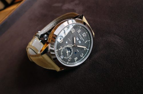
The Patek Philippe 5172G Salmon dial – Expression of tradition or…
Hi everyone,
Manual-wind chronographs are a field on their own at Patek and not only for them but among traditional established brands, over many decades. Today, I would like to have a view on the second version of the 5172 family: the Patek Philippe 5172G Chronograph with Salmon dial. It has been released last year and remains their first Salmon chronograph in the regular catalogue. Indeed, aside of maybe quasi-unique pieces made on order for older loyal customers, the previous Salmon dial chronograph was a 5070G-014 limited edition (5 pieces) released for the London exhibition back in 2015.
In the contemporary and very attractive blue dial 5172G-01 (2019), I remember wondering whether there would even be a traditional version for this generation. Indeed, in its will to modernize the brand’s image, Patek could have chosen to propose modern variations only. Meanwhile, I felt at the time that a more traditional layout could look very appealing with such a well inspired case base. With this Salmon version, it isn’t just about a dial color change, it’s about a totally different spirit while moving the cursor back toward the more classical field.
What we used to call “neo-vintage” was just a new expression of style. We’ve been able to see some very nice versions of casual/classical watches in recent years. However, while this Salmon dial version of the 5172 looks rather traditional, without for instance the higher contrasted markings we saw in the 5170P, 5140P Grey dial or 5270P Green, it might not be that simple. In a way, it can certainly be viewed as a kind of step back to the roots of the brand which used to remaining rather conservative historically. Indeed, the brand maintains here a very well tuned balance between 2 different sides of traditional watchmaking. This Salmon version is back to the warmer and more classical side… at least if keeping the brown strap. Because, yes, it’s a whole different story if you decide to switch for other colors.
Such an attractive complex gold sheath
The 5172/5320 case is one of my favorite in recent years. This is an area where I regularly focus on as I love what they put into their general body designs whether we talk about lugs or case profiles. It’s a major asset of the brand we don’t hear enough about and it’s a significant differentiating factor compared to many other watchmakers. That area takes its part in Patek’s prices. The more concave/convex curves, playing with the proportions, switching from round to square lines on a same profile, using splited case parts to embelish the design (like a 5326G or 5975 for instance), the 5227 officer’s caseback, the harder it is to design, to craft and, even more, to finish.
In 2017, the 5320 Perpetual Calendar (picture below) was the start of a new case line with its distinctive triple-tiered lug profile, case band and dome-shaped glass. The 5172 family is a complication variation of this design.
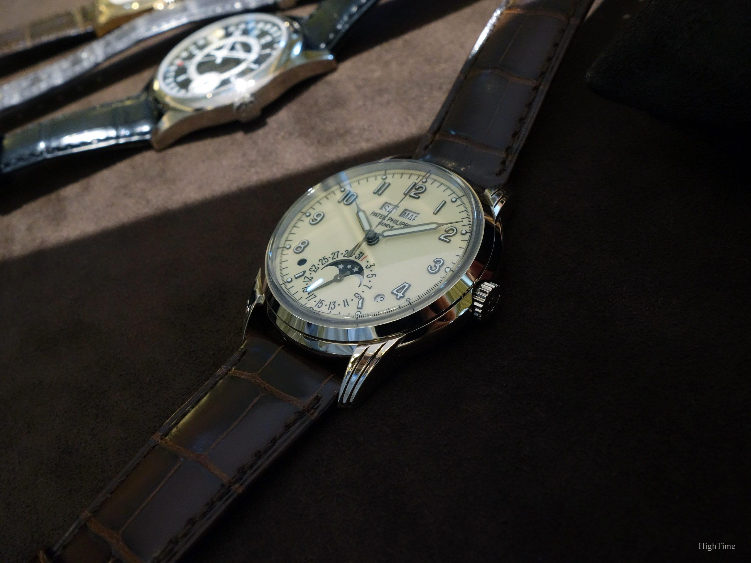
On the contrary to the “punched” 5320’s whole case, the 5172 is made by adding to the case the lugs that are prepared separately. This is due to its slightly bigger size (41 vs 40mm for the QP). As Patek studies the best way to design each case, caliber main plate or any other parts of a watch’s design and as they showed in the past (with the 5930 for instance), they aren’t afraid to modify an accomplished design if necessary, even for such similar versions.
Back to its aesthetics, when looking at the lugs in particular, the observer is glad to find again the same craftmanship skills expressed through the different “steps” remaining sharp after the fine polishing. More precisely, the decoration has to combine a certain sharpness together with smoothness: it isn’t just about aesthetics but about feeling. This distinctive strength of Patek becomes even more obvious when compared to others, in the metal, and that you can’t assess from internet pictures.
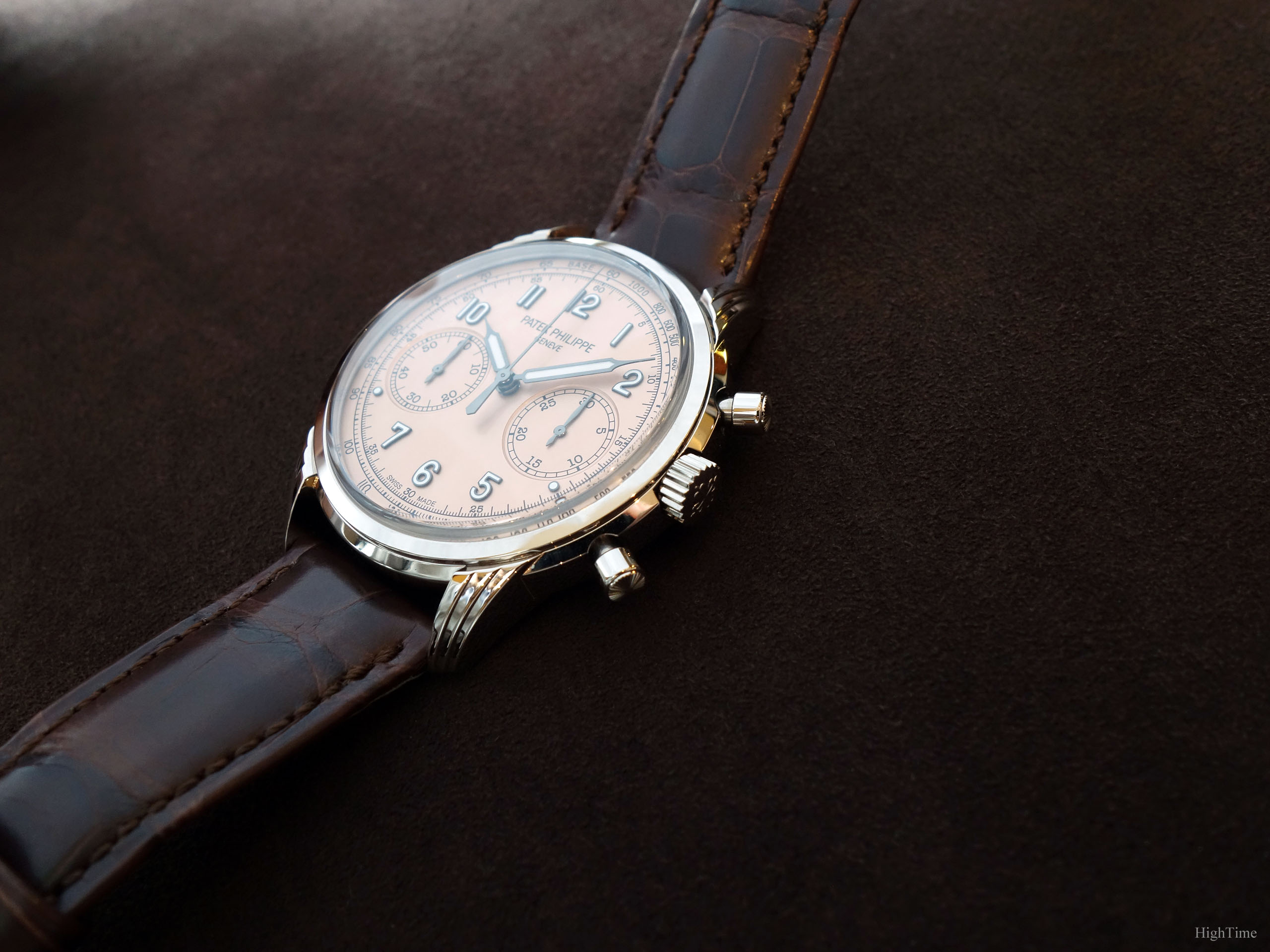
This is an illustration of why the brand’s early plans included rare handcrafts and craftsmanship training in the design of their new building (delivered in 2020). In the early and mid 2010’s, the growth of this market put a stress on the recruiting process. Considering the high level of skill required specifically for finishing watches, hence the number of years of practice, Patek knew they had to hire and take in charge the early training of young watchmakers (whatever the speciality) inside or outside their own facilities. This is no gimmick as it has a high cost (CHF500m) but it pays on the middle to long term. Historically investing heavily in craftmanship on the long run is a part of what helped securing Patek’s position today.
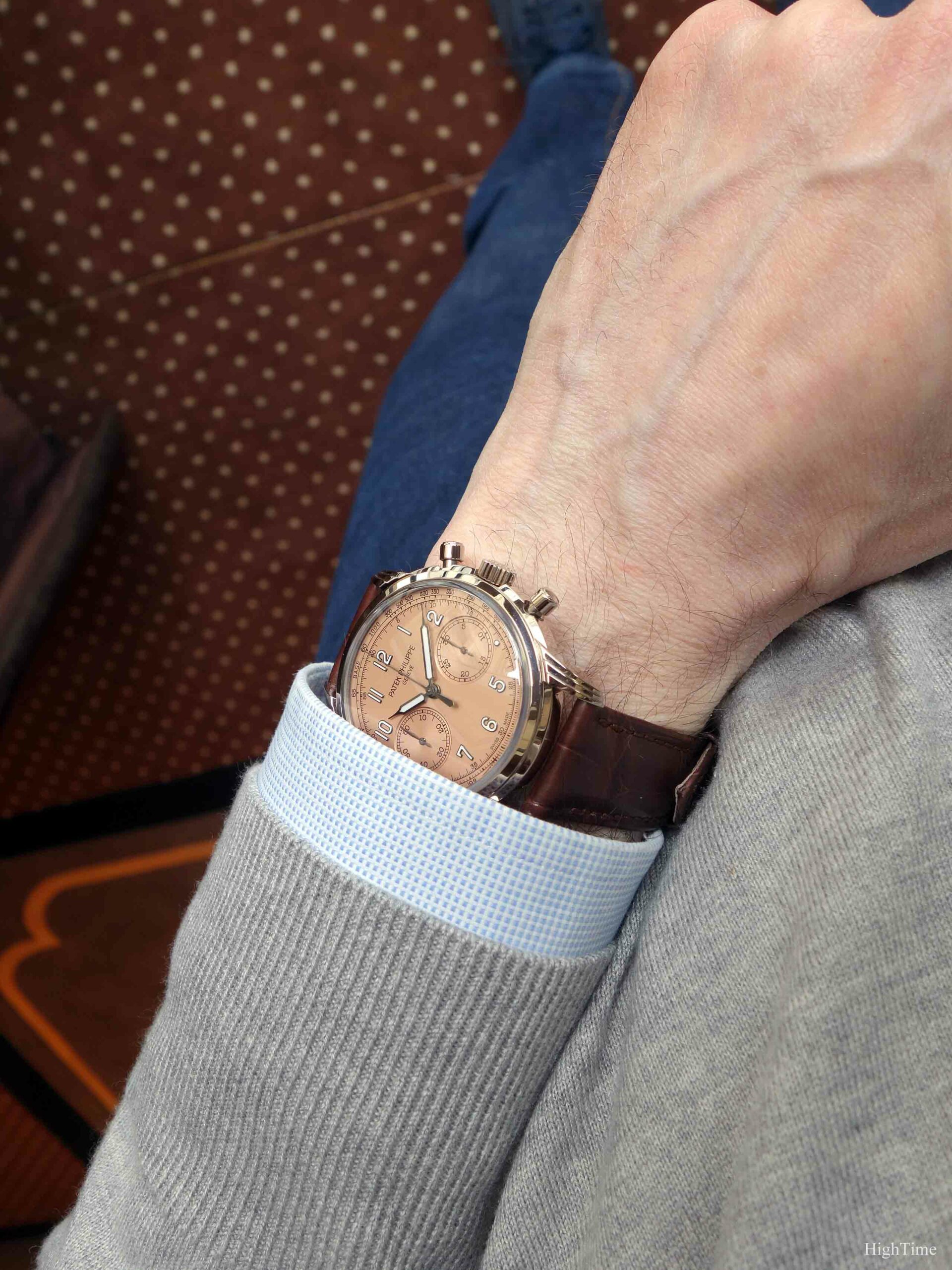
Regarding its dimensions, the 41 x 11.45mm is in today’s standards (even if I personally prefer a 40mm diameter considering my 16cm wrist). Diameter is a totally subjective topic as it relies on the wearer’s wrist size and what observations we experienced in our close environment. Sizes (and people) have increased since the first half of the 20th century’s 30mm and we see more and more owners preferring bigger watches, not forgetting regional differences, more or less sporty outfits, etc… Hence 41mm for a chronograph looks to be the right balance, especially from what we see in the watch world and that our eyes are getting used to. Not to mention a chronograph dial is obviously busier than a 3-hander, hence looks smaller.
Besides the case sits very well, even on my wrist. These lugs remain quite short, hence limiting the overall size compared to the wrist, and position the strap attachment quite low, near caseback level. The lower end of these lugs is even lower than the caseback itself. This leads to additional comfort, a characteristc of Patek pieces.
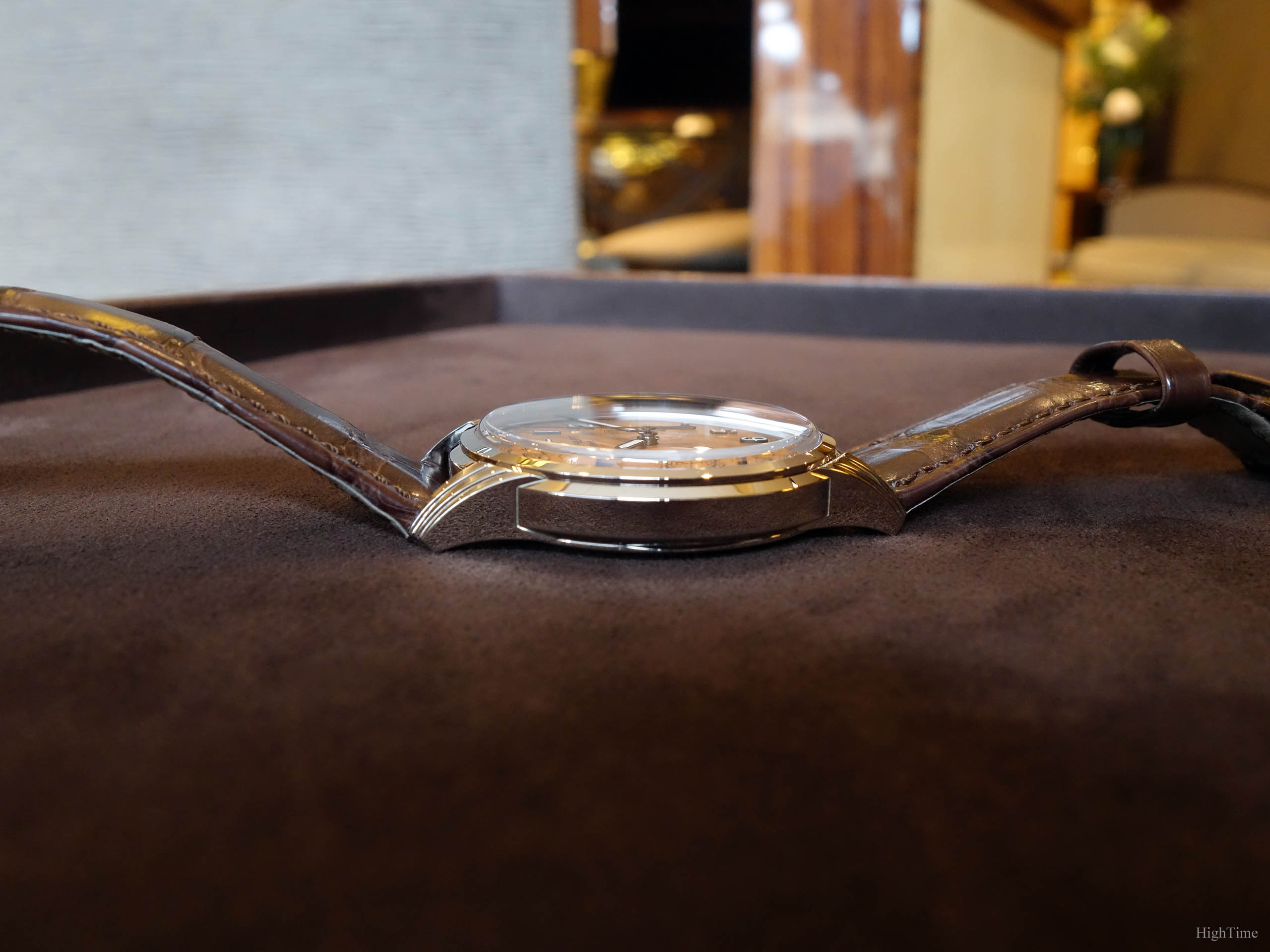
On a design standpoint, the central band you see well on the profile, visually “breaks” the length and height from a lug to the other. This is a detail I love and that combines beautifully with the pushers. In fact, this “ring” goes all around the case, crossing the lugs. I love that detail aesthetically but also in the way it wasn’t implemented randomly but from Patek’s designers choice.
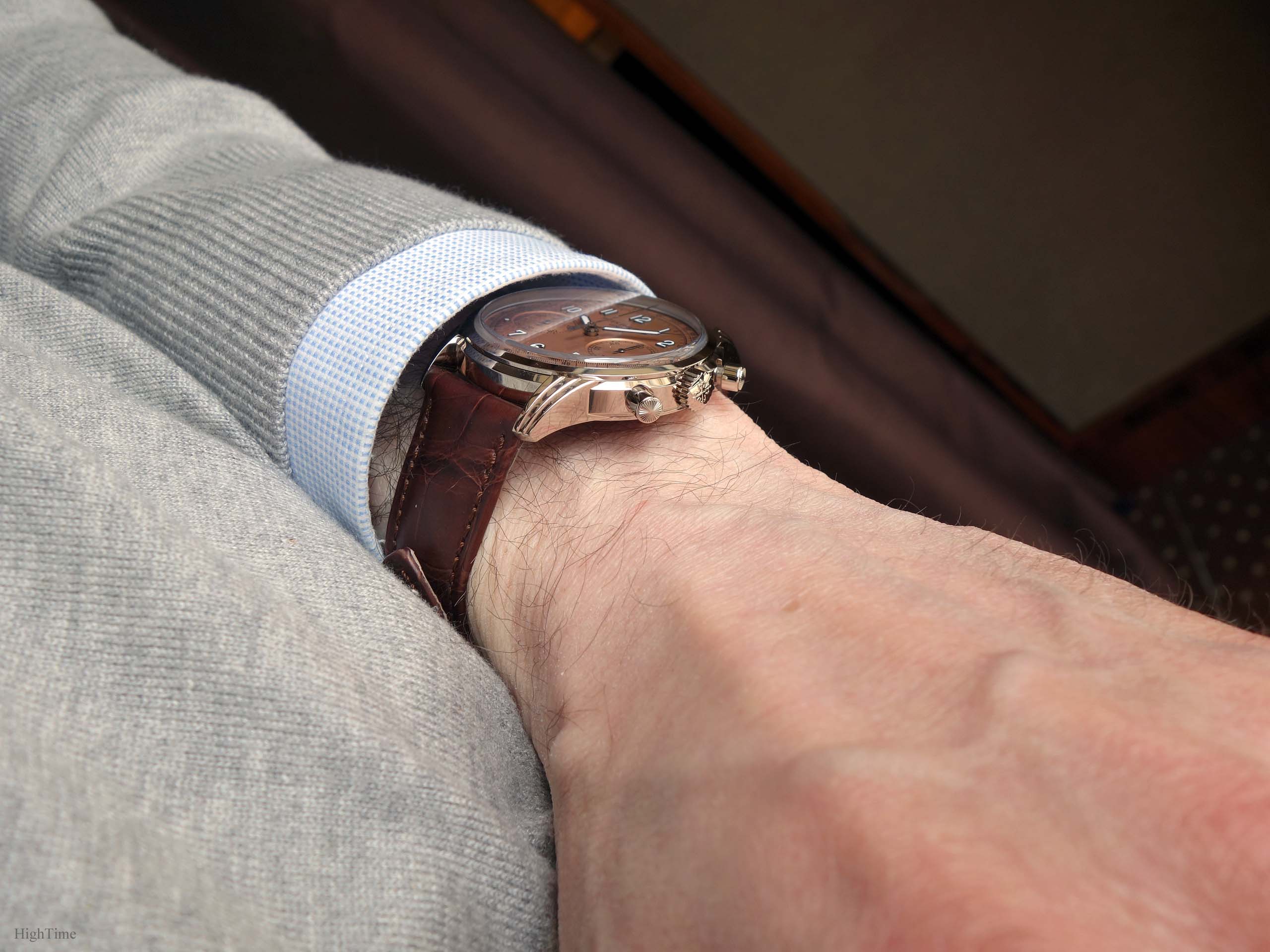
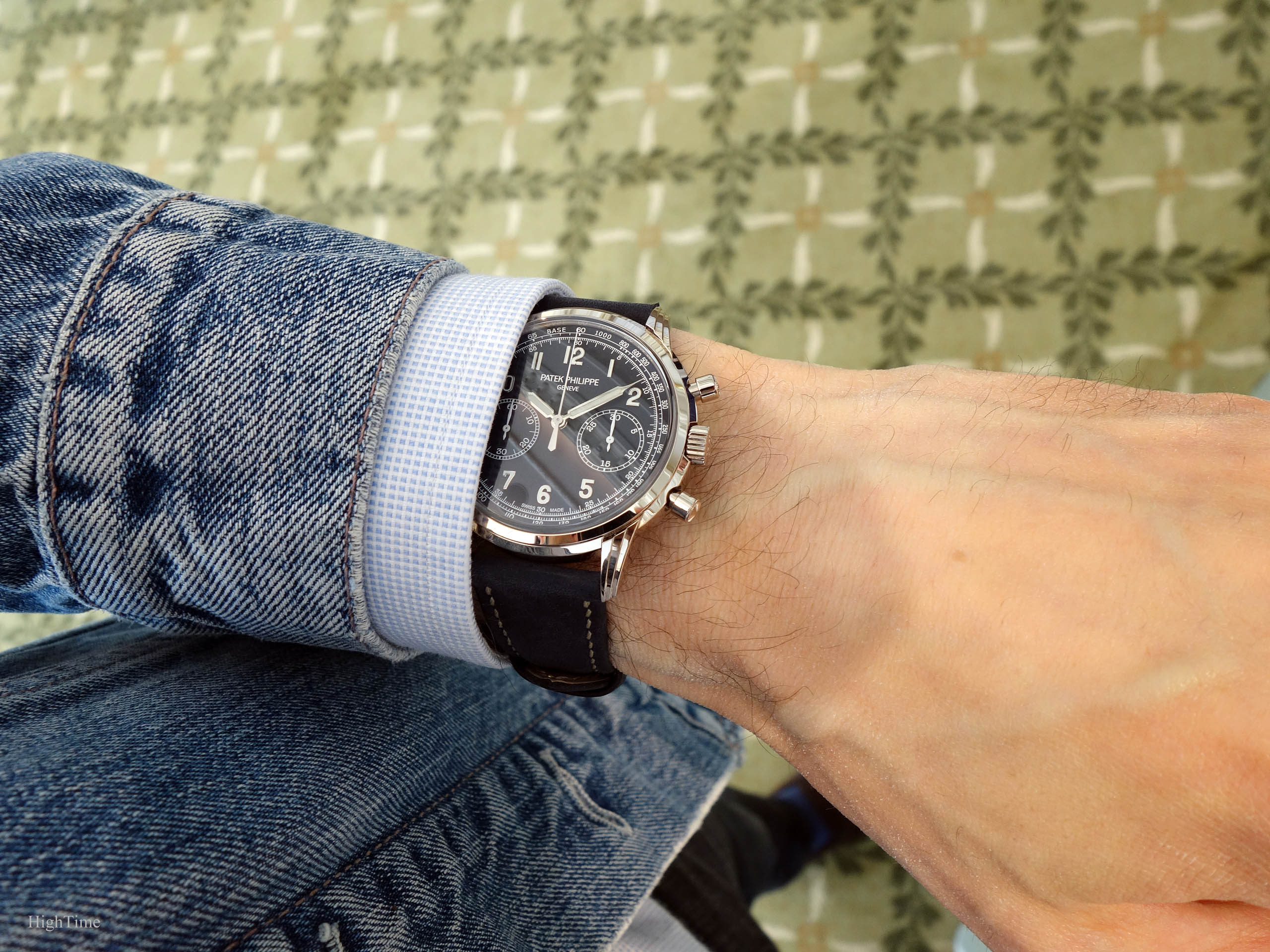
It’s very interesting to see that such case pairs equally well with a casual layout (blue version, picture below) and with such more traditional one. It’s certainly a good way to confirm a well-born timeless design.
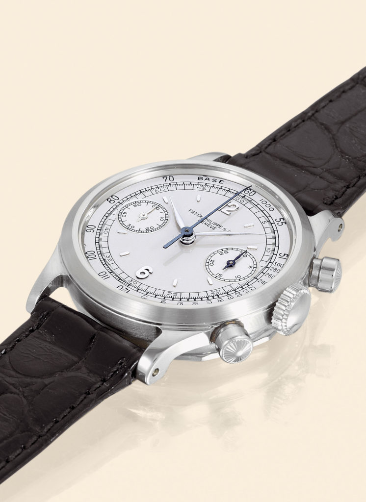
I personally think the addition of these pushers make it even better, but that’s just my bias for chronographs talking. The round engraved pushers that were introduced in the 5960G (2017, 2nd picture below) and the lady’s Ref. 7150 chronograph (2018, 3rd picture below), are inspired from the 1463 reference (1940 till late 1960’s, picture below):
They certainly match very well the traditional aspect of this Salmon dial version and give an additional touch to the show when looking the watch on the wrist. It’s definitely a detail we notice each time and we appreciate it’s been added.
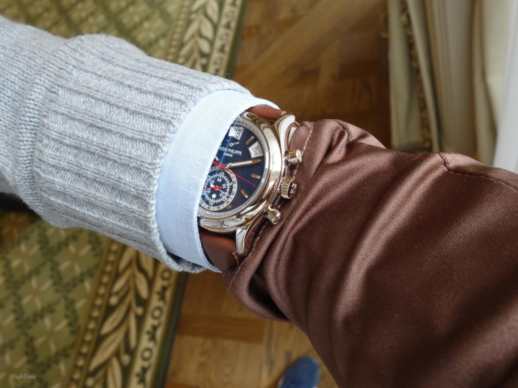
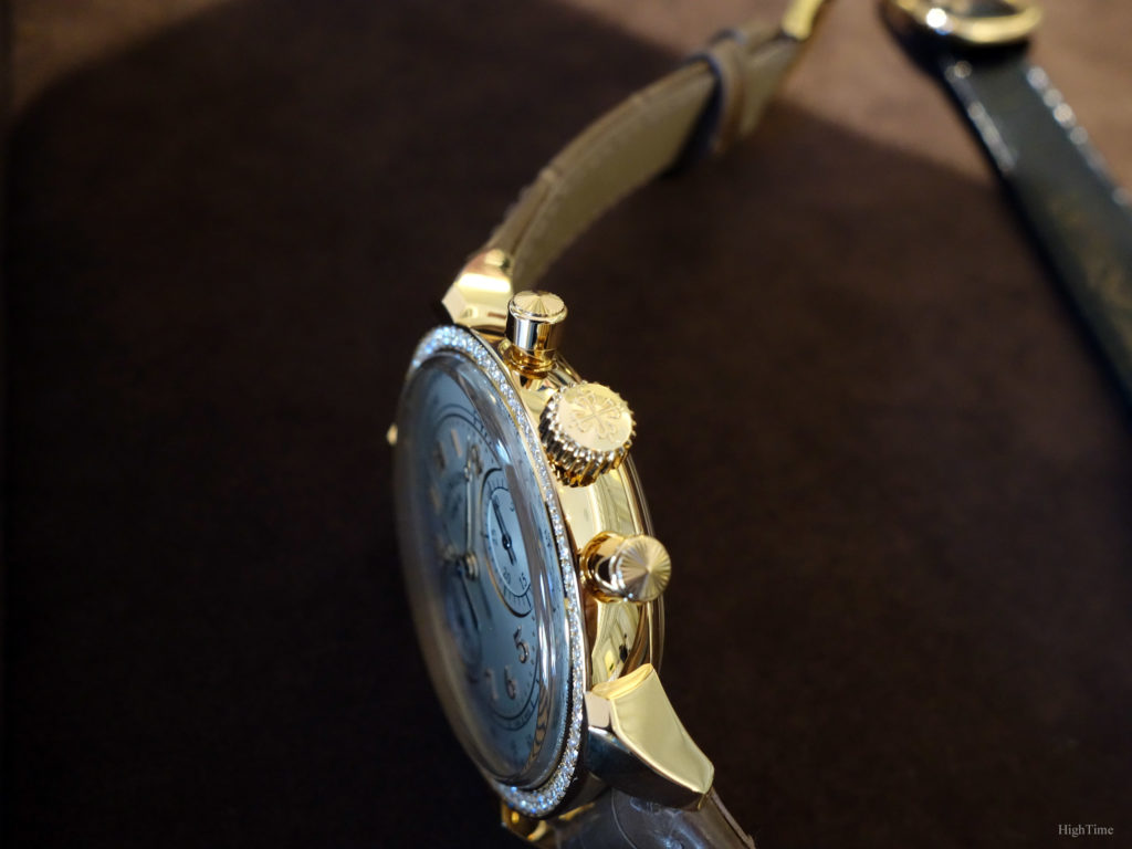
The sapphire “box” glass shape (picture below) is another aspect reminding the Hesalite versions (pre-1980’s plastic-based material). It helps limiting the visual thickness for balance as it helps reducing the case’s height. Said differently, the dial (and hands) is closer to the case’s top edge, hence the “dome” glass to raise its level. As a side note, the similar box-shaped glass was chosen for the 5320G Perpetual Calendar. However, in proportions, it looks less thick on this 5172G.
A Salmon dial to play with
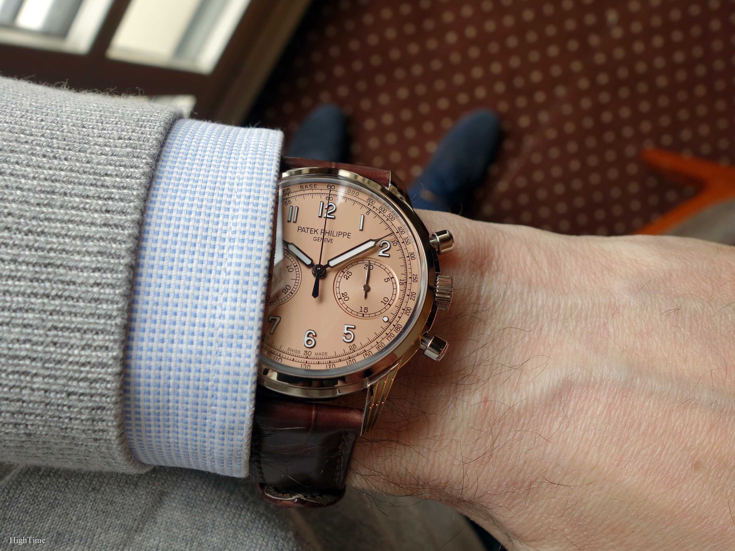
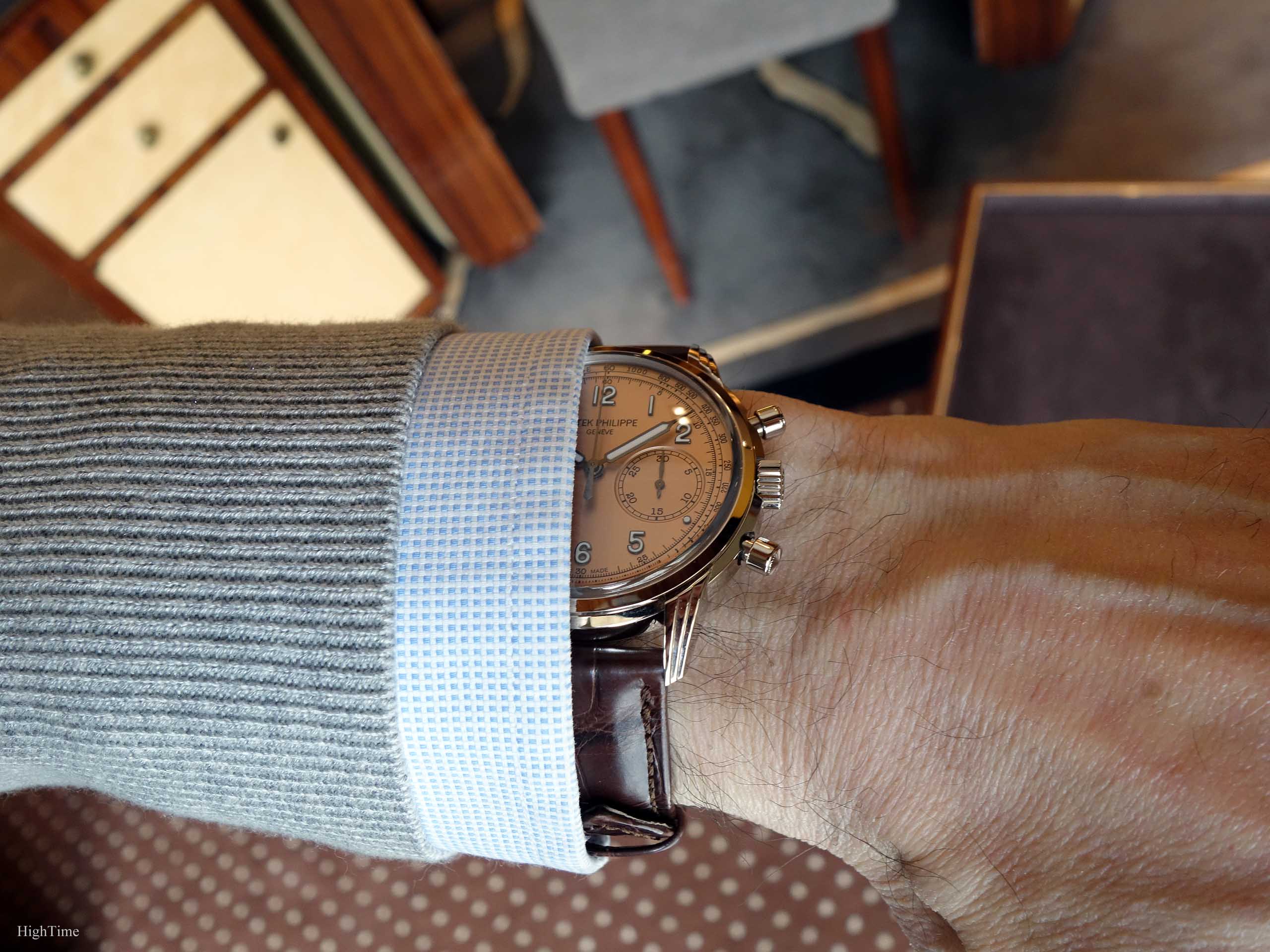
In watchmaking, and Patek in particular, it isn’t everyday that we can “play” at studying what uniqueness a Salmon dial can bring. For its second only version, as with the very charming 5320G Salmon earlier this year (picture below), the 5172G chronograph receives a pretty sandblasted copper-toned rose-gilt opaline dial. It’s a kind of dial we already observed in a similar tone in the 5024G Gondolo. The 5270P Salmon and 5450G’s tone is a little more “honey” colored than this pink salmon iteration. Overall, it’s a very different outcome than what we were used to seeing with the previous 5170 generation. Please note the second picture below shows a more faithful color to the live experience that the first one here below.
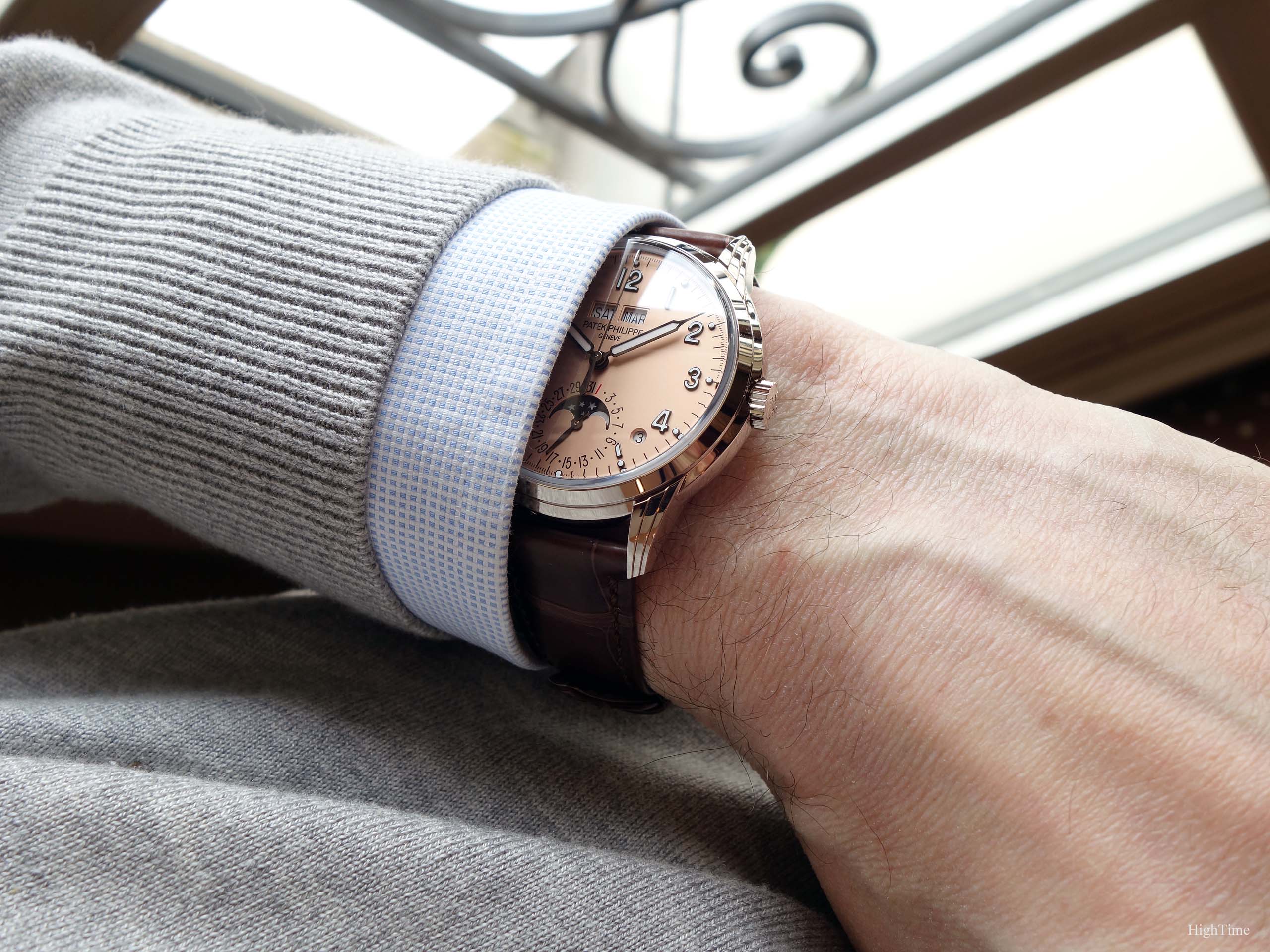
It’s communicating a nice feeling. It looks very different from silver, black and blue dials while not being excentric. It isn’t too coppery either. There was a time (pre 2000’s) when salmon dials were very scarce, maybe issued for a special client’s request or as a styling exercize. Hence, it faced very high results in auctions these last decades as hunger for watchmaking outpaced the offer. Nowadays, I find that including them in a more regular collection, with much higher volumes as a consequence, is a welcome idea. We shouldn’t limit ourselves from getting Salmon dial models just because they were rare in the past thus should remain as such.
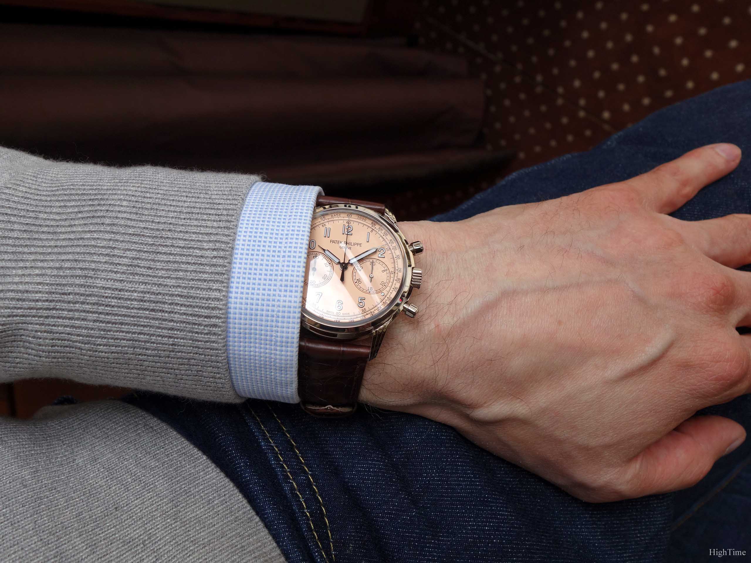
The following picture shows a quite nice idea of the charming impression the 5172G leaves. I found this version very elegant, with a shirt and a light grey pullover I was wearing that day (grey goes with every color so well). It exhales, with no doubt, a wonderful traditional look.
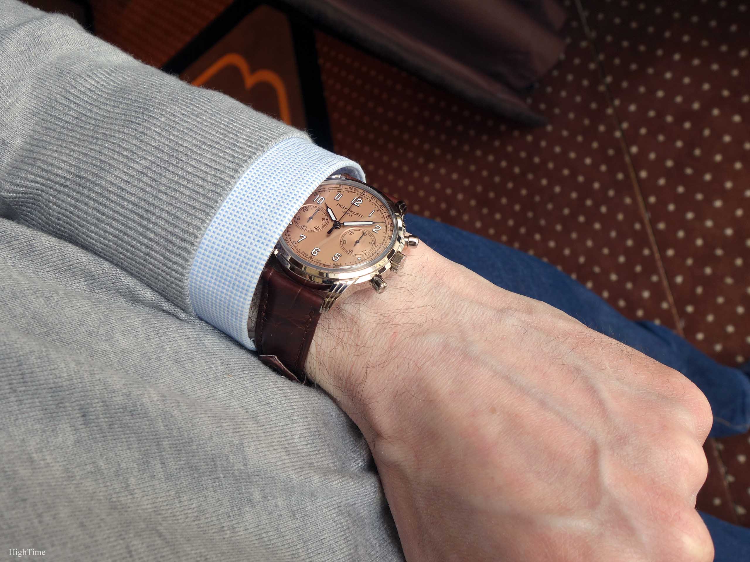
The polished blackened numerals are the second aspect that defines the dial’s atmosphere. It seems the dark anodizing is the new standard for Salmon dials at Patek. These indices are applied which means they are fixed to the dial via pins that are clinched behind the dial itself. The little cabochons (round 5-minute dots) look very nice as a complement. This helps bringing a kind of dynamism to the dial, especially as it provides a quite clear contrast in the metal. These luminova-filled elements are on this model the only remaining casual touch, especially since, on the contrary to the blue dial version, they are blackened here. This is the styling detail that separates a very classical watch from a slitghly more casual version, hence able to shine in perfect coherence inside today’s clothing habits. You keep the elegance while being up-to-date. Last year’s Patek releases will certainly move the elegance norm neutral point.
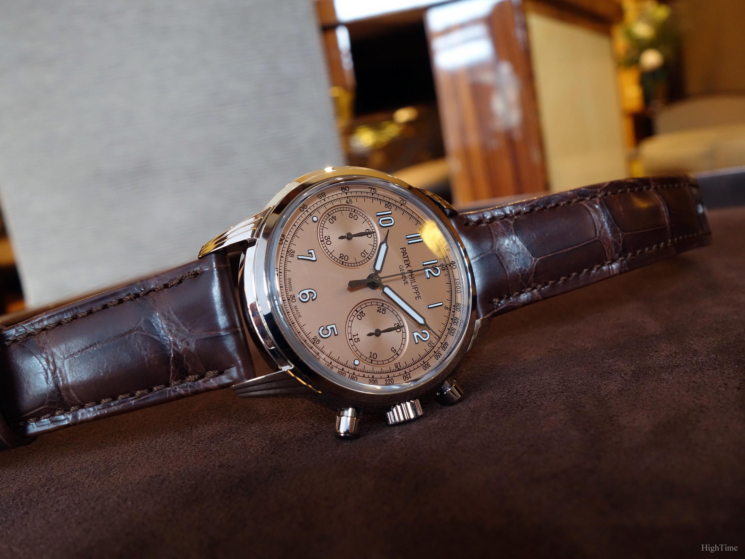
On the crafting level, it’s only when I could hold the 5524 Pilot that I realized these numerals are very far from being “standard” as they bring that special touch, making the observer know it’s obvious this is high-end craftsmanship: the smoother edges and the polishing are taken care of so perfectly that you know it’s superior work. And the more you are used to seeing this kind of finishing, clearer it is when a watch has it or not. You should really have a look by yourself if you can.
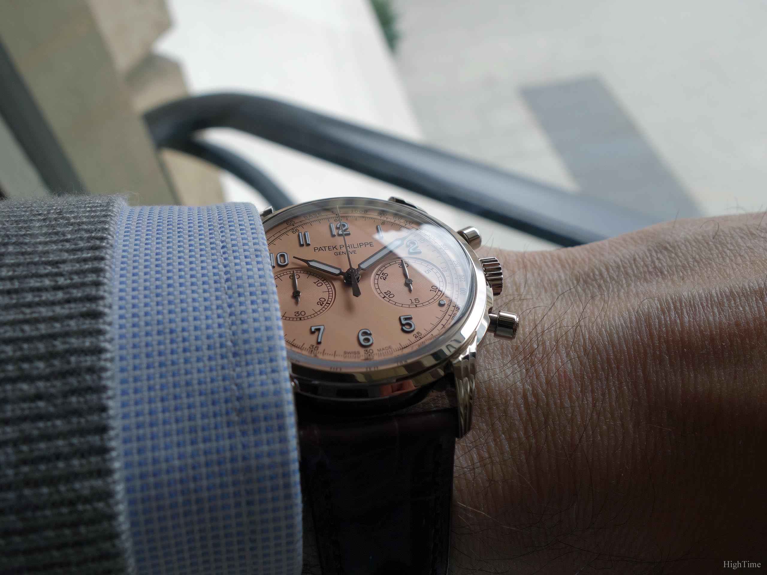
Blackened elements look more modern and will appeal to a wide array of customers. This being said, I would just mention that I’d love to see white gold numerals + hands on a Salmon dial (like the 5024G or London’s 5070G) on a future model too. That’s just me and they sure do modernize the watch. That’s what Patek needed a few years back to rejuvenate the brand. I just wish there will be a nice alternative in the future again.
The crucial straps matter
People are glad that such a traditional brand has come to offer a much wider range of straps material and more especially colors. I understand the overall more traditional spirit, hence brown strap, but we definitely experience on the net very nice new combinations from owners. A different strap color makes a whole different watch. Considering Patek straps are equipped with easily removable pump stems, it’s even easier to switch on a DIY basis (putting aside the screwed deploying-buckle switch).
Do you remember those magic ink/changing color markers? Well, Patek has created a version of the 5172 that will belong to 2 different style categories, depending on the strap color. This is Schroedinger’s cat science applied to watches aesthetics! You don’t know what style it is until you have the strap on.
This is different from pairing a blue nubuck strap with a purely classical dial (like a 5227 Calatrava for instance) and different from adding a classical strap to a 5270P green dial that is not at all traditional. All because of how the dial was decorated (blackened elements and Luminova-filled choice).
Indeed, the Salmon dial with darkened numerals and hands has pushed this 5172G back on the traditional side of the scope. But the shiny chocolate brown strap has pushed it even more so. Therefore, the strap color issue is even more interesting for this watch. You can indeed get a very different 5172G Salmon by picking a washed-out color, or any grey or blue tone variations and make it genuinely and coherently casual again.
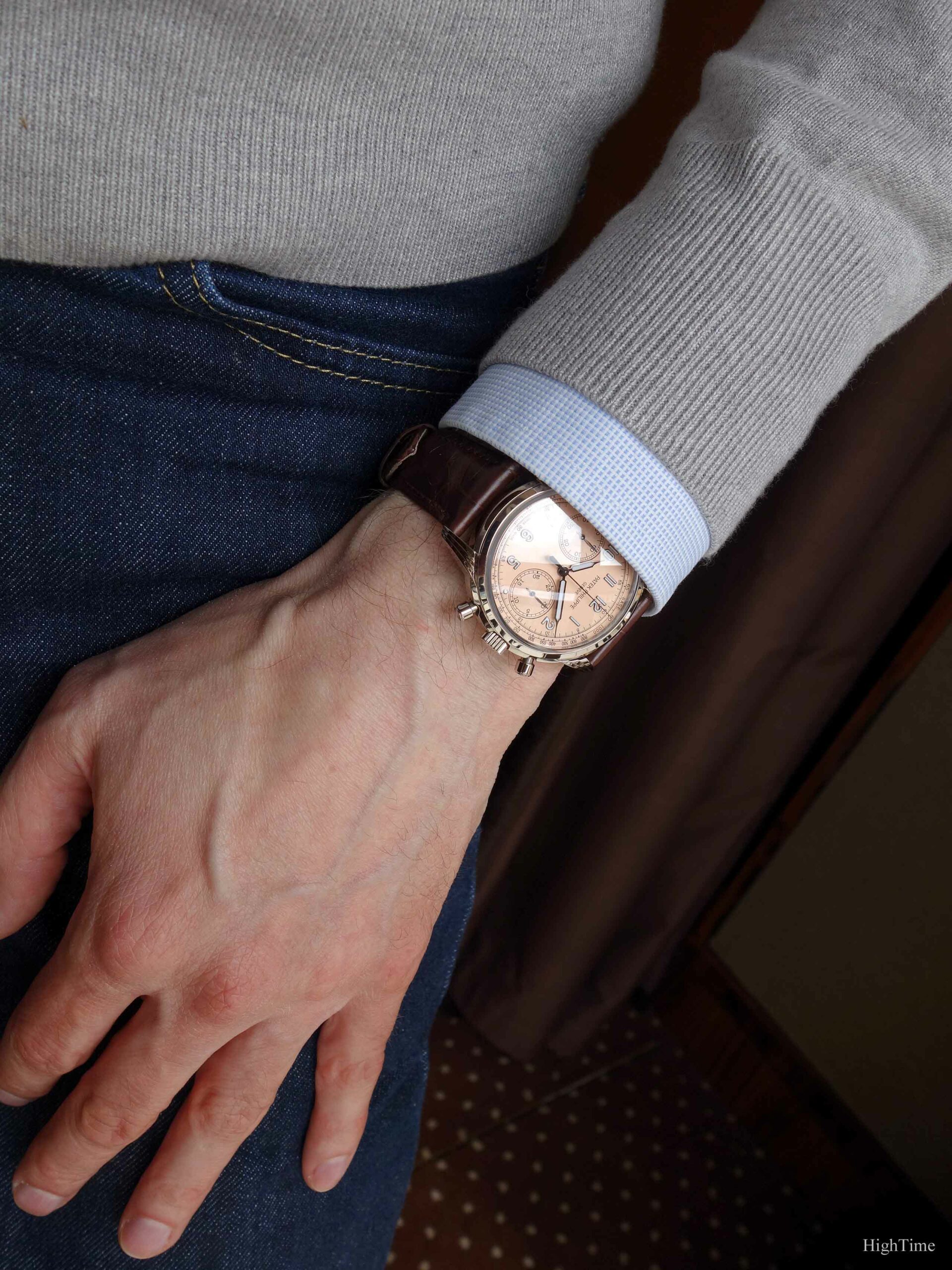
As an addition, even if a “standard” color, I personally would love to get a black contrasting strap for this dial; dressier for sure but it could look fantastic (though I would need to test if black works with the dial’s blackened elements that aren’t completely black).
Just food for thoughts in case you are on the market for such reference as I think it’s worth considering for a while, before any decision.
Finally, the 5712G comes with a white gold deployant buckle.
One of the finest chronograph movements
The 5172G embeds the cleverly designed and masterfully finished manual-wind 29-535 caliber. This gorgeous piece of mechanics houses the vision of an improved high-end traditional chronograph design. These evolutions are related to increased power reserve, improved adjustment settings, anti-backlash wheels, etc… but more importantly to frequency stability (improving timekeeping) with or without additional complications. But that’s not all as it’s made all the while finding as simple solutions as possible.
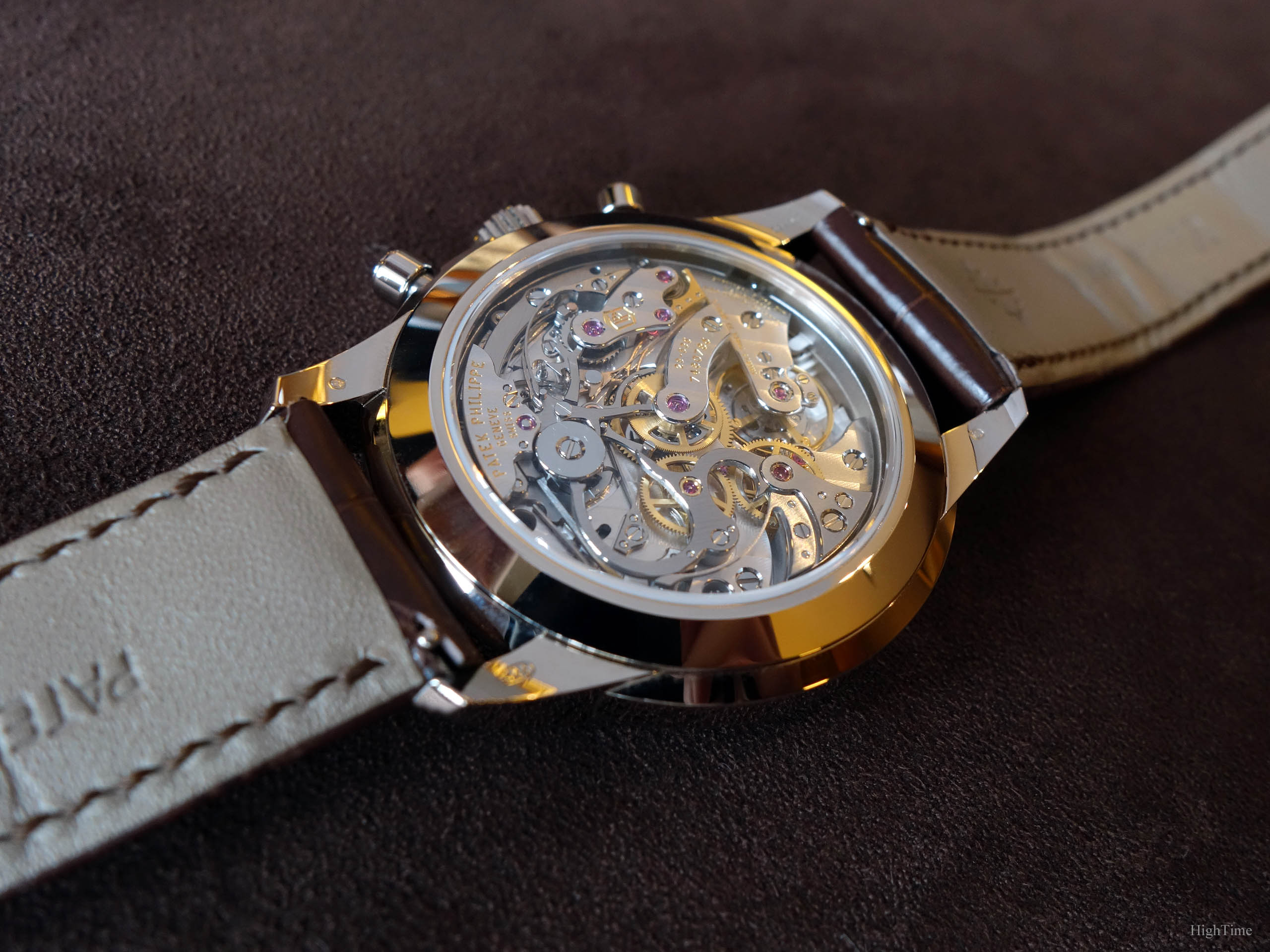
If it would have been nice to have 1 or 2 inner angle decorations, the evolutions are functional and clever ones. The 29-535 isn’t a transfer of the Lemania movement, it has been designed from a blank page, yet in the traditional way, with a column wheel and a horizontal clutch. I particularly appreciate when I know that a movement contains the brand’s watchmakers work as it’s the result of their own specific experience. You can find more details about these patented improvements at the bottom of the article in the Appendix.
A detail I appreciate a lot in this caliber is the smoothness of the pushers; they still allow the owner to feel a light “click” when activated and avoid being too “buttery”, which I don’t like personally. This comes from the addition of jewel bearings (lightening the load on pivots) and the improved cam settings design.
It provides a stop-second feature (the movement stops when pulling the crown to set the time) and a dynamometric crown as well (the latter is like a sliding flange used on automatic movements, avoiding over-winding pressures).
Aesthetically, the movement shows its appeal with very thin beveled edges (whether on bridges or cams and levers), the black-polished column wheel cap or the beautiful Cotes de Genève (which remain hard to make without flaws) and extraordinary perlage patterns. It isn’t overloaded, it’s very well balanced and was made with very fine taste, in terms of rubies with golden chatons or colour choices. The main lever used for the chronograph clutch mechanism is beautifully shaped and decorated as well: it marvellously hugs the bridges’ round shape. It may be the element I like to admire the most on this side.
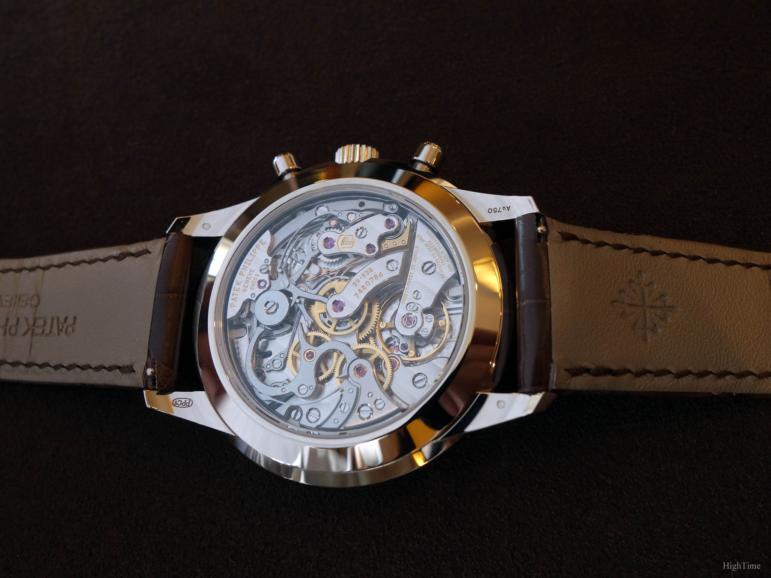
Overall, even if historically watchmaking is also an aesthetical art, it was mainly about improving efficiency to provide more reliable and accurate clocks. The 29-535 precisely responds to this definition and, as such, is in line with Patek’s movements history, relative to the era during which they were made.
To end with, the 29-535 beats at a high 28,800 vph with a power reserve of min. 65 hours and the 5172G is 30m water-resistant.
Conclusion and Thoughts
So, with this Salmon dial 5172G, Patek Philippe has proposed a very distinctive piece from the blue “opening” version but even more so from previous generations offer. For someone willing to reach the very fine high-end manual chronograph world, a place where the brand has built its unique legitimacy and aura, it has all the ingredients of traditional watchmaking. It’s true about aesthetics, but also as it’s able to completely dive into a casual-dressed modern world if adorned the appropriate way.
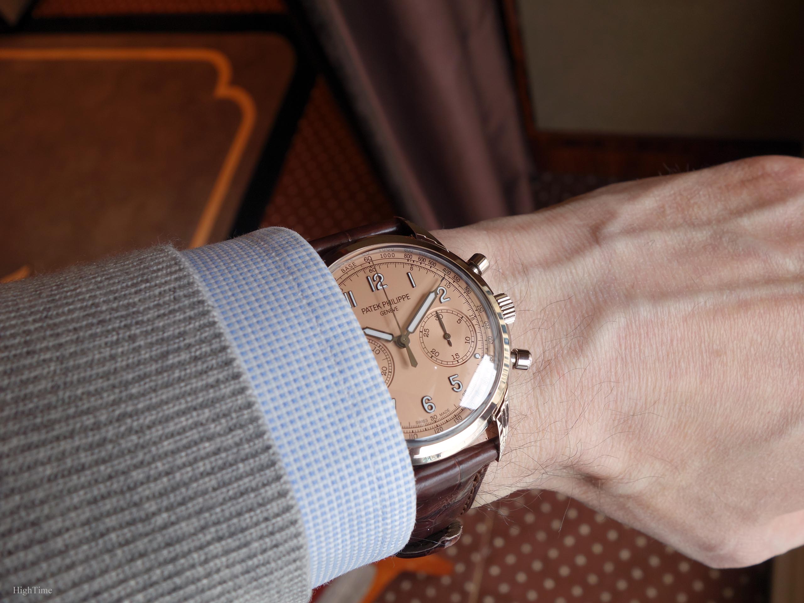
It’s definitely well born and fitting our times for what ends to be a beautiful classical piece. Each generation brings its specific evolution in parallel to the world’s Styling movements. Though known as a traditional brand with the more conservative image it implies, Patek has always been in close touch with lifestyle and how modern societies evolve. Even within the elegant and classical field, being in contact with clients all over the world, they show they keep in touch and dare to experience little touches of modernism in their secret creative vault.
The last decade has shown that, even if there are very few unavoidable bumps on the road, Patek Philippe is perfectly at ease in this dynamic hi-tech world. Dealing with styles, older and younger clients is a difficult exercise and not all watches are born to satisfy the whole array of its customers. However, they have been able to provide what each side is looking for, in terms of sizes, colors, complications and that’s for sure a wager that some brands struggle facing successfully. This new 5172G is beautiful in the metal, original in the color, and remaining versatile. In a world where we tend to enjoy short term pleasures, such watches are born to provide enjoyment on the long run.
If interested, the review of the blue 5172G is available here.
The Patek Philippe 5172G-010 Salmon dial’s MSRP is 82 100 € (VAT included) as of today (2023).
As usual, you can find more information, here:
The Patek Philipe 5172G-010 Salmon on the brand’s website
Thanks for the read!
PS : you’ll find here below the main improvements brought within the 29-535 chronograph caliber.
The 6 patents behind the CH 29-535 PS movement (from Patek Philippe’s website):
IMPROVED SYNCHRONIZATION BETWEEN THE CLUTCH LEVER AND THE BLOCKING-LEVER
Ordinarily, the clutch lever and the blocking-lever are synchronized by the column wheel. The engineers of the CH 29-535 PS eliminated this intermediate step by fitting the clutch lever with a finger piece that directly synchronizes both the clutch lever and the blocking-lever. This solution simplifies and improves the precision adjustment of the control sequences because the watchmaker only has to adjust one point instead of two as was the case in the past. Moreover, this approach suppresses the jump of the chronograph hand when time measurements are started and stopped.
IMPROVED PENETRATION ADJUSTMENT BETWEEN THE CLUTCH AND THE CHRONOGRAPH WHEEL
The adjustment between the teeth of the clutch wheel and the teeth of the chronograph wheel is performed by a large eccentric column wheel cap, working directly with the tip of the clutch lever instead of the conventional eccentric placed next to the clutch wheel. This new system enables a more precise adjustment of the penetration between the clutch and the chronograph wheel.
SELF-SETTING RETURN TO ZERO HAMMERS
The reset hammers of the chronograph counter are equipped with a self-setting system that makes it unnecessary to mechanically adjust the minute hammer function and thus increases the reliability of the mechanism.
OPTIMIZED TOOTH PROFILE
The wheels of the chronograph mechanism feature an exclusive patented tooth profile (presented for the first time in 2005 when the ultra-thin caliber CHR 27-525 PS split-seconds chronograph was launched). It eliminates the risk of hand jump in both directions when starting a measurement; limits the quivering motion of the chronograph hand ; increases energy transmission efficiency, and reduces friction as well as wear in the movement.
PIERCED-OUT MINUTECOUNTER CAM
A new minute-counter cam was created with a slot to prevent abrupt blocking in response to the reset command and therefore eliminates hand quivering.


