The Patek Philippe 5172G Chronograph – Another delighting alliance of traditional and casual
Hello everyone,
Knowing what Patek Philippe has offered in the world of traditional manual-wind chronographs from the early years of the Stern era, the launch of a new line is always a major event. The Patek Philippe 5172G Chronograph was presented in 2019 after we’ve been traveling through all the stages of the 5170 family from 2010 until 2018.
After the last 5170P, which already had a kind of “cool attitude”, we definitely can say with this new 5172G that the brand keeps on exploring new fields. Next to the more traditional line-ups, they find inspiration partly from the past and partly from our modern times. It’s even quite audacious a move to start this new generation with such a contemporary combination first, compared to a more traditional (hence conservative?) one.
Well, will there even be a traditional version for this generation? I don’t know yet but some more classical ingredients could also make a stunning combination in this reference.
Edit: Patek has unveiled in 2022 a more traditional-looking Salmon version, reviewed here.
Nowadays, in many aesthetical fields (cars, clothes, furniture…), the neo-vintage or vintage re-editions trend is the way it goes, relying on nostalgia flavors, which tend to bring out some very appealing things. However, established brands like Patek are in a segment where it usually works the other way: tradition is already a core ingredient of the watchmaking recipe. Hence, it isn’t about adding back “old school” scents but how bringing a touch of modernity to, by nature, traditional pieces. If we remember, the 5070 brought a lot of modernity compared to previous Patek models.
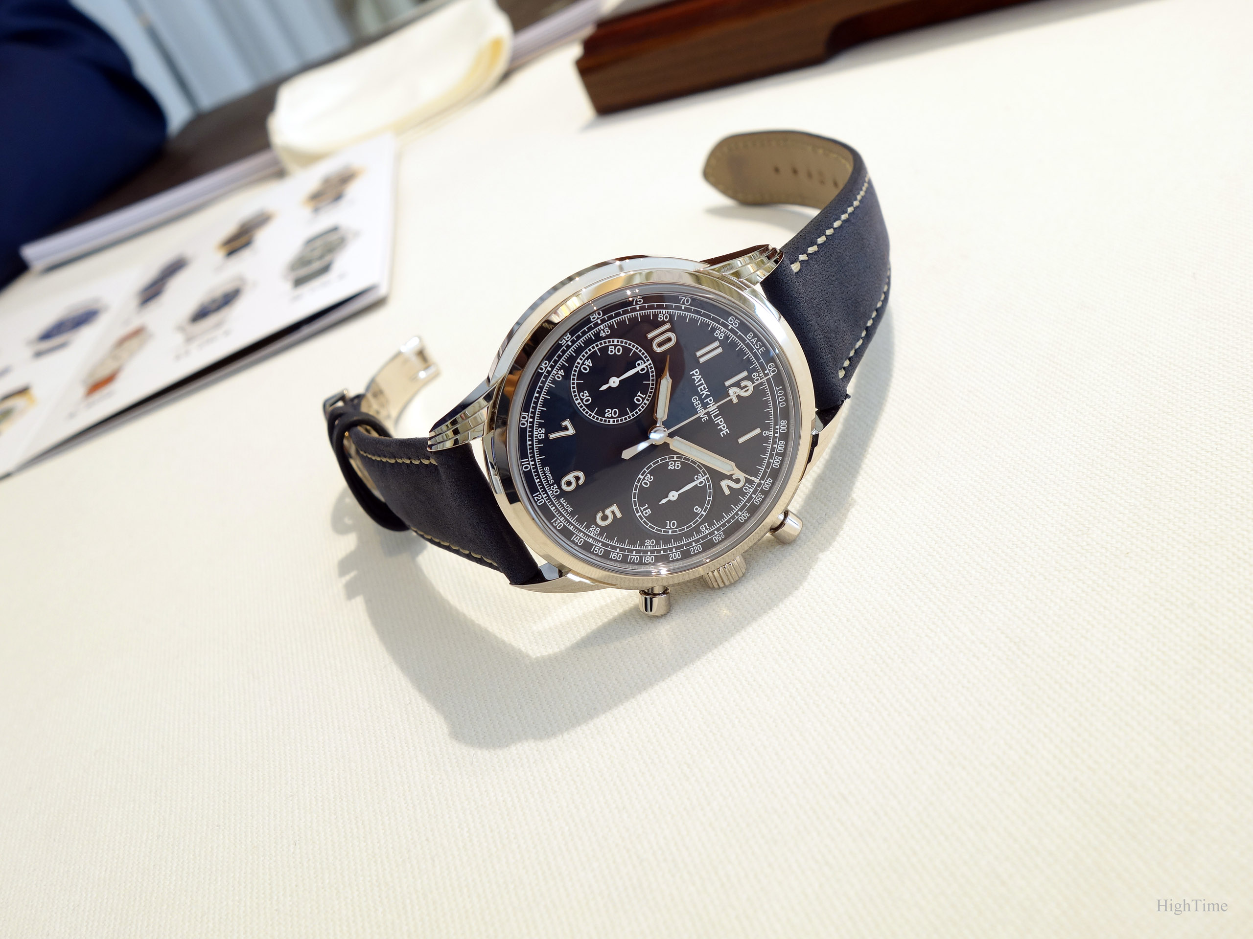
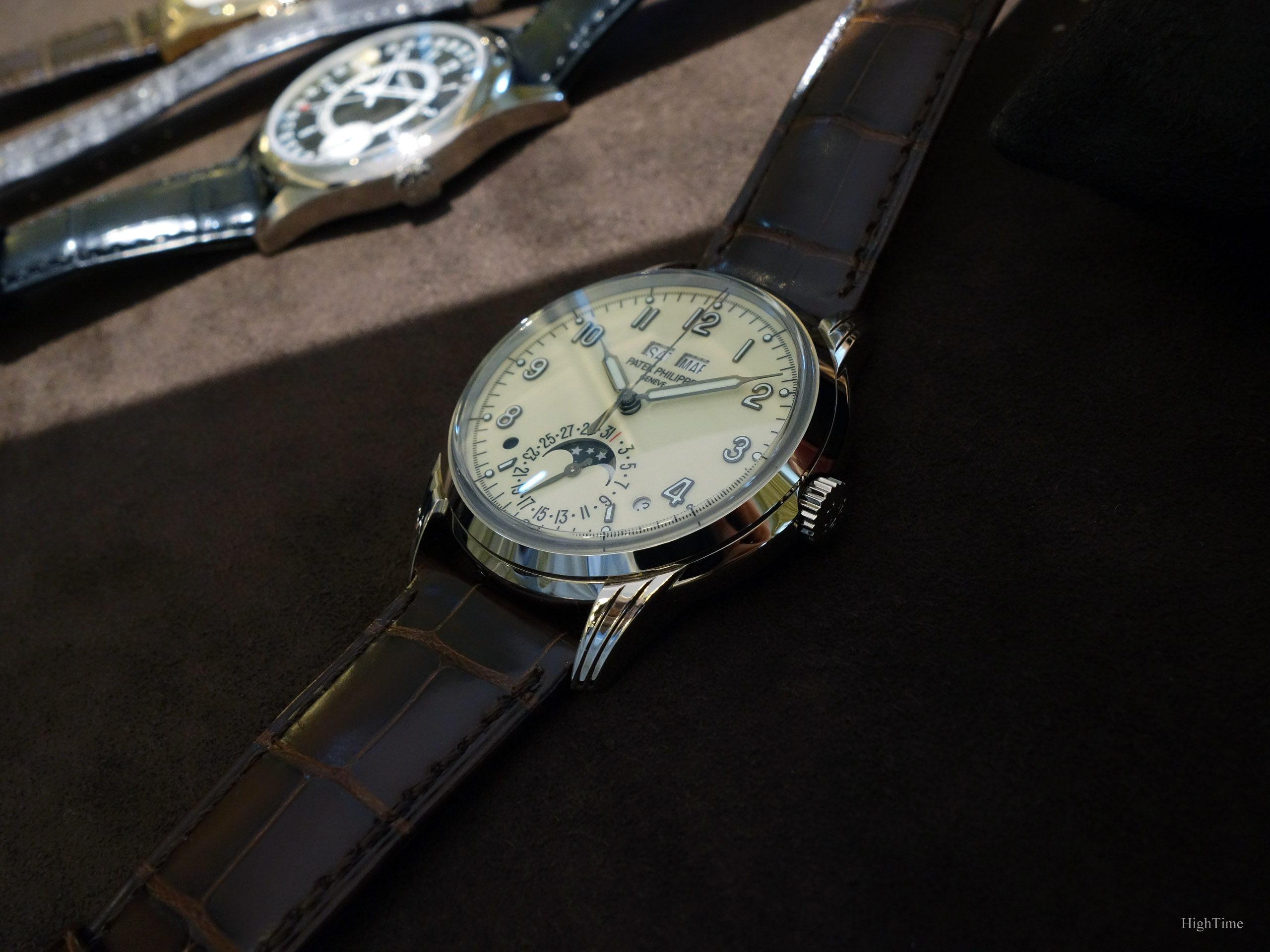
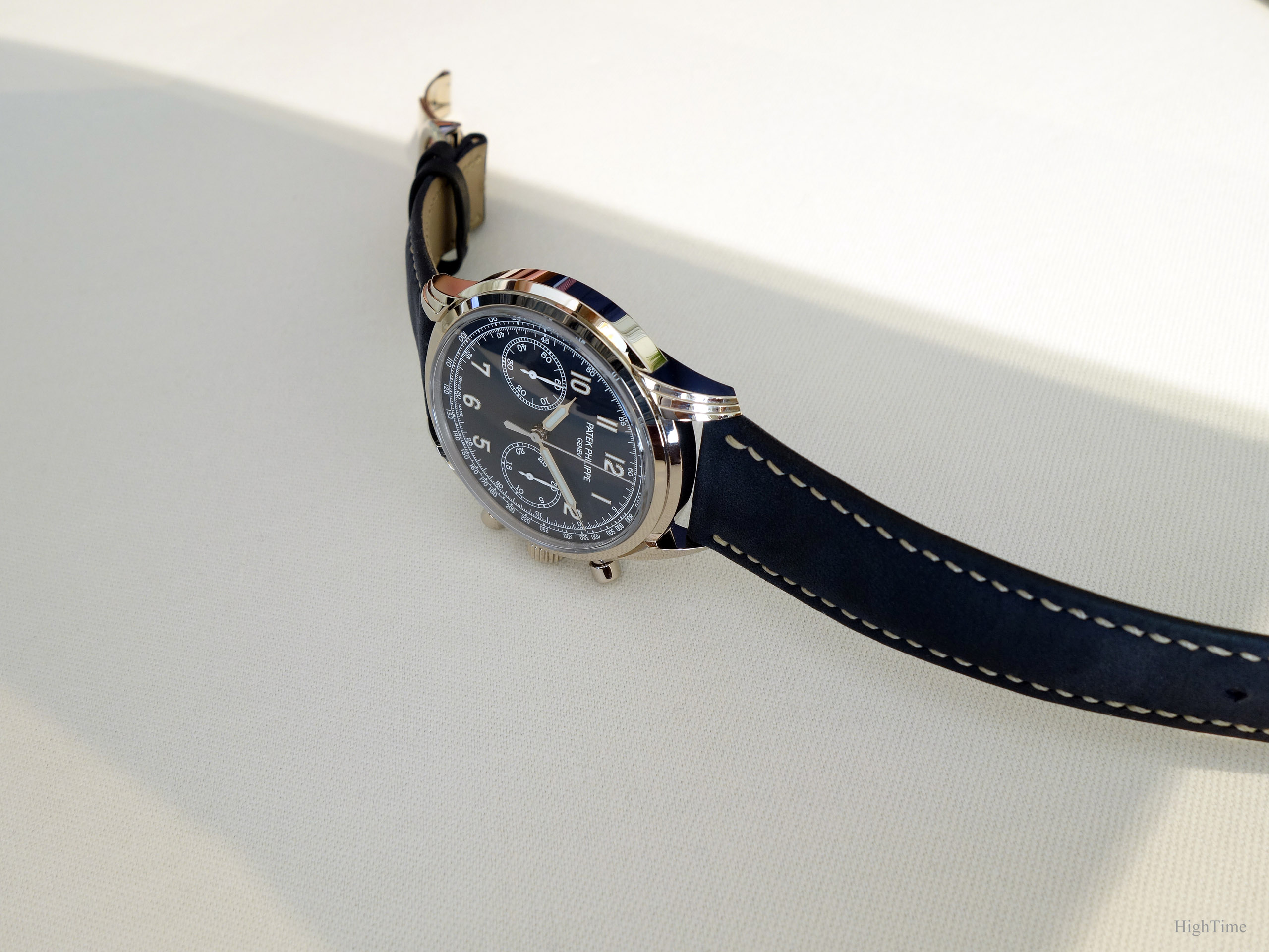
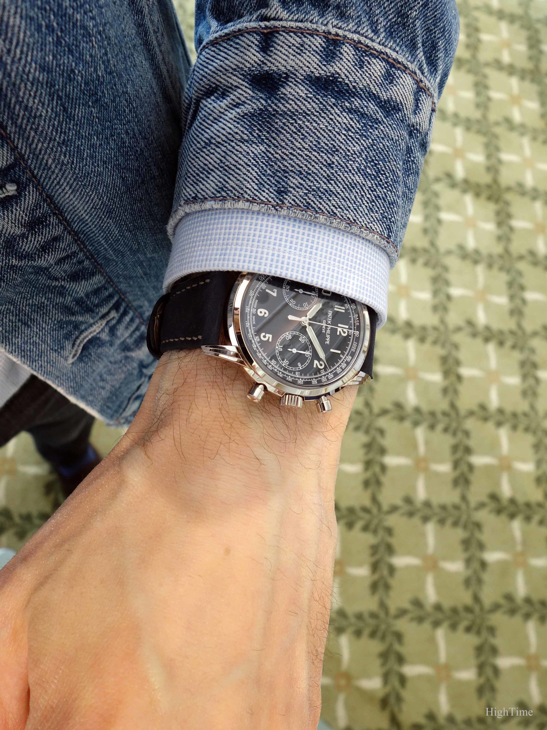
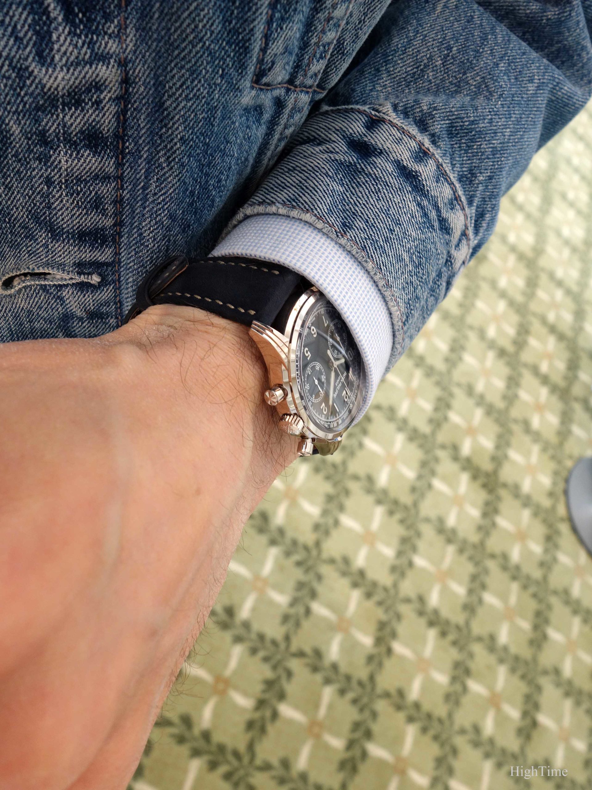
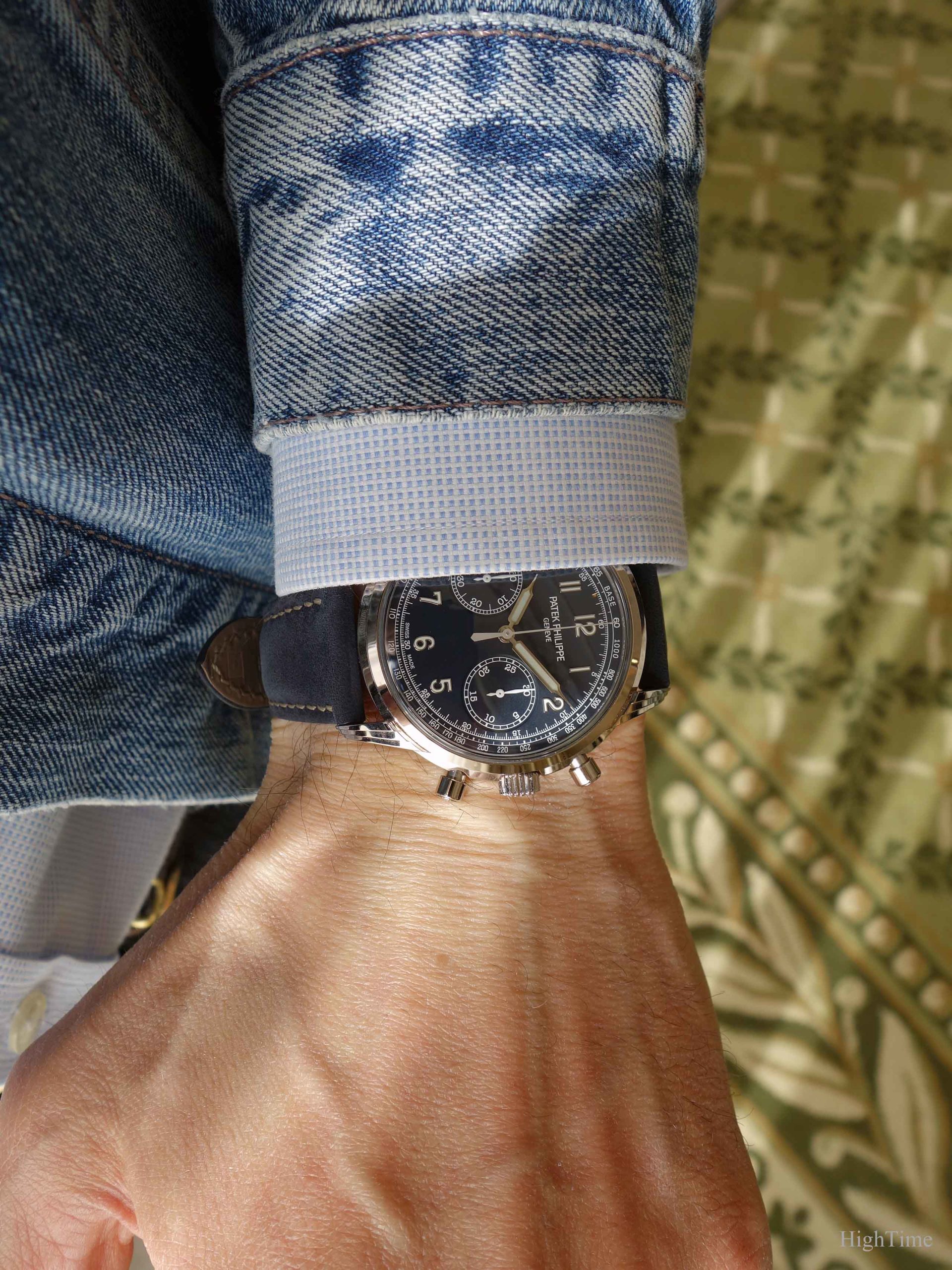
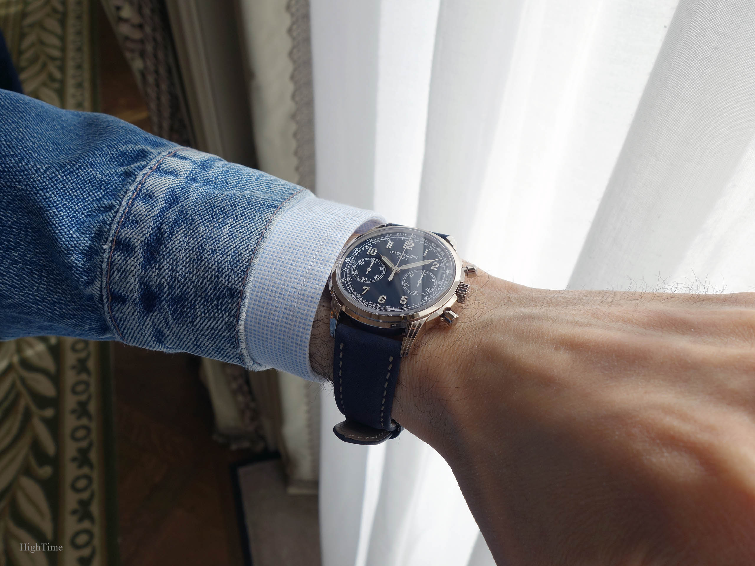
Nota: please note that the dial color in real is a little lighter than the dark blue one we see on many of these pictures.
The case, Patek’s signature
Observing their cases is one of my main interests when I visit an AD. The cases at Patek, especially through the diversity of designs (in lugs and profiles particularly), are to me a part of what makes this brand so attractive. It really is an area I enjoy spending time on when holding their watches.
Indeed, the more inner curves, changes from round to square lines on a same profile, the harder it is to craft and, even more, to finish.
Back in 2017, the brand has started to expand a new case line with its 5320G Perpetual Calendar (see photo below). It had this distinctive triple-tiered lug profile, case band and dome-shaped glass (and dial which we’ll be dealing with a little further).
We were told back then that it was “probably” the beginning of a new line from that style code. Hence other versions were to follow.
However, while the 5320’s case was obtained through a “punch” method, the 5172’s is made up by adding lugs which are prepared separately. Why not simply using the same method? In fact, when dealing with novelties, Patek Philippe studies what would be the best way to design a case, a caliber main plate or any other parts involved in a watch construction. They aren’t afraid indeed of not re-using a previously developped method if necessary. In the present piece, it’s the slightly bigger size (41 vs 40mm for the QP) that has pushed Patek’s watchmakers in that direction.
Consequently, as with several of their cases, the polishing skills of Patek’s crew are expressed through the lugs’ triple edges. They indeed have to remain sharp after the process.
Even more, the decoration has to show both a certain sharpness and smoothness: you can feel the thin edges but they are still slightly rounded. This becomes even more obvious when comparing with other watches. This is what craftmanship in watches is about imho. It’s the difference between a carefully finished part and what looks “punched” and quickly deburred.
As a side note, let me say this is an illustration of why the brand’s early plans included rare handcrafts and craftsmanship training in the design of their new building (delivered very recently). This is no gimmick as it has a high cost. But it counts. This is something we can observe and check every year in the brand’s offerings.
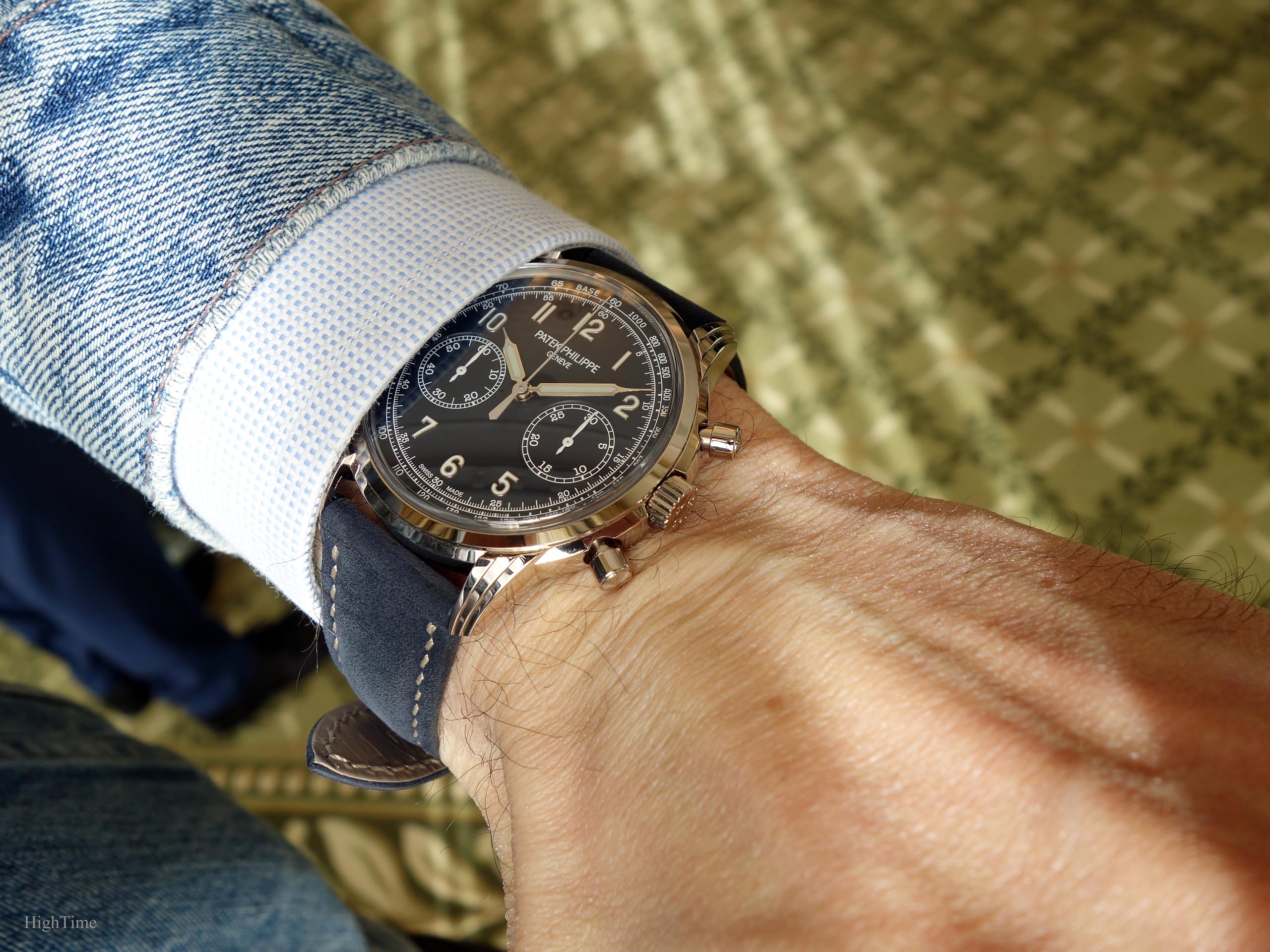
Subjectively, I must say I find the case even more appealing in this chronograph compared to the 5320G. I guess the round pushers addition plays a lot in this feeling but so does the dial layout (especially its complicated applied numerals).
In traditional watchmaking, shapes usually go from all smooth and rounded (like the 5130/5140/5960 models) to flat and squared (as with 5X96 variants). Today’s designs tend to combine both worlds (not only in watchmaking but for cars, clothing…).
Good aesthetics isn’t an absolute matter and depends on the standards in vogue at a certain period of time. Therefore, it’s even better when a brand can position itself slightly ahead of the moment when the new standards will be “in place”. Whether the brand creates the trend or benefits from other brands paying for it (Marketing costs).
We know that traditional brands try to find their way towards younger clients in a world of smartphones, smart watches and less ties and suits. At its time (1976), the Nautilus answered to new needs as well (the “SUV” of its time for sportier activities) and appeared as a creation exercise. It isn’t different today, brands still have to evolve or they’ll disappear (to stand still is to regress bla bla bla).
But, this is really also for us a way to experiment and discover things we might love as well. Curiosity is indeed something very important in aesthetical fields. Everything new won’t always please us on the long run. It might not be well born but if we aren’t curious, we certainly are more likely to miss very important and attractive changes. These few very exciting novelties are the ones we are at risk of missing because of our preconceptions. It’s something that at least worked for me in other fields where style has a strong influence and especially in the Independents watchmaking world.
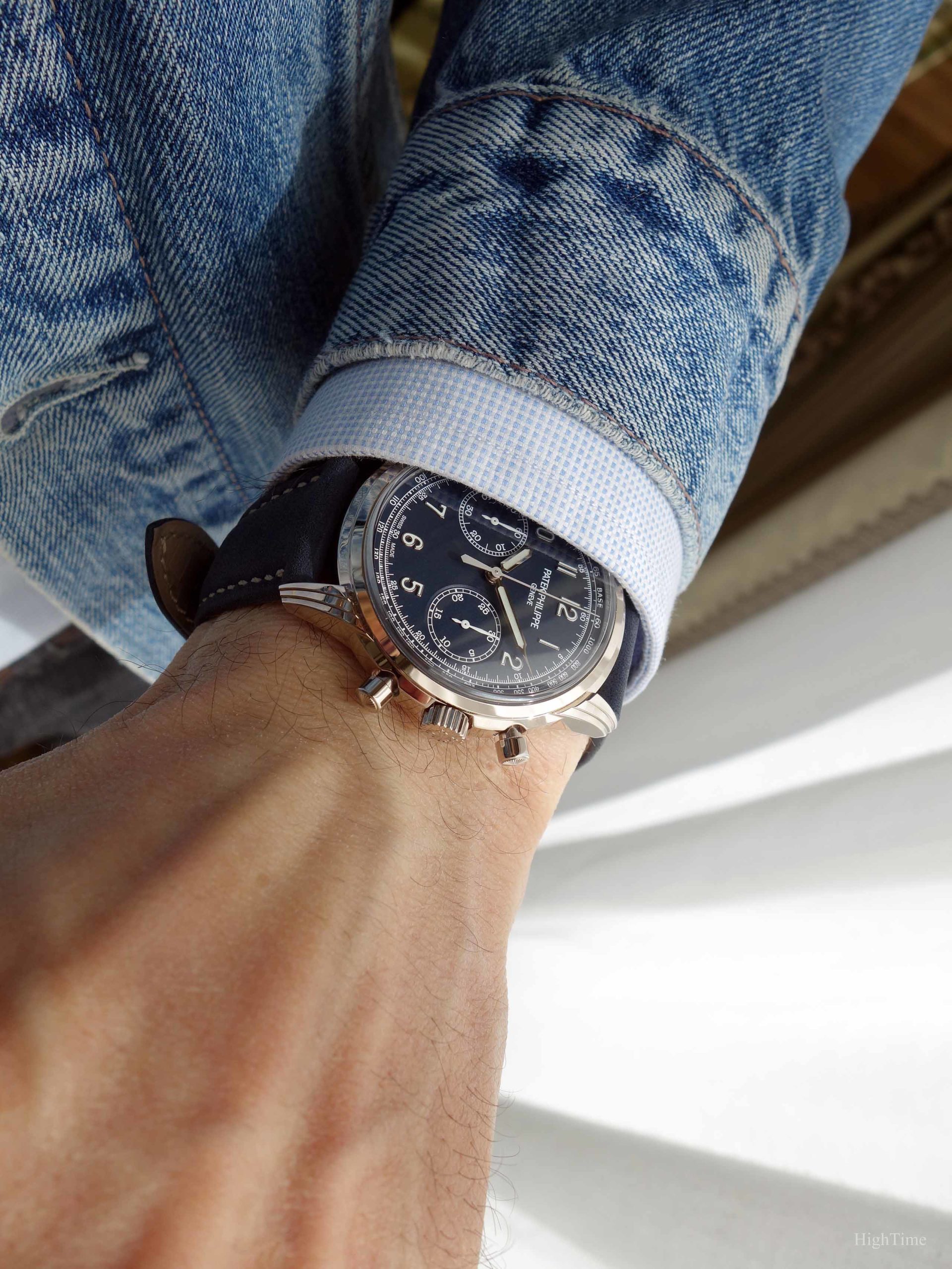
This is the difficult balance (together with colors) brands have to find and this 5172G is definitely a very attractive offer from what I could see in the metal. Especially since I’m glad to see blue becoming a classical color next to black and silver.
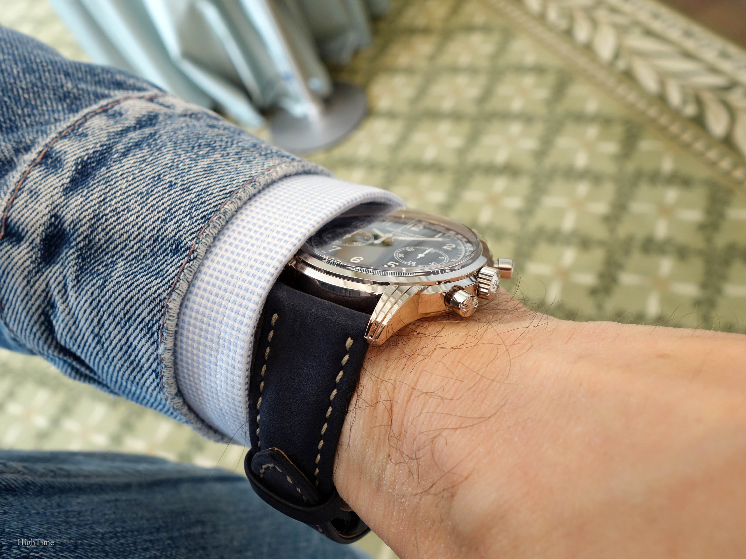
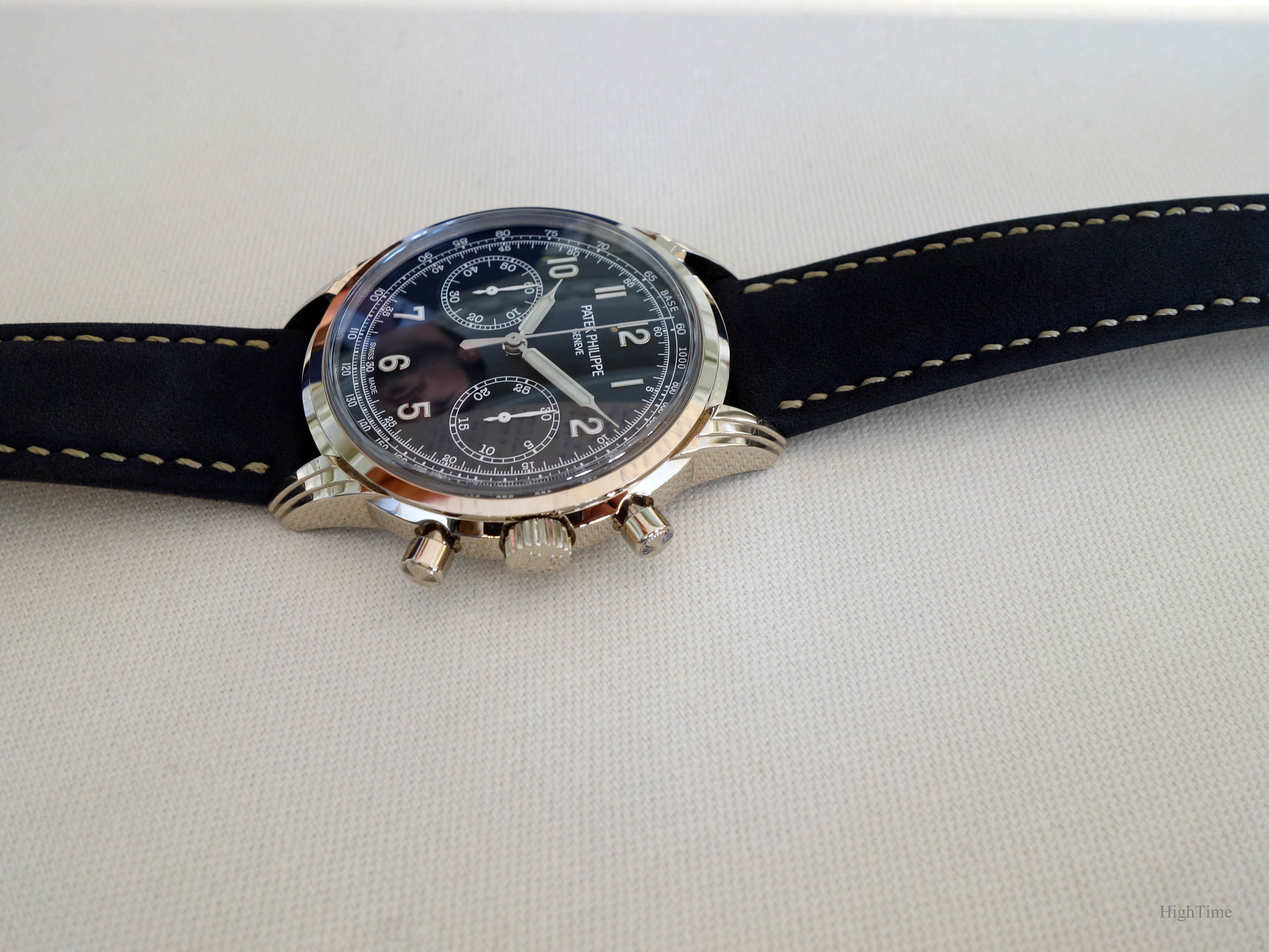
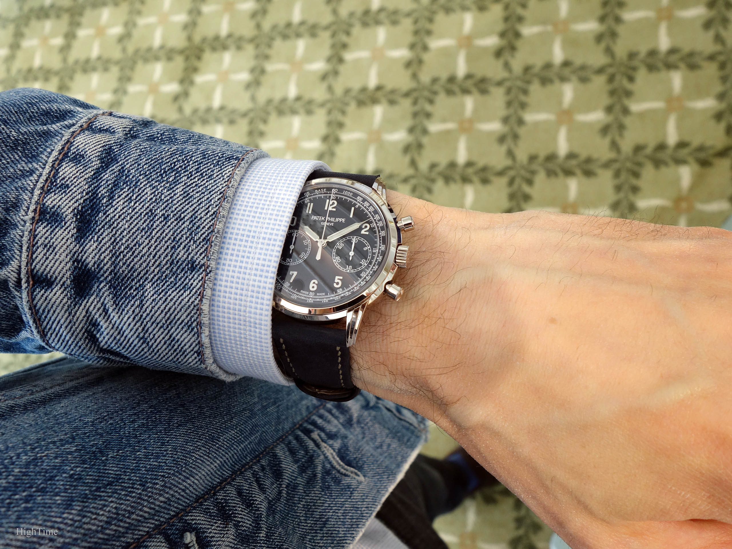
In the dimensions field, the 41 x 11.45mm is excellent for today’s chronograph standards (even if I personally prefer a 40mm diameter considering my small wrist size, around 16cm). Diameter is a totally subjective topic and relies on the wearer’s wrist size or what proportions one was used to seeing in the past. Sizes have increased since the first half of the 20th century’s 30mm (and so have people!). And let’s not forget regional differences, more or less sporty outfits, etc…. Thus, we see more and more owners preferring bigger watches. As a consequence, 41mm for a chronograph looks quite right for many, especially from what we see in the watch world and that our eyes are getting used to.
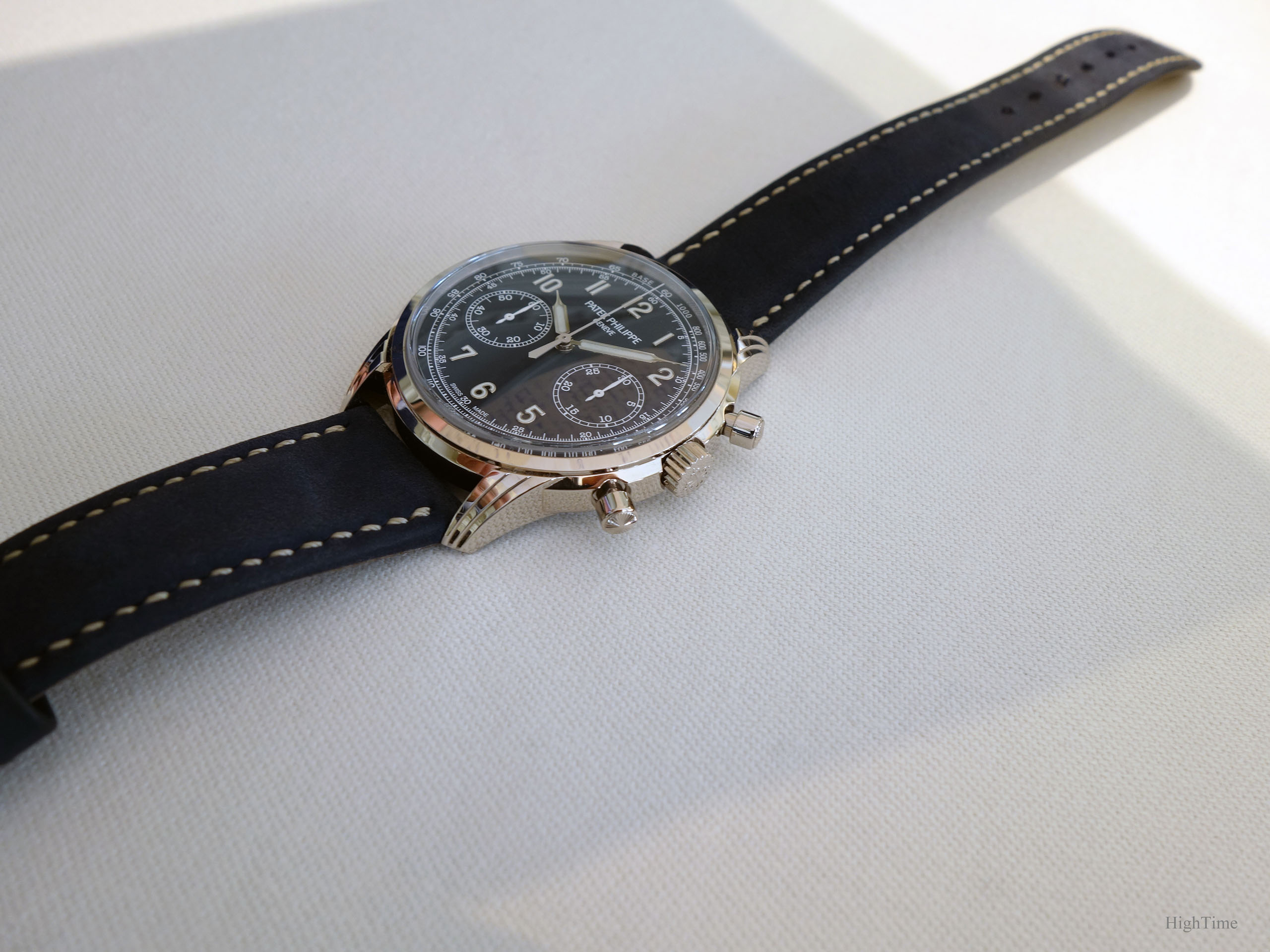
On a design standpoint, the central band you see on the profile (on each side) visually “breaks” the length from a lug to the other. This is a detail I love and that combines beautifully with the pushers. Moreover, these lugs remain quite short, hence limiting the overall size compared to the wrist it sits on.
While remaining on the classical side of the road for such a watch, I think this 5172G is performing perfectly in line with its time. It’s an issue a brand mustn’t forget to set right in order to thrive in every way. And certainly not stand still as a traditional watchmaking natural tendency would push them to.
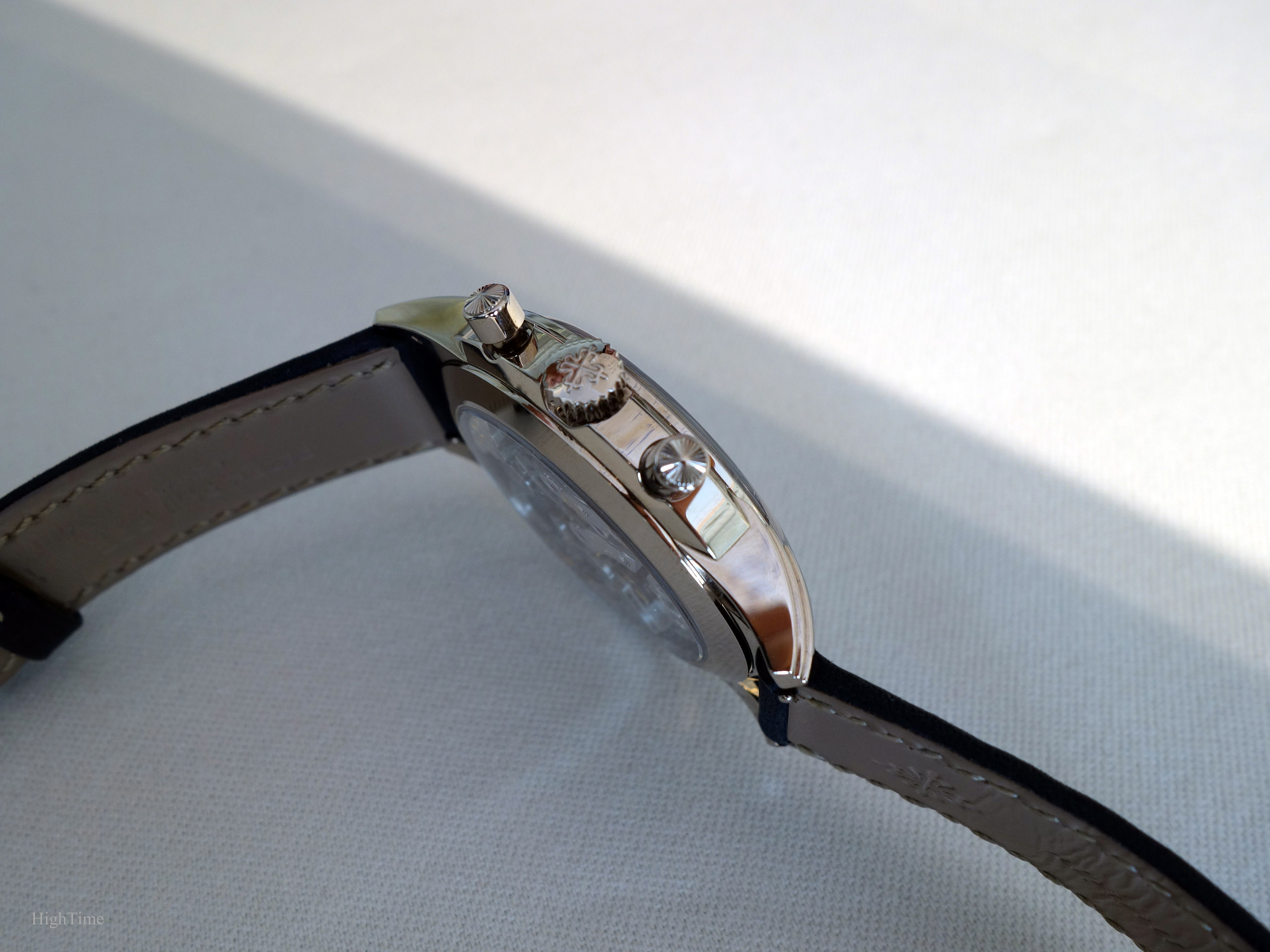
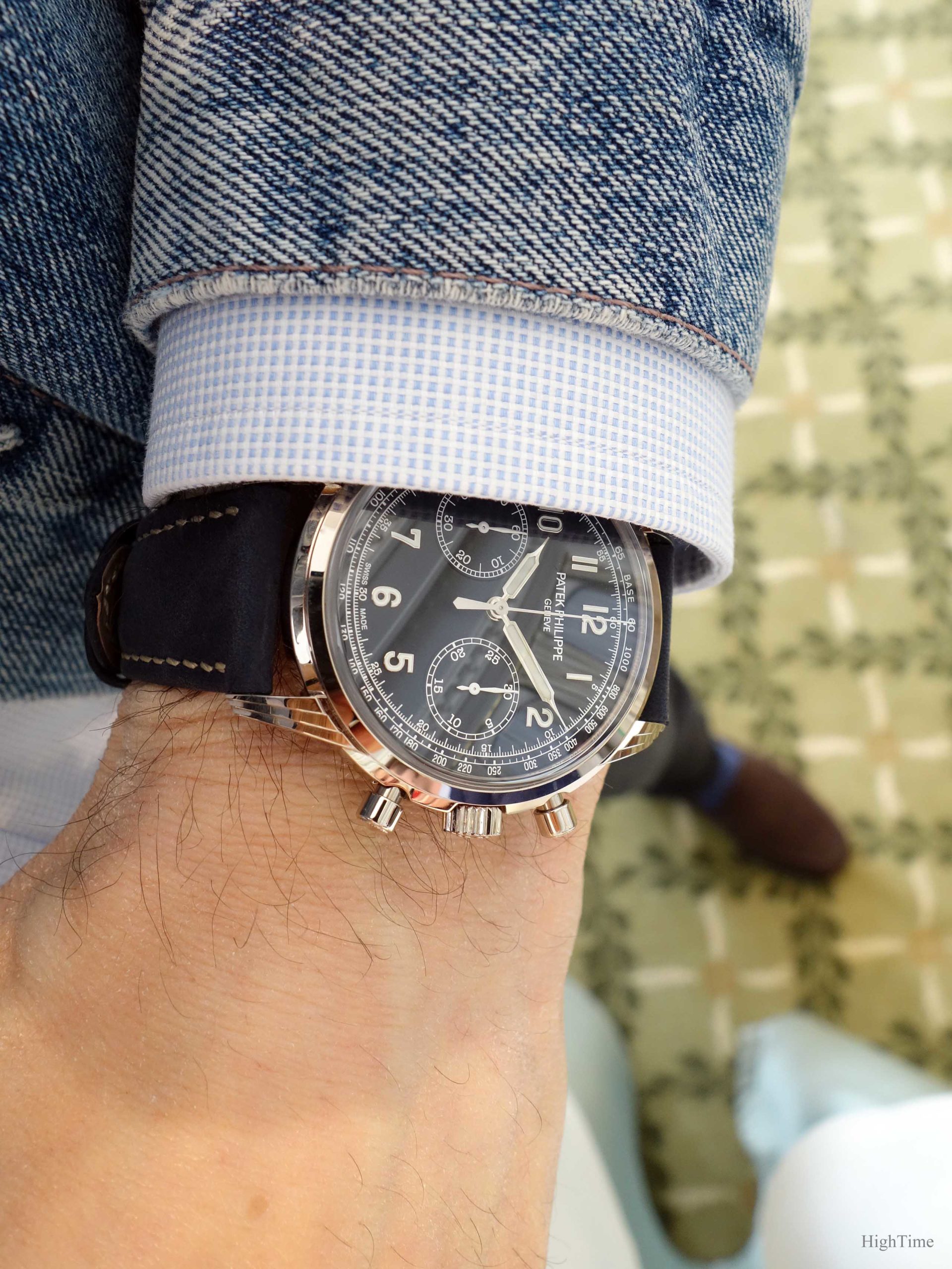
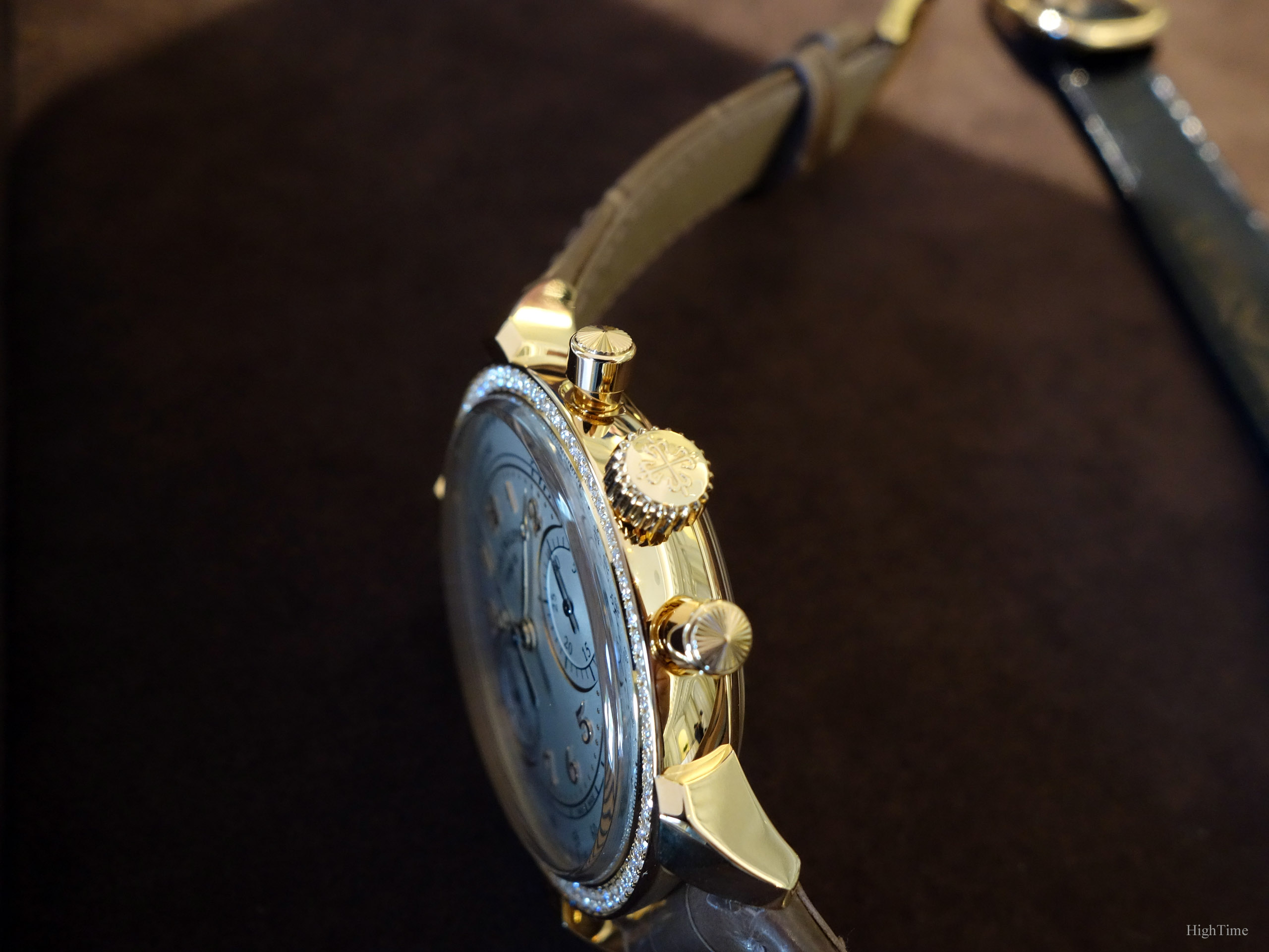
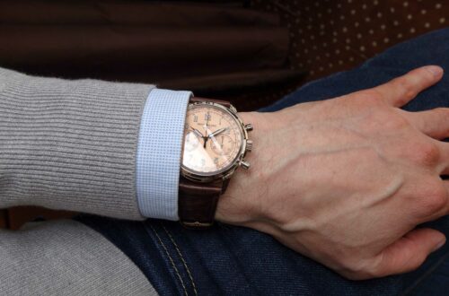
A few words about the round engraved pushers that were introduced in the 5960G (2017, 2nd picture below) and the lady’s Ref. 7150 chronograph (2018, 3rd picture below). You may know they come from the 1463 model (1940 till late 1960’s, 1st picture below):
Well, as old school as they may look at first with this decoration, I think it’s one of the nicest addition to these modern chronographs and pairs beautifully with the crown’s Calatrava cross.
However, it’s a small detail but it seems the pushers’ decoration from the 5172G, 7150R and 5960G is a little different from the 1463’s. It is now shaped a little more “outward” of the button, where the top surface has been a little “raised” (especially on the ladies chronograph).
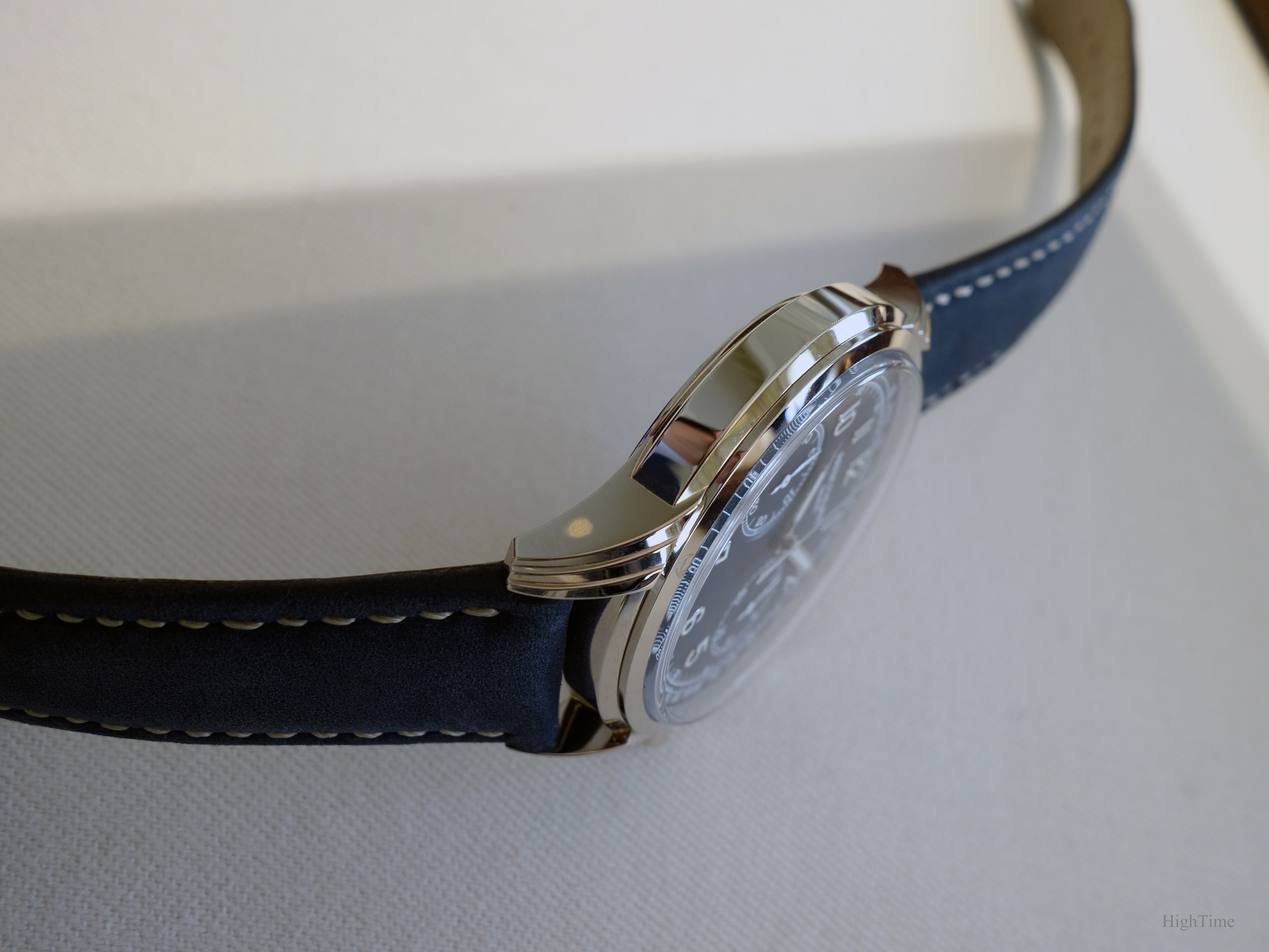
The sapphire “box” glass shape (picture below) is another aspect reminding the Hesalite ones (pre-1980’s plastic-based material) from earlier eras. It brings an additional visual thickness for balance without making the watch look heavy. As a side note, the 5320G Perpetual Calendar also receives the similar box-shaped glass. However, in proportions, it looks less thick on this 5172G. It can of course be explained by the fact it would have been too thick for such dimensions and I prefer the way it looks here anyway (a little less “vintage”).
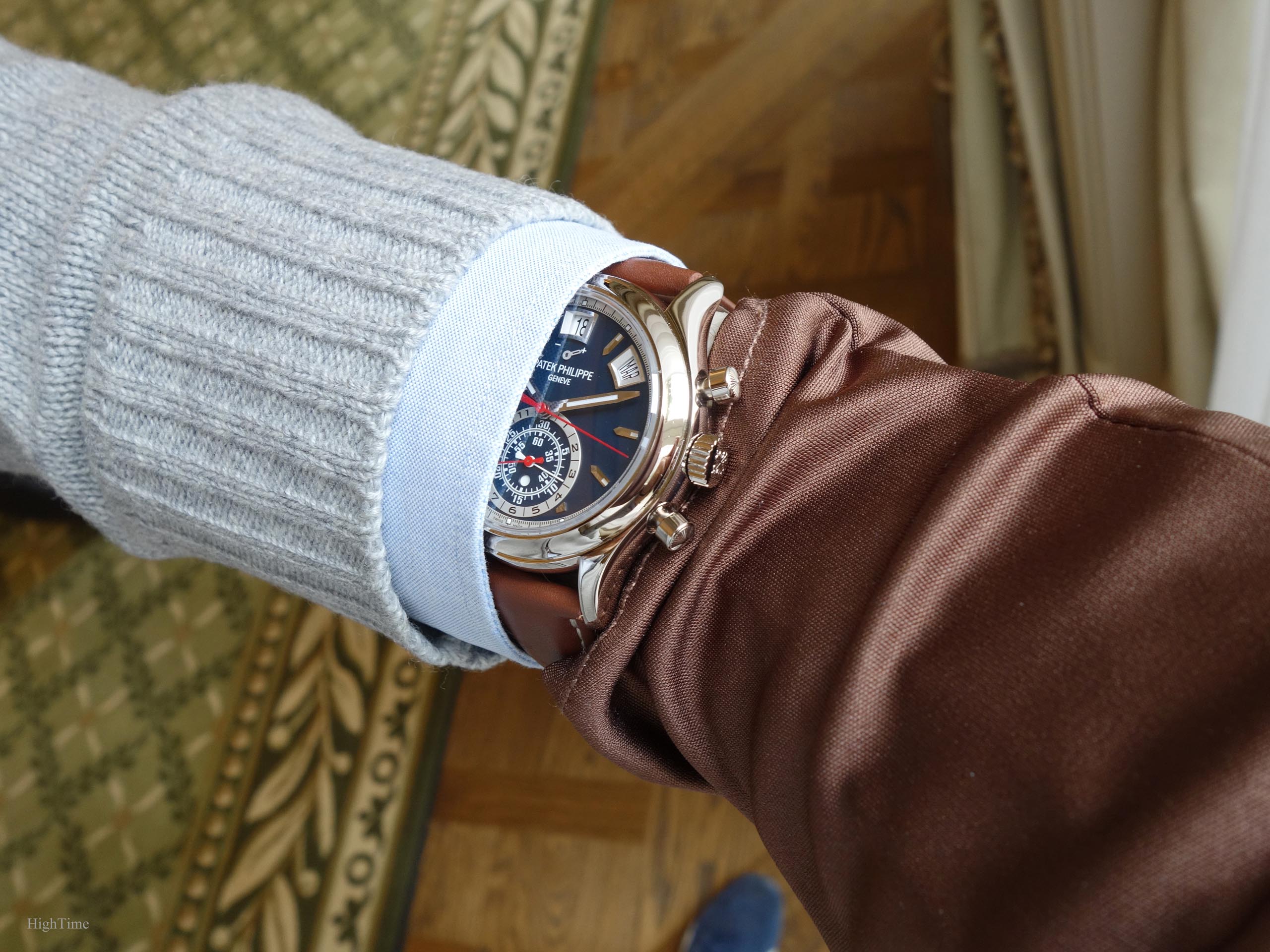
For sure, when I look at the pictures, I would really love to hold it again soon.
The stunning balanced dial
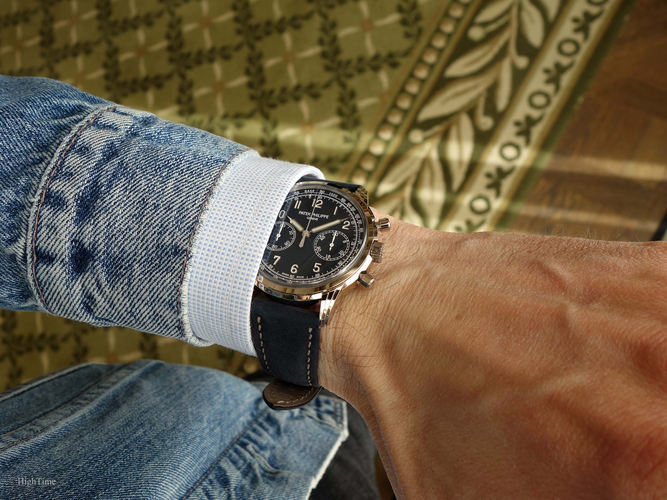
Besides being very appealing to contemplate, the dial is a very distinctive and interesting part of the watch. We can quickly notice the white gold hands’ and numerals’ shapes (same as in the 5320G) but also the contrasting white elements next to the blue (PVD coated) sandblasted dial (like the 5524G “Pilot” and 5960G).
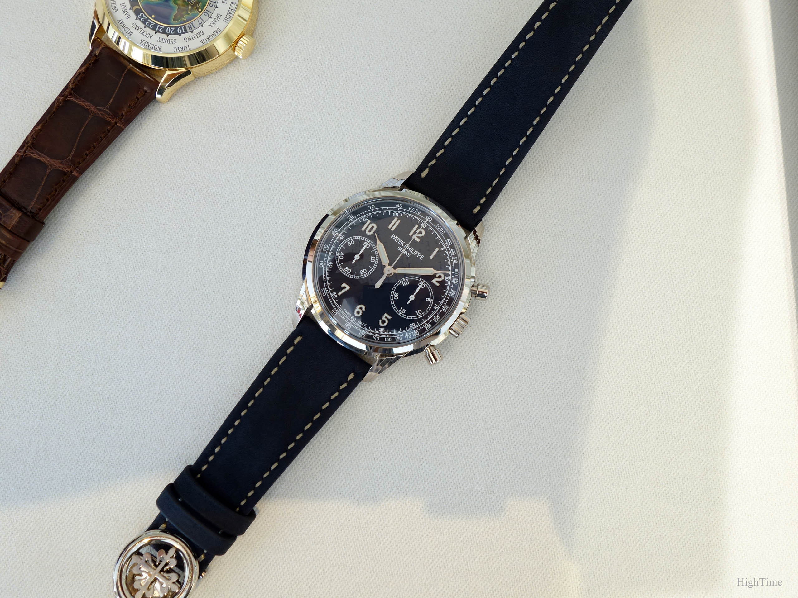
The white on blue contrast isn’t without reminding the 5170P or 5236P as well (with a totally different result of course). Indeed, the 5172G’s white painted subdials hands, white tachymeter scale and 5-minute intervals are supporting this casual ambiance. They enlighten the dial thus make the piece more modern.
As a matter of fact, both subdial hands are painted in white whereas, on previous chronographs, the small second hand (left side) used to share the same color as the time hands.
The chronograph second hand is grey sandblasted.
We notice slightly different fonts for the printed figures (vs 5170P). In order to balance its more modern aspects (dial texture, colors) the 5172 displays with-Serif fonts, insisting on the classical leverage together with the traditional pushers’ engraving. On the contrary, the 5170P showed non-Serif figures to balance a very traditional watch.
Modifying small details might bring such significant changes: for instance the 5170G silver and black dials (the latter without tachy scale) were very different, with a more Art Deco retro font style.
In the same way, the “railway” minute scale in the 5170Gs and R has moved to a thinner hence more discreet one in the 5170P and 5172G.
It’s always about details.
Applied lume-filled numerals are ones I love at Patek (since not long ago in fact). Usually, when dealing with numerals, I had a soft spot for Breguet or for baton markers within more technical dials. The ones we find here are a cross-over between the ones I discovered more “recently” while holding the 5524G Pilot (Luminova engraved applied numerals) and the 5070’s (for the style type). Indeed, I observed the 5524 was a watch appealing to more and more people while I remained more attracted by rather traditional designs. Hence, I thought I had to hold one in order to forge a reliable opinion.
In the end, it’s only when I could hold the 5524 Pilot that I realized this numerals’ type is very far from being “standard”. They indeed bring that special touch, making the observer know it’s obvious this is high-end craftsmanship: the smoother edges and the polishing are taken care of so perfectly that you know it’s superior work. Of course, the white gold adds up to it, more than steel, thanks to its color and brightness.
And the more you are used to seeing this kind of finishing, clearer it is when a watch has it or not. It is like someone able to recognize an ancient and genuine piece of furniture from a copy, a real diamond from a fake one. You should really have a look by yourself if you can.
I noticed recently that these applied numerals are the same between 5320 and 5172, except they were blackened on the Perpetual Calendar. It’s funny as a change of coating and context makes them so different. Hence, in a thinner design (compared to the 5524 Pilot), I find that in such new chronograph, it gorgeously pairs with other noticeable elements.
And maybe that’s the most important here.
Indeed, not that long ago, one would have arranged its outfit avoiding mixing pees and grid patterns or accumulating more than 2 colors. Today, in clothing, you can “nearly” blend everything (the “nearly” is important as it isn’t totally random picking either).
As a matter of fact, each decade holds its share of aesthetical evolutions. Those evolutions, while annoying for a more conservative part of the clients at first, bring what we love in the brand. Hence, definitely making it stand out from the others on the long run (even with inherent few bumps on the road…).
Over these last years, Patek is exploring new fields and I would say this 5172G gathers several of them. The pushers, round again in a manual chronograph (vs 5070 and 5170) and which decoration deliciously comes from the past like the numerals. The grainy blue dial coating, the contrast, even the size…
Today, I would say we have an accomplished result with this new model, in this very version. To be frank, I’m looking forward to future versions, as any watch fan, but I must say that I’m not sure how they can improve this one on the contemporary side (or if I even need to see one!). Except in a 5236P/5170P version (gradient-blue) but I don’t believe they’ll do 2 chronographs the same way.
In the same spirit, I’m glad that such traditional brand has come to explore other strap styles than croc patterns or brown and black. This blue satin/matte (not totally Suede matte) sample is a fantastic match for this version.
The watch comes finally with a white gold deployant buckle.
The gorgeous movement
As with the 5170 line-up, the 5172G embeds the exquisite manual-wind 29-535 caliber. This wonderful piece of mechanics houses the vision of an improved traditional chronograph design. These evolutions are related to increased power reserve, improved adjustment settings, anti-backlash wheels etc… but more importantly to frequency stability (improving timekeeping) with or without additional complications.
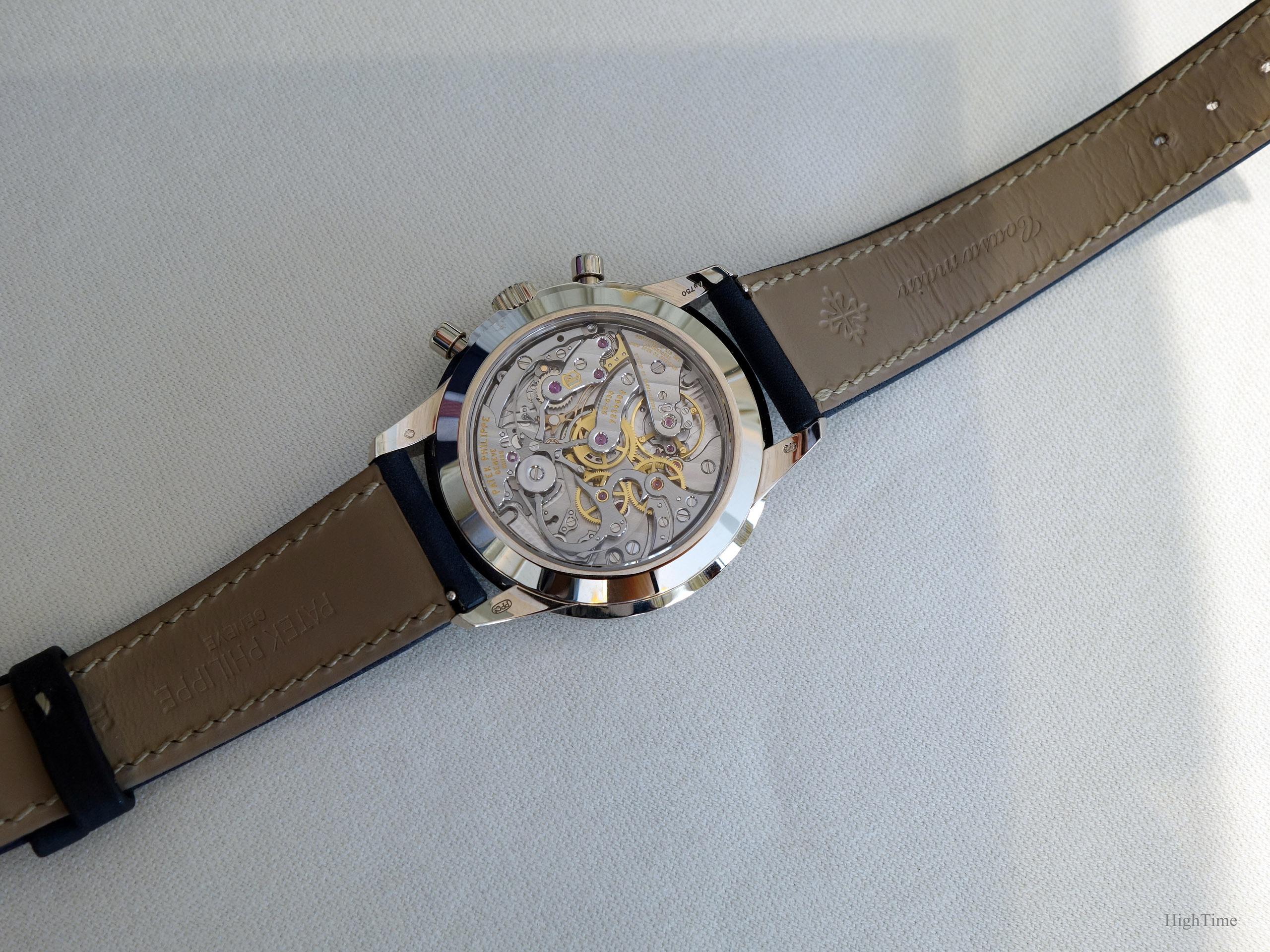
The finishing is top notch, from the edges to the column wheel cap and cams. If it would have been nice to have 1 or 2 inner angle decorations, the movement receives additional decorated bridges and parts. Delving in the movement’s characteristics helps understanding what this caliber represents for watchmaking today.
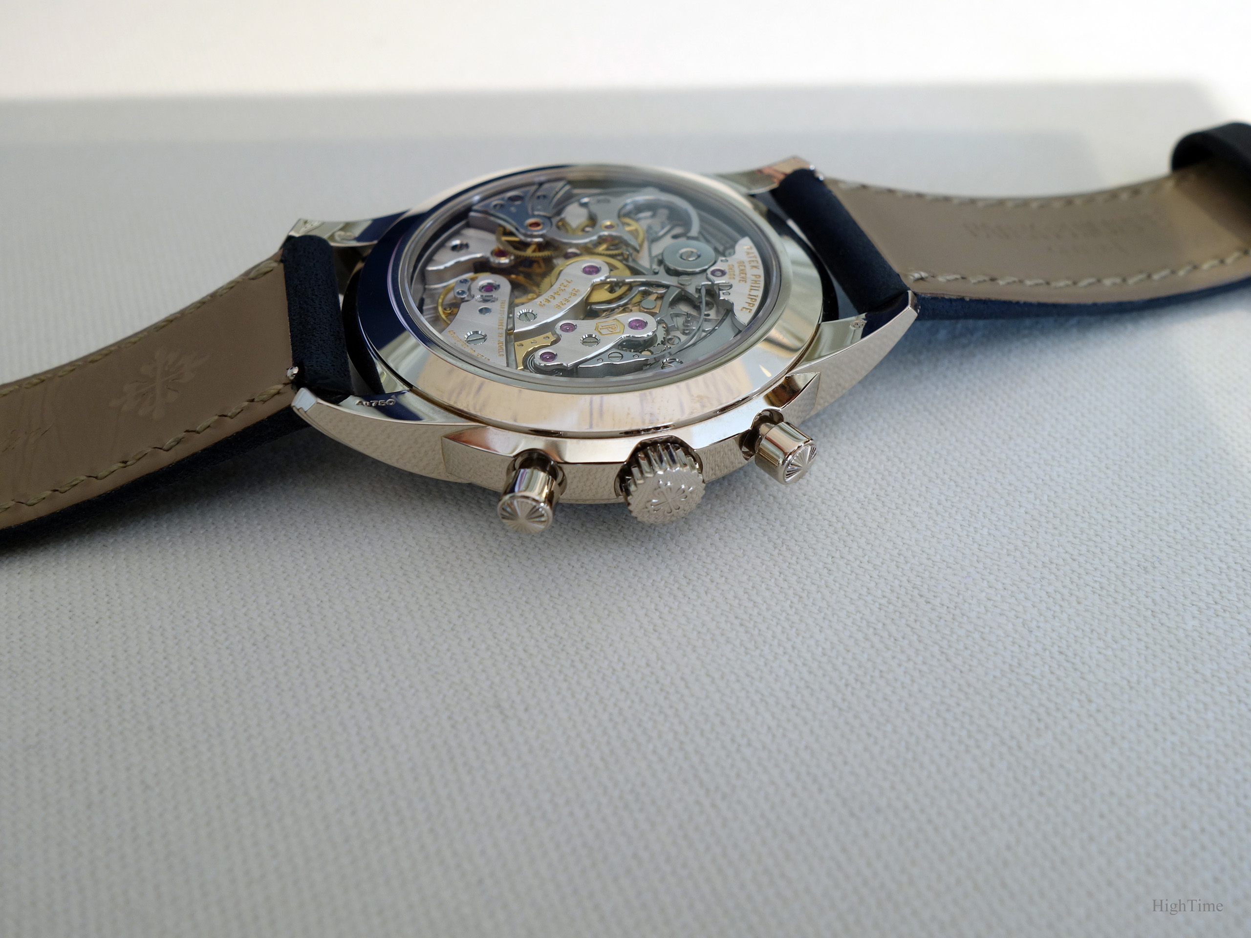
A detail I appreciate a lot in this caliber is the smoothness of the pushers. They still allow the owner to feel a light “click” when activated and avoid being too “buttery”, which I don’t like personally. This comes from the addition of jewel bearings (lightening the load on pivots) and the improved cam settings design.
It provides a stop-second feature and a dynamometric crown as well (the latter is like a sliding flange used on automatic movements, avoiding over-winding pressures).
Conclusion and Thoughts
To go straight to the point, I’m very excited about this watch.
There are novelties from these last years that are spot on, very appealing with casual outfits in the real. They also have in common to shake our aesthetical habits. I would say, more than before, the live experience gives all that the watch can offer, at least aesthetically speaking.
As always with aesthetics, it’s too early to say what place it will take in the brand’s history. We’ll see this in 20 years I guess. However, it’s definitely well born and fitting our times for what ends to be a beautiful classical piece, like the Nautilus or the 5070 at their time for instance. Each generation brings its specific evolution in paralel to the world’s Styling movements. Some people don’t recognize themselves and their epoch in too conservative pieces and others find in them an invaluable spirit. It’s an ongoing process the brand is taking care of since 1932.
I personally enjoy very much the contrast between wearing modern and very classical things. A Calatrava with jeans and rolled up sleeves shirt is one of my favorite examples.
However, in such 5172G or 5650G Advanced Research for instance, the mix is very powerful. The finishing is certainly what makes the difference for the observer. Moreover, the fact they aren’t in steel is definitely playing another significant role. When adding the movement to the list, it makes a very attractive chronograph from Patek Philippe.
The Patek 5172G sure has a lot of presence and that is Styling at its best from my point of view. Well, I really enjoyed wearing that watch and just can invite you to do so!
The Patek Philippe 5172G’s MSRP is 68 300 € (VAT included) as of today (2021).
As usual, you can find more on Patek’s website, here:
Edit: as I posted in introduction, the Salmon version was later reviewed here.
I hope you enjoyed the read!
PS : you’ll find here below the main improvements brought within the 29-535 chronograph caliber.
The 6 patents behind the CH 29-535 PS movement (from Patek Philippe’s website):
IMPROVED SYNCHRONIZATION BETWEEN THE CLUTCH LEVER AND THE BLOCKING-LEVER
Ordinarily, the clutch lever and the blocking-lever are synchronized by the column wheel. The engineers of the CH 29-535 PS eliminated this intermediate step by fitting the clutch lever with a finger piece that directly synchronizes both the clutch lever and the blocking-lever. This solution simplifies and improves the precision adjustment of the control sequences because the watchmaker only has to adjust one point instead of two as was the case in the past. Moreover, this approach suppresses the jump of the chronograph hand when time measurements are started and stopped.
IMPROVED PENETRATION ADJUSTMENT BETWEEN THE CLUTCH AND THE CHRONOGRAPH WHEEL
The adjustment between the teeth of the clutch wheel and the teeth of the chronograph wheel is performed by a large eccentric column wheel cap, working directly with the tip of the clutch lever instead of the conventional eccentric placed next to the clutch wheel. This new system enables a more precise adjustment of the penetration between the clutch and the chronograph wheel.
SELF-SETTING RETURN TO ZERO HAMMERS
The reset hammers of the chronograph counter are equipped with a self-setting system that makes it unnecessary to mechanically adjust the minute hammer function and thus increases the reliability of the mechanism.
OPTIMIZED TOOTH PROFILE
The wheels of the chronograph mechanism feature an exclusive patented tooth profile (presented for the first time in 2005 when the ultra-thin caliber CHR 27-525 PS split-seconds chronograph was launched). It eliminates the risk of hand jump in both directions when starting a measurement; limits the quivering motion of the chronograph hand ; increases energy transmission efficiency, and reduces friction as well as wear in the movement.
PIERCED-OUT MINUTECOUNTER CAM
A new minute-counter cam was created with a slot to prevent abrupt blocking in response to the reset command and therefore eliminates hand quivering.


You May Also Like
The Patek Philippe 5172G Salmon dial – Expression of tradition or…
The Patek Philippe 5960G Annual Calendar Chronograph – In a sailing camo